
Add to collection
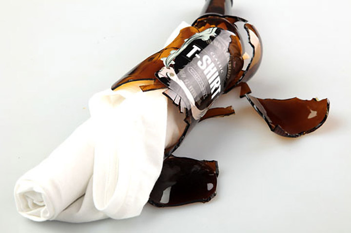

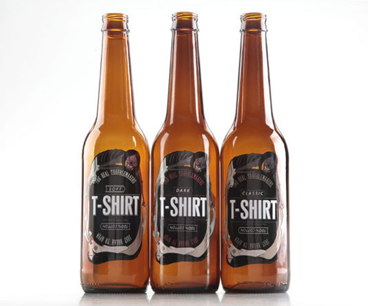
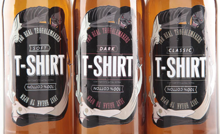
RockArsenal is leading Russian shop for undergrounds. Besides musical instruments, rare records and jewelry it sells tonns of t-shirts. The goal was to invent a new aesthetic and transfer it into firm logo and package to draw a new grown-up and payable customers. To mature thebrand and at the same time to retain the essence of what made themstand apart. T-shirts are put into recycled beer bottles, the most popular drink in underground culture. Bottles should be crashed toget the t-shirt – according to an underground practice of fighting with bottles and using them like a self-defence device.

Like main beer sorts and music styles, shirts are divided by three types – soft, classic and dark. The illustration can be turned both up and down to look properly and symbolize an eternal circle: life exhales death and death hacks life with a sward. An aesthetical base is composed of bleak colors and thin graphical lines with the typography in style of old traditions in decorating beer bottles.
Designed by Ann Leushina, Moscow.


http://www.behance.net/gallery/Rock-Arsenal-package/1595303

Add to collection