

Add to collection
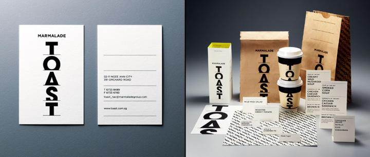

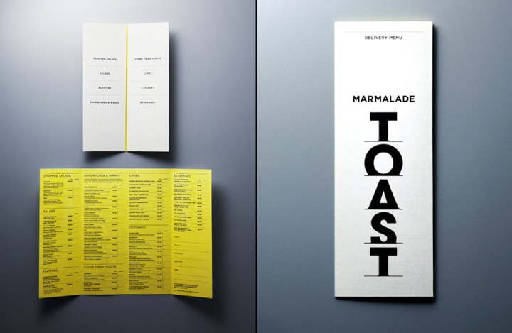
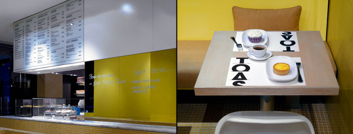
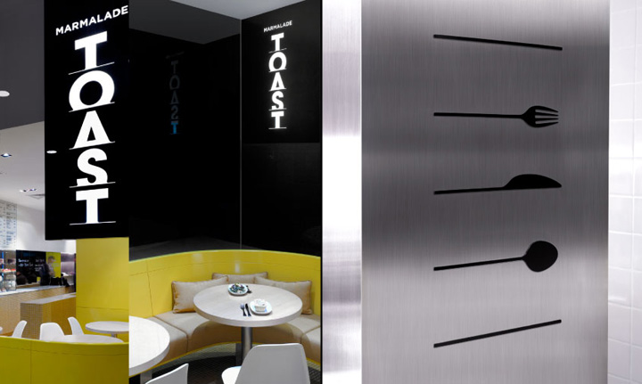
A fresh new identity for an upmarket gourmet café from The Marmalade Group. Previously known as ‘Toast’, the café’s brandmark has been refreshed to include ‘Marmalade’ as a headline and co-branding element.

The letters for ‘TOAST’ are rendered vertically in a custom typeface with truncated baselines, reminiscent of bread slices popping out of a toaster. Slightly rounded-off corners at the bottom of the letters are reminiscent of melted cheese on toast.

All in all, a simple and evocative design that is elegant, informal and full of visual flavour as applied across store signage, cups, bags, menu, wrappers and food tags.

Brand identity by &Larry
Add to collection