

Add to collection
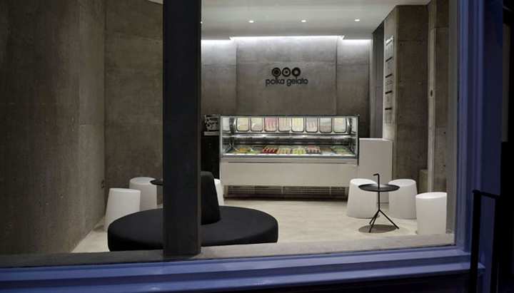

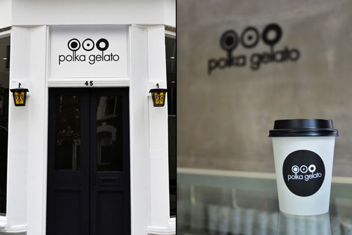
VONSUNG recently completed the total identity design for Polka Gelato, from naming, identity, branding, signage, website to spatial design. Based in a conservation area, Fitzroy Square, Polka Gelato opens its doors to showcase their artisanal way of creating ice cream.

The character of the listed building situated near the Fitzroy Square, is clearly that of a London period building. The dilemma was how to avoid the ice cream parlor formula of pop-culture, primary colours interior decoration, without making a disconnected piece of modern design that clashes with the building’s original identity.

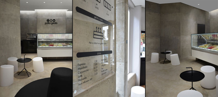
This is reflected in the design through the formal language and tactile quality of the finish materials used. The surrounding interior is unified with a single colour used on all surfaces.

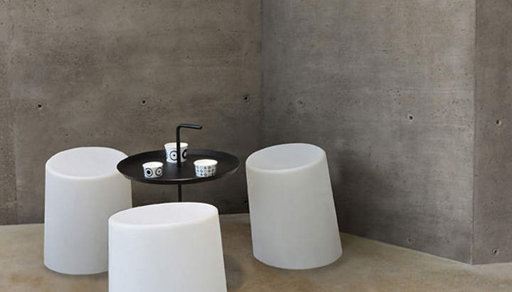
Housed inside a concrete/limestone mix surrounding, the furniture piece on the floor is designed as a strong, masculine and dynamic form whilst the lighting enunciates femininity to create more fluid contour lines. The store is designed in a more playful manner creating different zones that maintain the perspective view between them.


http://www.theindiebrandingcollective.co.uk/vonsung-polka-gelato-store-identity-unveiled


Add to collection