
Add to collection


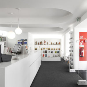
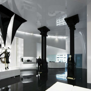
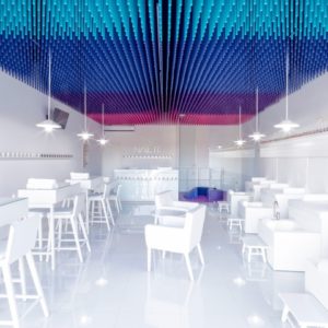
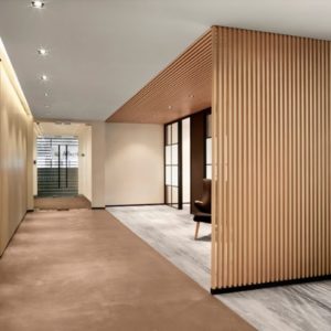
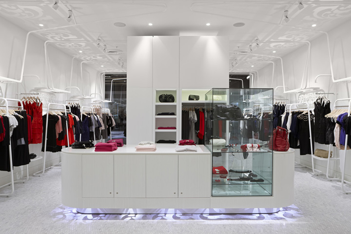
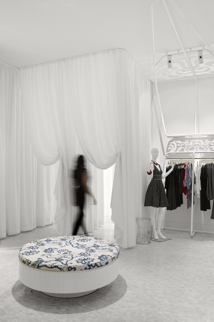
The Review store is designed as a suite of components that come together to create a whole the entire store effect is created through a series of carefully composed vignettes, layers and hidden details. Elements within the store are modular and repeatable, allowing for speed in construction and limited time spent on site. This aspect of the design is to create a sustainable focus towards the future installations in other locations by minimising time, material waste and energy use.

The project is designed to reflect the core vales of the Review brand. It is the label’s feminine, delicate and decorative ambition that has been seen as the main drivers behind the store design. Explorations in light and shadow epitomise this ambition. The store design is geared to accentuate and heighten the experience of this element.

Furniture, joinery and custom racking systems are all designed to reflect the patterns cast but also to be read abstractly as individual elements, as abstracted flower petals or organic ironwork. The white colour palette adds to this effect, creating a powerful backdrop for shadow as well as allowing the product to sit proudly among the created soft, elegant and unique interior landscape.
Designed by Russell & George


Photography Dianna Snape
http://www.theweeklyreview.com.au/article-display/Fear-of-colour-Not-us/3775
http://www.diannasnape.com.au/


Add to collection