


Nike Press Room by Torafu, Tokyo
posted by retail design blog on 2012-04-19
Add to collection
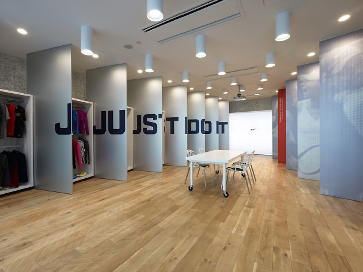

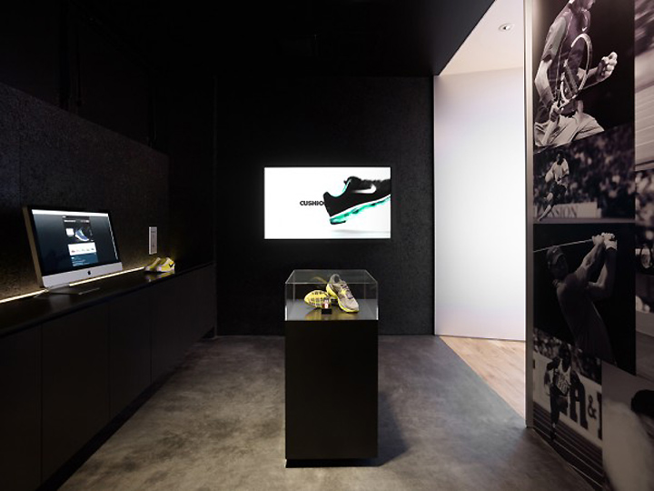
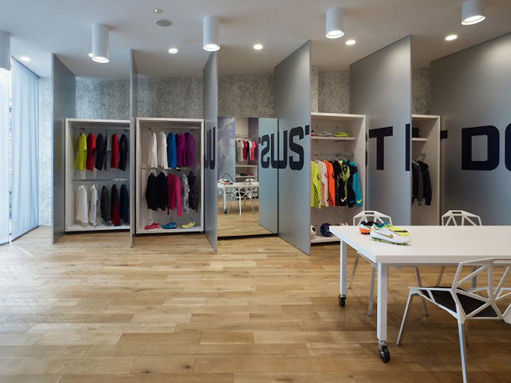
Planning for the project to relocate the Nike Pressroom began in 2007. The space is separated in three areas; namely the “entrance space”, the “initiative space” and the “stock space”. The project required a space in which product display walls coexist with a large graphic banner that brands the space as Nike’s.

We proposed a space presenting said graphics on rows of aluminum fins. These appear as a continuous giant banner when looked at from one direction, while revealing Nike products between the fins when looked at from other directions. It is possible to confer a sense of novelty to the space by replacing these graphics to match the season’s image, or to lend flexibility to the central area events by rotating the fins flat on one side during events.

The sneaker sole pattern carved into the flooring, the cement excelsior board walls painted white, the oriented strand board furniture, etc., as well as the contrast between the overall rough finishing and the sharp expressivity of aluminum come together to reinforce the duality of Nike’s mind which combines innovation and heritage.

The luminescent surface at the end facing the exterior light from the window side serves as a projector screen on which hangs the familiar swoosh mark. This light-emitting wall evokes a “light tunnel” while the arrangement of the fins create a sense of perspective in an otherwise closed and confined space.
Designed by Torafu
Photo: Daici Ano / TORAFU ARCHITECTS


Add to collection