It Me Eco Fast Restaurant by Joanna Pszczółka & Łukasz Brandys, Ochaby – Poland
posted by retail design blog on 2012-06-30
Add to collection
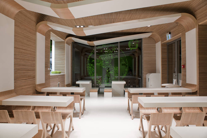

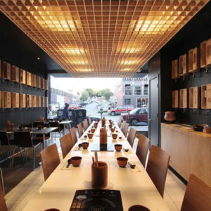
It!me fast food restaurant, which is located in Dream Park in Ochaby, was created at the beginning of July, 2011. It is the first branch of the planned chain of eco-restaurants. The designers made an attempt to give this small place an image that would make it distinct from other big fast food brands. A mixture of elements, such as a proper choice of materials, limited colour gamut and refined details allowed the designers to achieve an unpretentious effect of modern and delicate beauty. It determined an unambiguous identity of this brand new restaurant.

The entire image was adjusted to the small size of the place and its function. However, the project was not only confined to the decor. The designers created the entire brand, including the image which stands against other restaurants’ image, its name, logo, even the packaging project, a set of instructions for preparing food, advertising campaign and furniture.

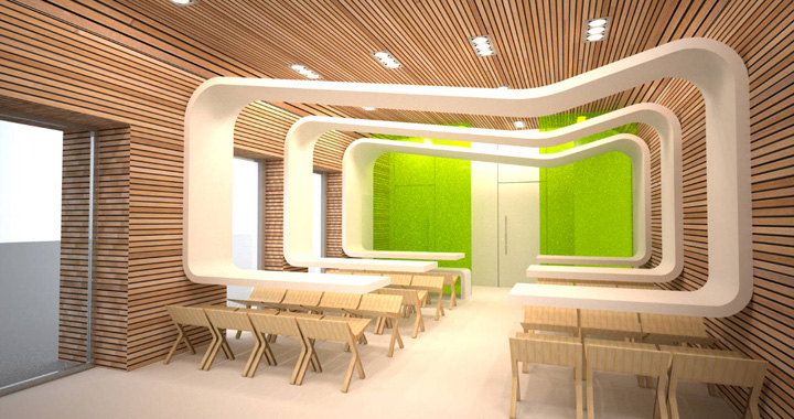
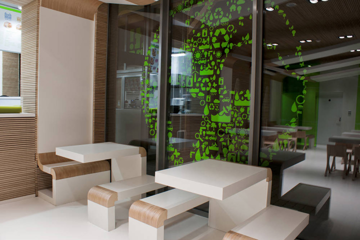
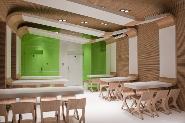
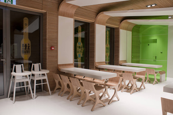
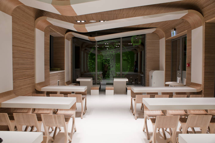
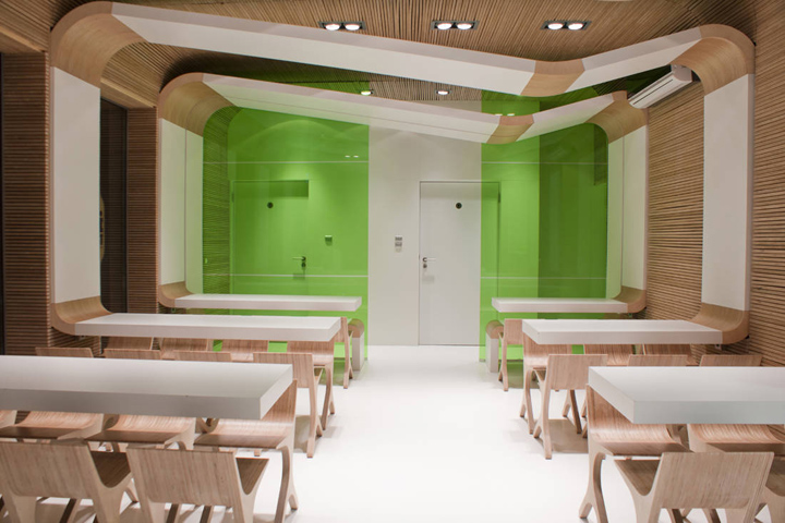
The main idea was to create an eco-brand which makes use of biodegradable ecological materials. The designers had to face the problem of small and limited architectural space and to find a place for fifty sitting places as it was the investor’s requirement. In order to optically enlarge the interior, the floor to ceiling windows were used. There are no traditional tables but only table tops fastened to the load-bearing walls. Tables with no legs make it easier to keep the restaurant clean, they also enlarge the space, and enable people on wheelchairs to eat in the restaurant without designing a separate place which would be accessible to them.

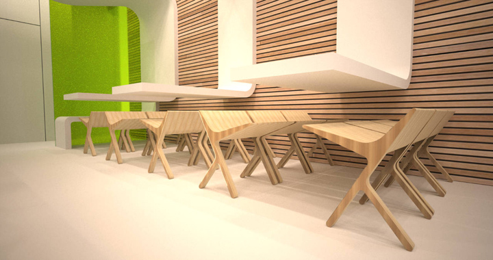
The restaurants’ walls were made of concrete blocks covered with non-woven geotextile fabric. The light wooden construction, with slats made of coniferous plywood on top of it, was fastened to the walls. The table tops are metal with MFD panels screwed to them. The white and thick laminate, used in gastronomy, was stuck on top of them. The chairs were made of deciduous plywood, with each element cut by use of NC milling machine and then stuck together with ecological and biodegradable glue. The warm colour of plywood and cold whiteness were complemented with green which is associated with eco-products and brands. The same colour scheme was used on the packaging and this is the essence of It!me ecology.

The designers’ aim was to use as little paper as possible, and to get rid of full packaging for hamburgers, tortillas and cakes and replace them with wrappers which reduce paper use to only 25%. The staff wraps a hamburger in a thick greaseproof paper and puts a thick and narrow cardboard with only a logo and product’s name on it. Folding of the packaging doesn’t require a glue which is possible due to special folds which hold the construction together.

It has the trapezium shape which additionally stiffens the packaging. Only Kraft paper made of waste paper and virgin fibres which can be recycled was used for packaging production. The usage of printing ink enables composting and has no impact on the quality of it. The designers tried to eliminate plastic in the process of packages designing, however, the chain is still to small to get rid of it completely and to create a well-designed material for production of mugs for carbonated drinks. All plastic elements are made of PET material which can be easily recycled. The restaurant is equipped with recycling bins and the consumer recycles the waste itself. Sorted waste is collected by a recycling company.

The designers took care of the balanced development during their entire work. Because of that all elements used in the restaurant were created with help of small companies located in the neighbourhood of Ochaby. The majority of them were small enterprises since only these companies were willing to face the challenge of creating the design. They managed to meet the requirements, both aesthetical and financial since, in comparison to other fast food chains, the budget was rather small. The entire project was complemented with graphical elements designed in the same manner as the interior and the packaging. The main colours used were white, beige and green.

The image was created by the UL DESIGN company (Joanna Pszczółka and Łukasz Brandys). It took four months to achieve the final result, however, the designers are still working on the development of the It!me brand.
Photographs: Joanna Pszczółka
http://www.archdaily.com/246176/it-me-eco-fast-restaurant-joanna-pszczolka-lukasz-brandys/
Add to collection