Karaway branding by ico design
posted by retail design blog on 2012-08-04
Add to collection


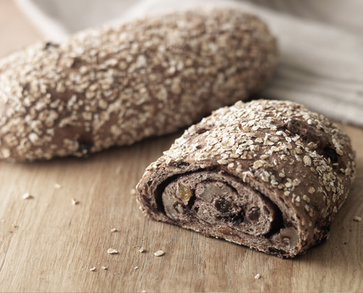
Karaway is a bakery that makes bread the traditional way, with great attention to detail and wholesome ingredients. The challenge was to develop a brand strategy that would reflect this heritage, looking to Eastern Europe, Belarus and Lithuania for design inspiration to develop a visual identity that is contemporary and sympathetic to the traditions of the bakery.

The name Karaway is derived from the Slavic greeting Karavi, which refers to a custom of welcoming guests with a loaf of homemade bread; the name also communicates flavour and further emphasises the natural feel of the brand. Red, the national colour of Russia, was chosen, and both the illuminated letter used for the ‘K’ logo and the pattern that embellishes the marketing material were inspired by Slavic artwork. In keeping with the theme, Orbi, a typeface designed by Russian typographer Natalia Vasilyeva, is used across all brand communications.

Showing products at their best is of vital importance for a food brand. We commissioned photographer Cristian Barnett to shoot in the Karaway bakery, capturing both the baking process and the finished breads.

Once the brand values and visual direction had been agreed, we collaborated with architects 31/44 to develop the first Karaway store at Westfield Stratford. There is strong emphasis on the use of natural materials throughout the store, from brown-paper carrier bags, to linen staff aprons and handwritten price tags. The open-plan shop creates the feel of a market, using wooden food crates and wicker baskets to display breads and baked goods.
Designed by ico design


Add to collection