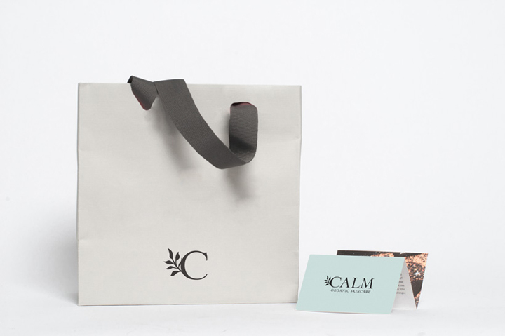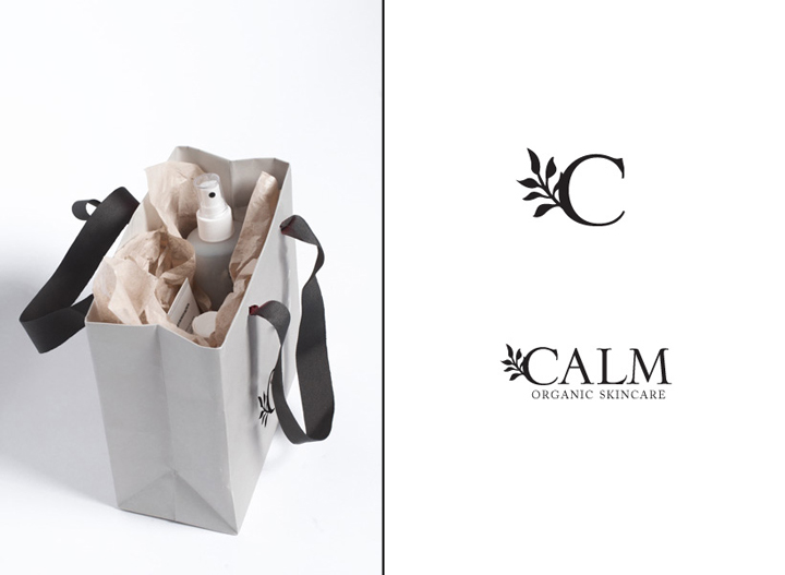
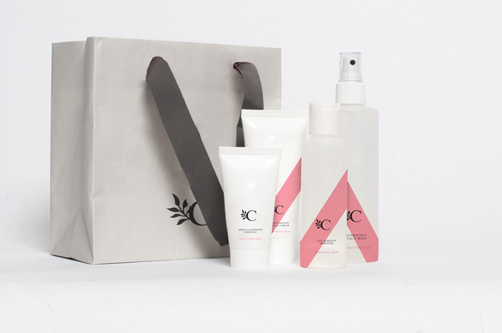

Calm is a beauty brand that produces a range of natural skin care products. They wanted a classic but white and fresh design for their newest line C. The products are paraben free and contains no artificial colors or preservatives. Calm wanted the C line to smell great and look classy and somewhat expensive. The aim is to attract the modern, stylish and aware woman. The products are available in three different skin types, normal, sensitive and oily.
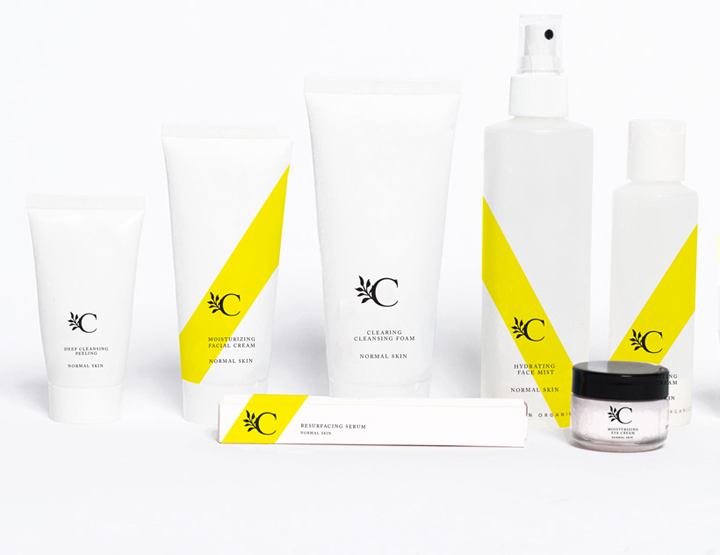
For the customers to be able to tell them apart easily, I needed to come up with an idea that would make them differ in a subtle but still very visible way. I decided to use a sash to illustrate the brands aim to be the number one in the industry of natural skin care. The sash is also perceived to be ceremonial and classic, and are traditionally used in beauty pageants.
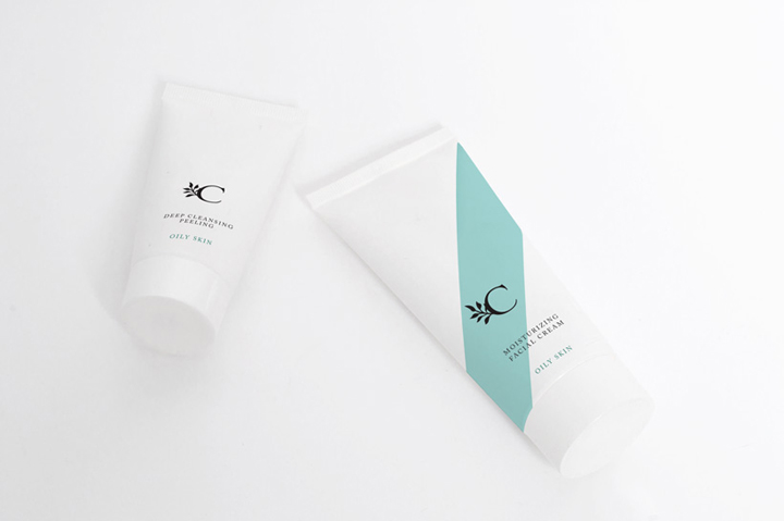
By using the sash only on some of the products, as well as using bright and light colors, I created an over-all fresh and white look, and the color of the type of the bottle still unites the products of different skin types. I decided to use yellow for normal skin, its happy, fresh and a bit edgy. Pink is for sensitive skin, its healthy, glamourous and calming whereas the oily, often acne prone skin, needs a soothing, calming red-covering turquoise.
Designed by Matilda Hedman / Blanc


Add to collection


