

MYATA branding by ART Studio
posted by retail design blog on 2012-11-11
Add to collection

Fresh “MYATA”
Corporate identity has to reflect strictly the present position and the future targets of an enterprise. It is even better if the brand book is a little bit more modern than the company, thus leaving room to grow in to. This tactic was followed during the design of corporate identity for the youth clothing shop ‘Myata’.

We are often contacted by beginner companies or businessmen. We always advise them to initiate their enterprise with the creation of a corporate identity and only then to proceed to a project design of an office or shop. The aim is to achieve an integral harmony. For those who decided to open a personal business and don’t know where to start we devised the special offer “Business start”. This assists in the formation of a complete, well defined corporate image, meaning at least 50% of consumer success. This is the exact scenario of our cooperation with the owners of the shop “Myata”.

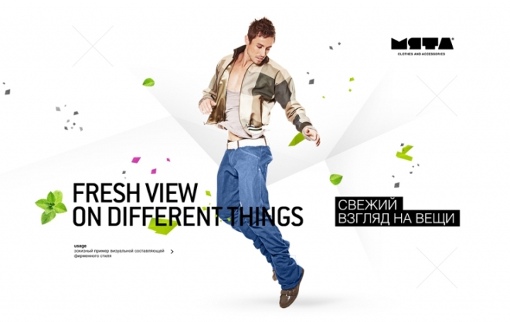
“Our customers are people having an active life style, ambitious and willing to differ from the mass, at the same time considering modern tendencies in style and fashion,” with these words a young couple presented their future business to us. The young people created themselves the name and the main slogan — “Fresh view on different things”. Such customers are quite a rarity. They knew exactly what they wanted.

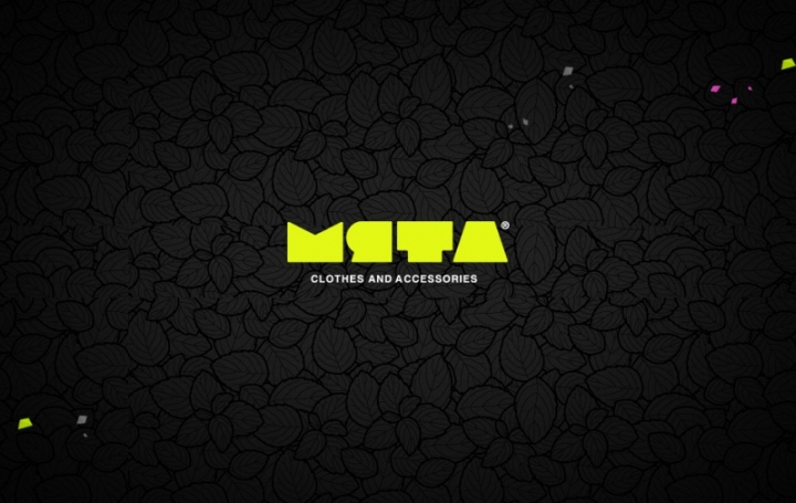
One of the crucial steps in corporate identity design is brand naming. And even the fact that the name was primordially set as “Myata”, meaning “mint”, there were several new creative solutions suggested. One of them was “Myato”, meaning “crease”. Though the name finally was not accepted, this idea was reflected in the broken, “creased” lines, making this motive one of the principal elements in the Corporate Identity.

Logo – sign
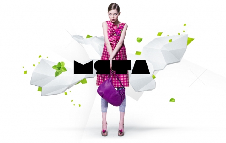
Very often corporate identity designers separate the name and the graphics of a logo. In this case we have chosen a different way — the letters MYATA were stylized, resulting in an individual symbol. It is not just a word or a business sign; it is a simple and recognizable logo.

Such a logo is flexible and can be used on different backgrounds and with different intentions. It can be filled in with jeans fabric, for instance or, other interesting textures to reflect the image of a trendy youth shop.

Non “mint” colours
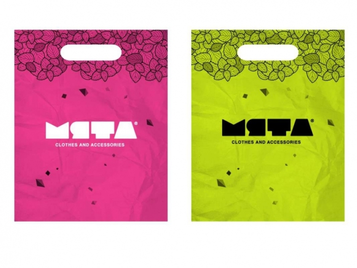
It might seem that the name should define the colour solution of the future logo. As “myata” in Russian means “mint” a green palette would be expected. But this solution seemed boring and predictable. That is why apart from bright lettuce colour we used black, crimson, silver — grey and white. The mint motive itself appears in the contours of mint leaves as the background in quite unexpected non “mint” colours.

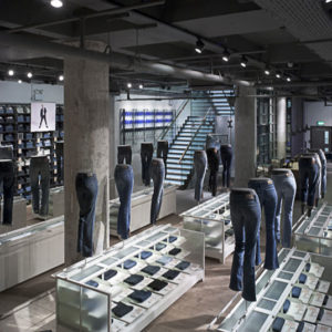
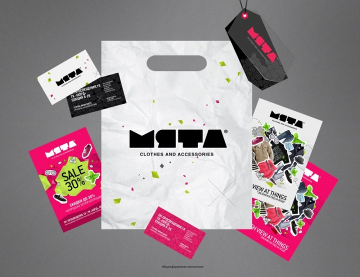
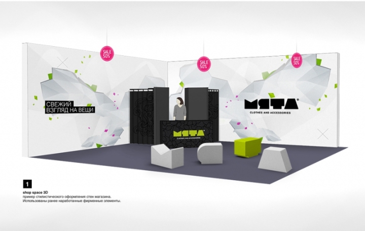
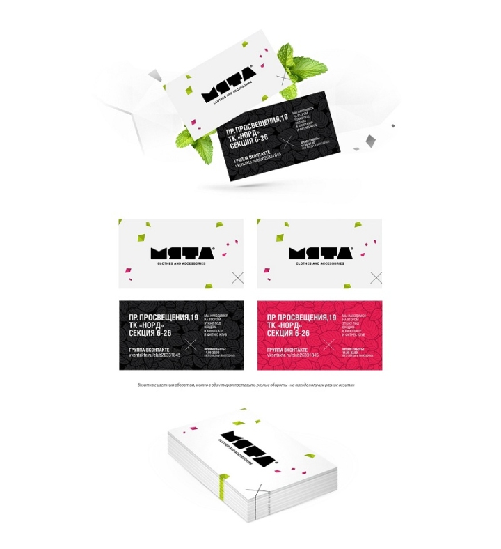
From the business card to the shop
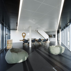
Corporate identity is needed to sustain an integral unity of style of an enterprise — from a business card up to the retail design. That is why immediately after defining the principal elements of the corporate identity, which took us about two months, we started the procedure of equal importance — the concept of the interior design.

During the works on corporate identity we created a pattern design for the walls, the rest of the interior elements were considered within the framework of the design project.
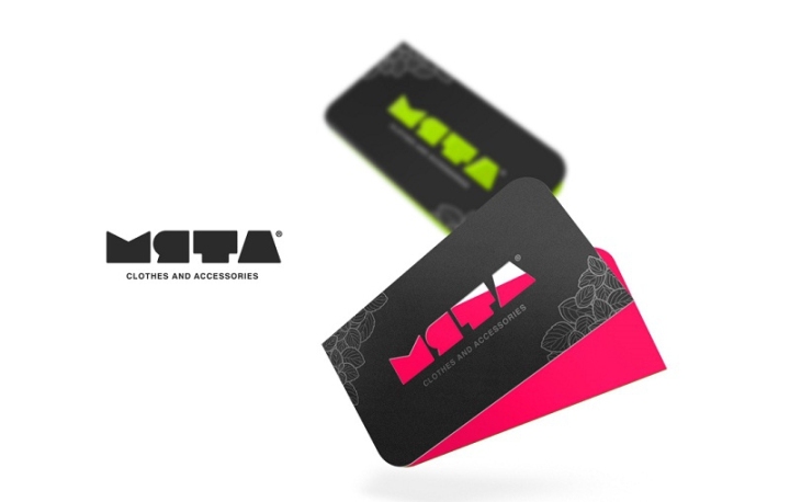
The customers also ordered the design for leaflets, business cards, client cards and price tags. We decided to play with the colour solutions and filling of the logo, so the cards, tags and letterheads bear a common style, but appear different at the same time. Different backgrounds and fillings are applied, along with the interchange of the corporate identity elements. Monochrome versions are perfect for black and white T-shirts, fabric brand bags and any clothing printing

In this way we managed to avoid a direct replication of the same logo with one of the same palette solution. This technique captures a client by its diversity steering away from boredom. The logo is very versatile being flexible for vast range of applications; it can be easily updated and transformed. It is light in perception and easy to remember.

Such corporate identity has the ability to evolve successfully acquiring additional details with time, without our assistance being necessary. One more important point is that the design of the corporate identity at the start will save expenses in the future when the company will open branches or even develop into a chain or a group.
Designed by ART Studio


Add to collection