

Add to collection
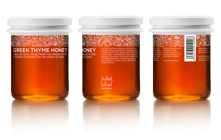

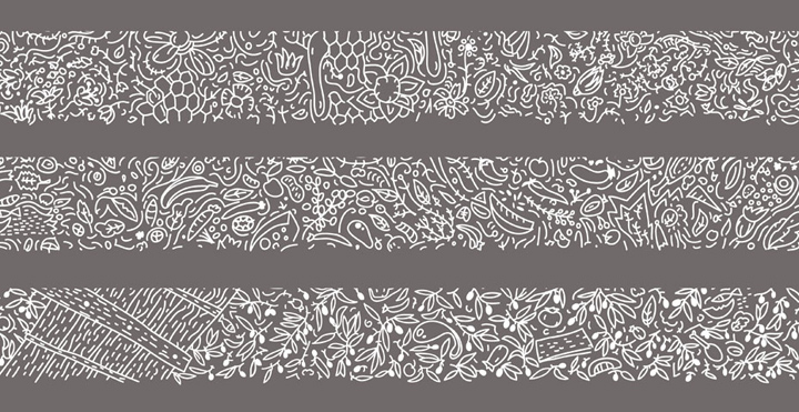
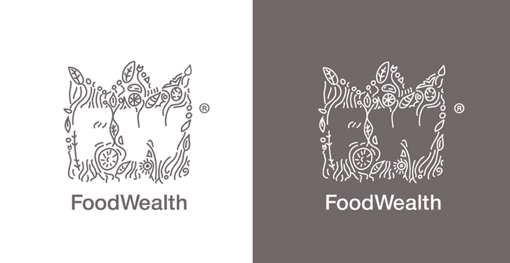
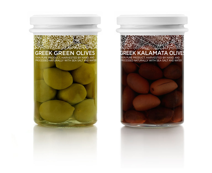
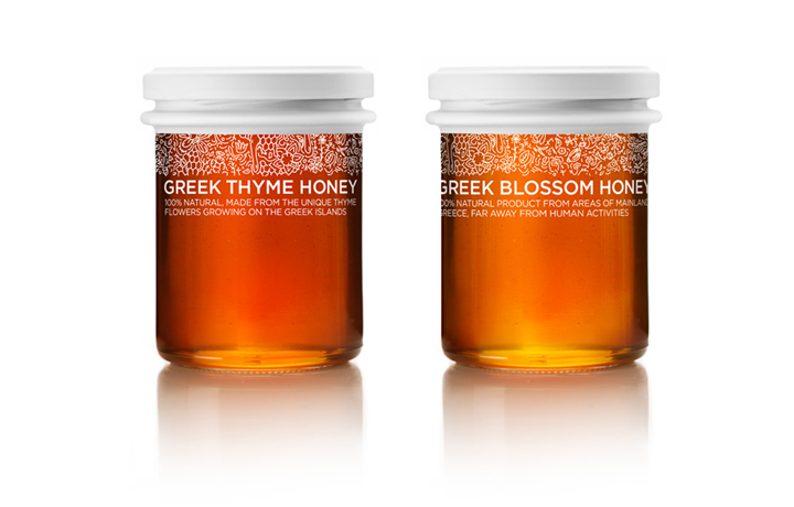
Τhe briefing (in brief): ‘we want a simple and lucid identity, a logo and packaging design that will convey the nutritional wealth of our products’ Τhe target audience: foreign clientele. People who can appreciate affordable originality. The design: the products our client exports needed a rich but simple design language in order to reach different foreign markets. We began by designing a logo, where the first letters of the two-words brand name (Food Wealth), are engulfed by the Greek flora, the lush foliage of plants.

We thus created the illusion of a tiny ‘garden’ and allowed for the immediate association with the idyllic land where these products grow. Taking this a step further we designed the outlines of branches and tree leaves, referencing the source plant for every product. Olive trees and thyme are printed on the transparent glass jars, complementing the food within, in a way which allows easy and pleasurable identification. Instead of using color codes, bold graphic symbols and such we aimed for a product differential characteristic closely related to the values of the brand.
Designed by mousegraphics


Add to collection