
Add to collection


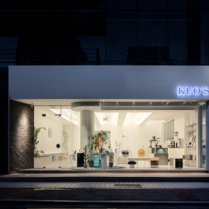
Pentagram’s Natasha Jen designed the identity and environmental graphics for the exhibition Gimme More: Is Augmented Reality the Next Medium?, recently on view at Eyebeam Art+Technology Center in New York. Originally developed by the EPFL+ECAL Lab at the Ecole polytechnique fédérale de Lausanne in Switzerland, the exhibition showcased seven installations by artists who use augmented reality (AR) to tell stories in new ways.

Previous incarnations of the exhibition have been shown in London, Milan, Paris and San Francisco; the New York version was designed in collaboration with SOFTlab and Futureflair, and featured several new works.

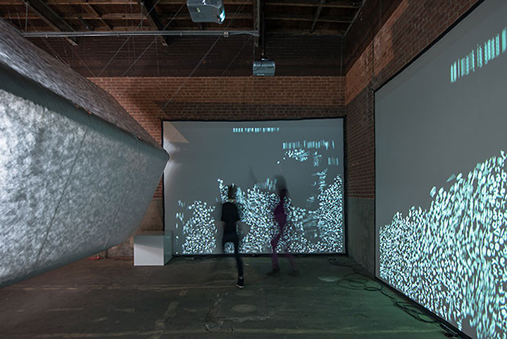
Augmented reality is reality with something extra—objects, environments or interactions that have been enhanced with virtual content or storytelling that blurs the line of the physical and digital. Jen’s graphic design for Gimme More plays on this intersection of the material and immaterial, using simple elements of light and shape to create an otherworldly effect that helps introduce visitors to the subject and sets off SOFTlab’s innovative exhibition design.

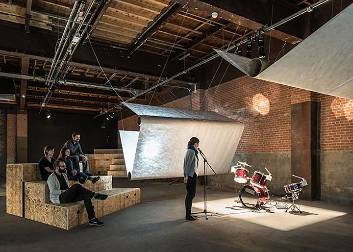
SOFTlab’s design for Gimme More used large structures made of Tyvek sheets to define the gallery’s open, industrial space. Wrapped around suspended cardboard tubes to create volume, the sheets acted as dividers that helped separate the installations and create an environment for the show. The structures were backlit by custom-designed lighting fixtures that brought out the texture of the Tyvek and created a kind of glow at each installation.

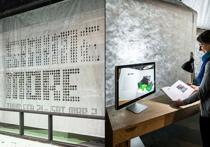
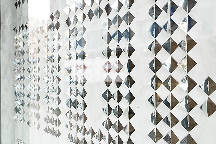
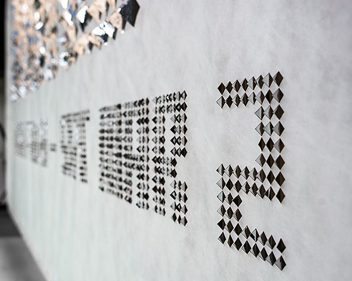
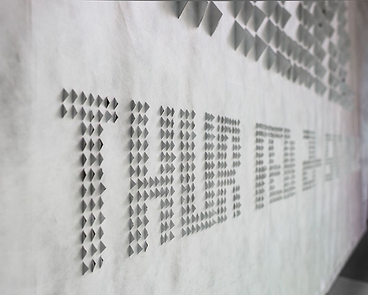
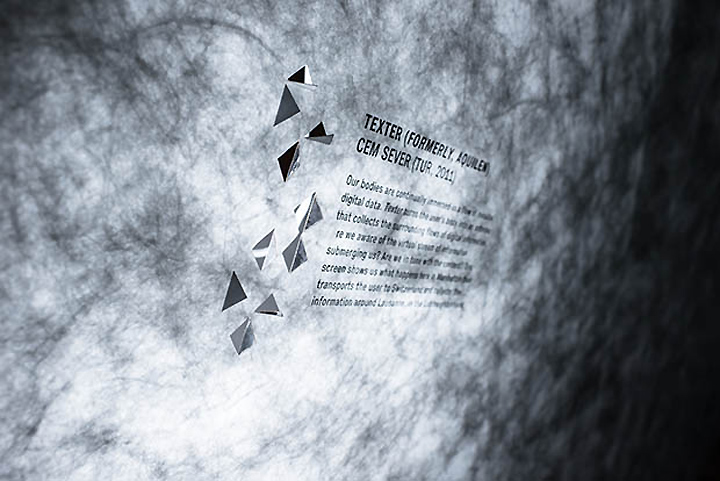
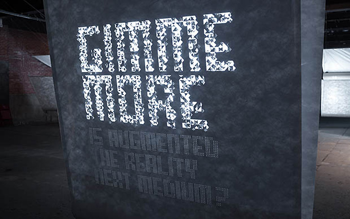
Jen’s graphics for the exhibition helped tie together the low-tech architectural material of the Tyvek and the digital nature of the installations. The graphics used a custom-designed typography composed of triangular shapes. The pixel-like, modular typography formed the identity of the exhibition and was easily scaled for various applications, from large-scale graphics in the gallery window to the printed exhibition program. In exhibition signage, the triangular modules were cut out or projected to create type that was dimensional and constantly changing.

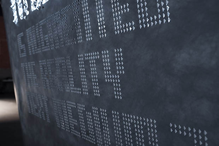
The identity in the gallery window appeared on a Tyvek sheet hung from existing beams. Here the triangular modules were die-cut and folded toward the street, with silver Mylar stickers adhered to the back of each fold to create a glimmering presence that changed with the light, from day to night. The holes also allowed visitors to peer into the gallery space, adding extra dimensions of color, reflection and depth that tied into the exhibition theme. At night the signage was illuminated by lights hanging behind the sheet for a different effect.

Inside the gallery, the analogue treatment of the window was translated into a more dynamic, digital approach for the title “wall” at the entrance of the show. Here some of the triangular pixels were cut, folded out or adhered on the Tyvek, while others were projected as animated pixels of light to “complete” the graphic. The final effect successfully captured the exhibition’s blur of the physical and digital. Inside the exhibition, the cutout modular typography was also used for numbers identifying the various artist installations, accompanied by caption text applied in vinyl.

Gimme More was on view from February 21 through March 2, 2013.
Project Team: Natasha Jen, partner-in-charge and designer; Belinda Chen, designer. Exhibition photography by Alan Tansey.


Add to collection