

Add to collection
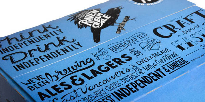

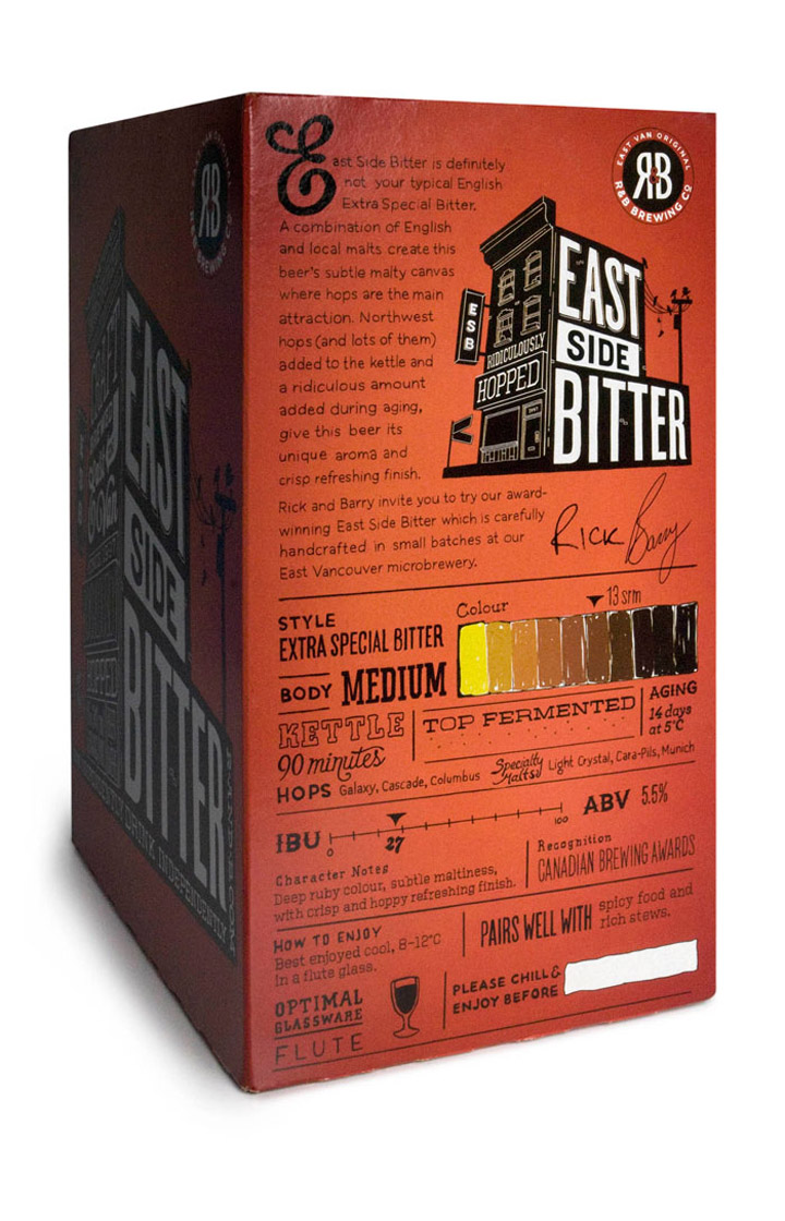
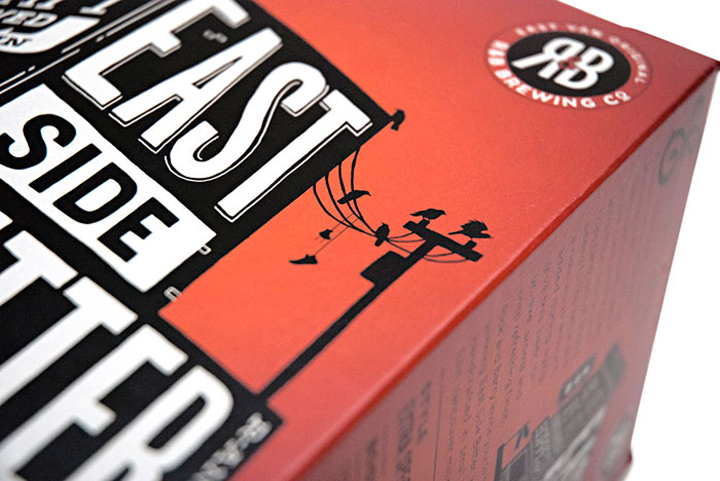
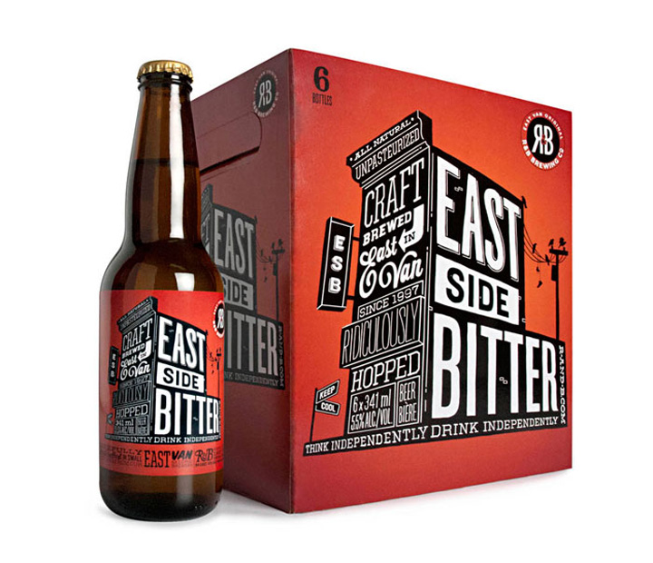
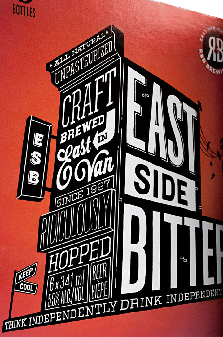
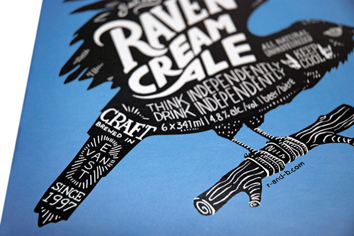
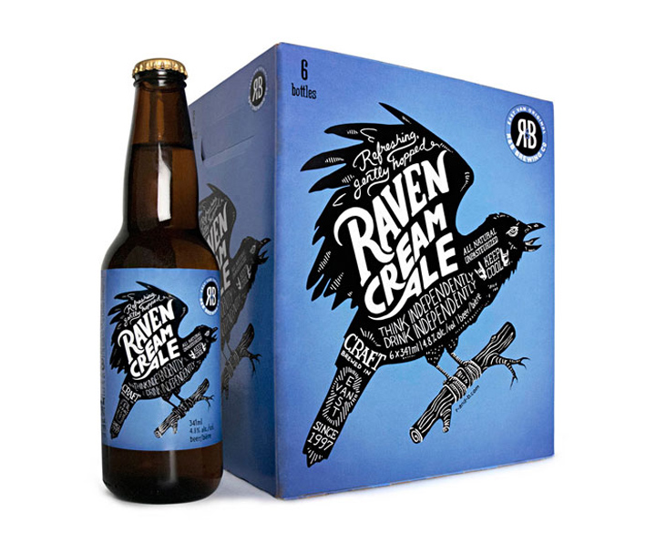
R&B Brewing is one of Vancouver’s original East Van micro breweries, predating the current trend by almost two decades. Partners Rick (“R”) and Barry (“B”) asked St. Bernadine to help with a packaging redesign, initiated by the move from 650mL bottles to a standard 341mL 6-pack format.

The design language is inspired by R&B’s resolutely hand crafted product – as such, every element on the packaging is rendered by hand, including the bar code. Bold silhouette key illustrations take their cues from the beers’ quirky naming conventions, and strong colours aid standout and shelf blocking. Key brand story elements, hand rendered in expressive type, and additional varietal information, like IBU scale, boil information, aging temperature, hop and barley type and mix all support R&B’s independent, craft positioning.
Designed by Saint Bernadine Mission Communications Inc.


http://www.thedieline.com/blog/2013/3/19/rb-brewing.html
Add to collection