Park Inn by Radisson Hotel by Medveczky & Gothard, Budapest
posted by retail design blog on 2013-04-30
Budapest
Add to collection

Sometimes, realization of the designer’s intent and the quality of the outcome is influenced by practical points. However it is always desirable to keep balance between the designer’s and investor’s point of view. Our intention was to reinterpret the ordinary, commonplace and tight-budget project and create new value by designing something unique in style. The emotional richness of color and surface, austere plasticity, dynamic styling accents and sophistication of the subtle details are some of the tools we use when designing interior for a hotel.

Strict requirements controlled the designer’s invention, as the hotel is part of a chain and has pre-existing brand elements. It is instructive however, that even so we were able take effect on the brand identity. Functional and design elements that seemed rigidly regulated, gently transformed, so that the initial ideas, the design intent is achieved.

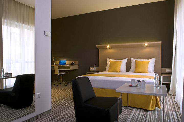
The business hotel lies close to the city center, in an environment of office buildings. The hotel has 136 double rooms and suites, some of which have connecting doors. There are rooms on every level for disabled people as well.

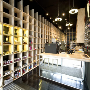
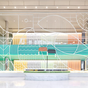
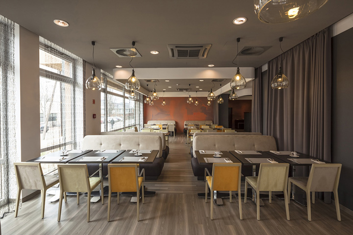
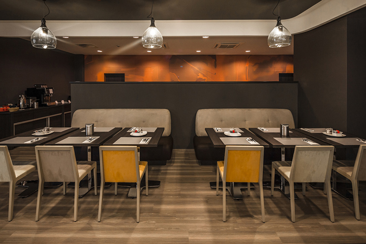
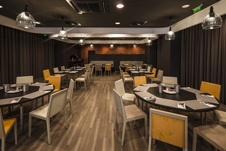
Most of the rooms have ‘zip & link’ or ‘king size’ beds. All built-in furniture, furniture units and carpet samples are individually designed. Typically, the gray-ash veneer furniture, the white-dark gray walls and 7 color scale carpet make up the rhythm of the rooms’ color and texture world. We followed this sentiment also when developing the public areas. We used intense black-gray-white contrast, amplified by shapes and used it to move unfavorably characterized ceiling space.

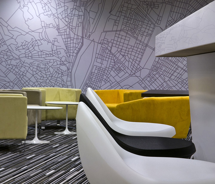
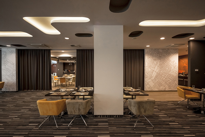
Ceiling stairs and perforations, color nuances displayed in various materials / relief vinyl wallpaper, textile, paint / characterize space. The furnitures’ tapestry have vibrant color accent to balance the black and white contiguous space character, this character also signals the function changes in space. With dark colored curtains the restaurant is divided into a larger or smaller spaces, depending on the time of day and modes of operation.

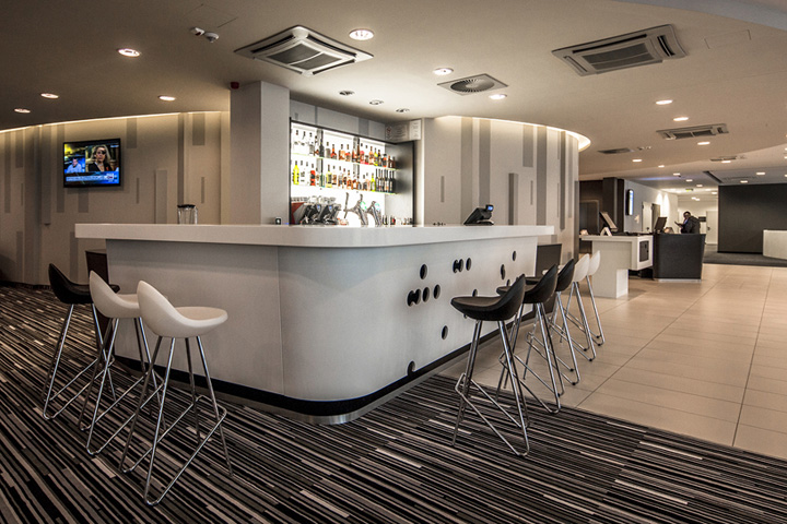
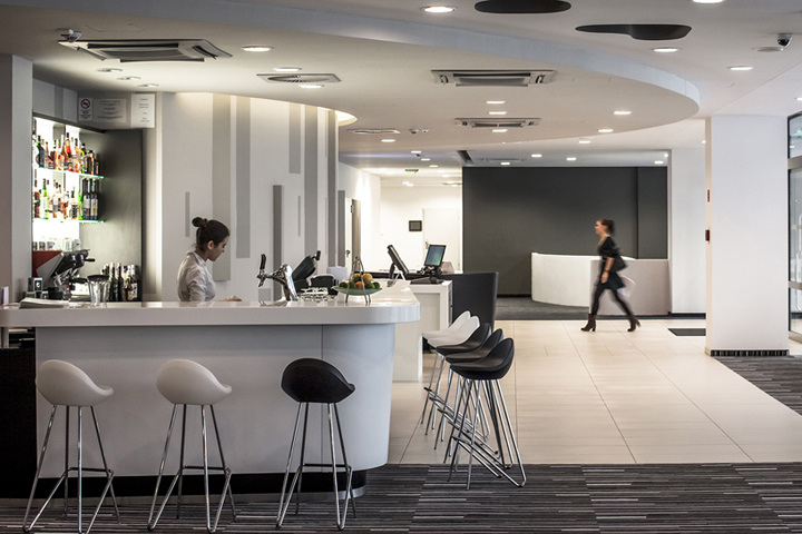
Bright orange-red digital prints were used to close the restaurant’ inner boundary walls. Outside the partition walls, abstract map layouts of Budapest were used, hence the name of the bar: ‘Map’.

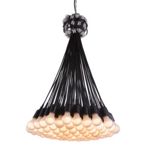
Artificial lighting can be operated in different modes and the overall effect of colors make it possible to change moods for different occasions. Several unique lamps were designed to serve as the restaurant’s ceiling light – DIY glass-balloon lamps and unique, randomly twisting ‘worm-like’ lamps make the lighting special. The surface quality and the nature of the constituents were selected so, that graphic designs, light and shade effects could be created on large surfaces with just a few elements and lighting would be a new experience depending on the time of day.

We used materials such as vinyl, polyurethane paint, or various plastics digital prints to provide cost-effective, but attractive solutions.

To find more information about Park Inn by Radisson Hotel please visit this link.
Interior design : Kazimir Medveczky ( Medveczky & Gothard )
Photos : Zsolt Batár and Francis Vauban


Add to collection