
Add to collection


We predominantly worked with existing elements and were briefed by the creative director to use as much colour as possible to re-energise the existing elements and make them relevant to the Mediacom brand. Because we were re-using as much as possible, the main focus of the design was to bring contiguity to the three floors Mediacom were occupying.

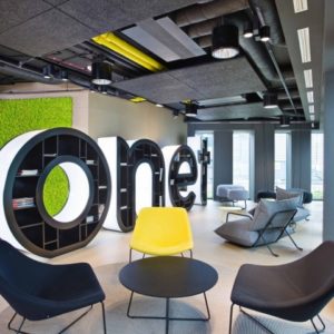
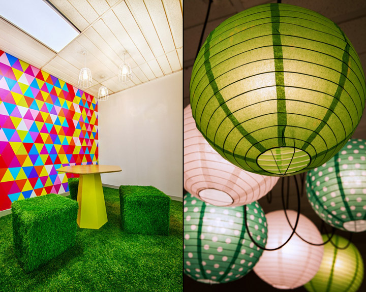
As the largest agency in the building, we had a lot of workstations to cater for and needed to focus on making the support spaces as inviting and engaging as possible. It became apparent that we needed to offset the workspace with livable alternative environments in the work space.

The breakout and meeting spaces at MEC were designed to help people engage and bring them together. These spaces were largely located on Level 15, encouraging activity on that floor and integration of staff from all three floors. Levels 16 and 17 would be encouraged to spend time in the spaces on Level 15. This was the most efficient way to help staff come together without the budget for an interconnecting staircase.

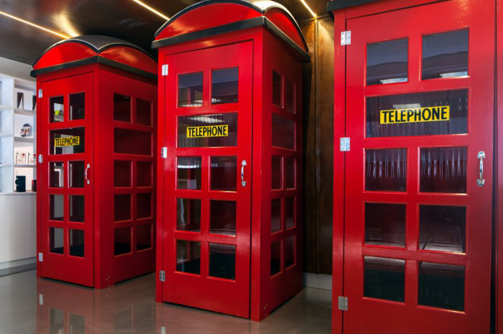
As the design was predominantly re-use of existing elements, it lent itself to be environmentally responsible. The reception area included large cut out letters spelling Mediacom on recycled sleepers and we included hand-knitted socks around timber poles in the work area that were all locally sourced. Most of the new elements were loose fit and easily dis-assembled.

One of the design features we used throughout the space was branded graphics that described the company’s core beliefs. These 2D graphics were an economical way to rejuvenate the office and make it more livable. The graphics used a bright colour scheme that was applied throughout the fit-out and directly reflected the company branding.

The result was three floors that reflected the agency’s brand direction and included a variety of environments for staff to work in. The communal spaces were brought to life with dynamic 2D and 3D elements that incorporated a kaleidoscope of colour and would be inviting for staff from all three floors to occupy. Overall the fit-out achieved high visual impact for clients and staff, which was produced on a lean budget that relied on high levels of re-use of existing elements.
Designed by The Bold Collective

http://officesnapshots.com/2013/08/28/inside-mediacoms-newly-energized-offices/


Add to collection