Add to collection


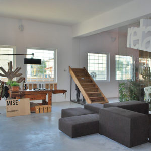
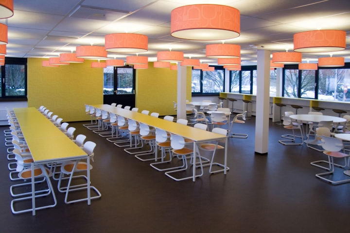
The ‘MBO Raad’ is the Dutch Association of VET Colleges. The association represents all government-funded colleges for secondary vocational education and training and adult education in the Netherlands. This office space was re-created by COEN! together with the architects ‘Bos en Alkemade’ to form a light, colourful and attractive working environment. The designs for the corporate identity, product and interior are all based on one consistent and powerful concept. Coen: “An appropriate colour combination can greatly enhance a good working environment. Colour elements can enhance and focus attention on the identity of this customer.”

Everyone is unique. COEN! has the expertise needed to translate this uniqueness into a consistent and powerful corporate identity which fits like a glove. That´s why I started workshops to let clients discover their unique identity. This makes it for me easier to create afterwards an identity that reflects the soul of the company. So this identity lasts longer and communicates stronger. And, more important, the company creates an identity inside out instead of outside in. This has lead to this interior that feels like home for the employees: they have created it together with our agency and the architect.

Gate to the future
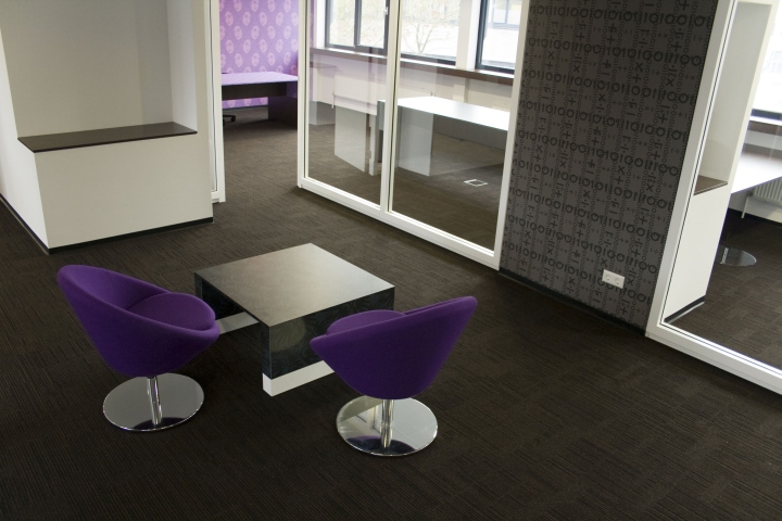
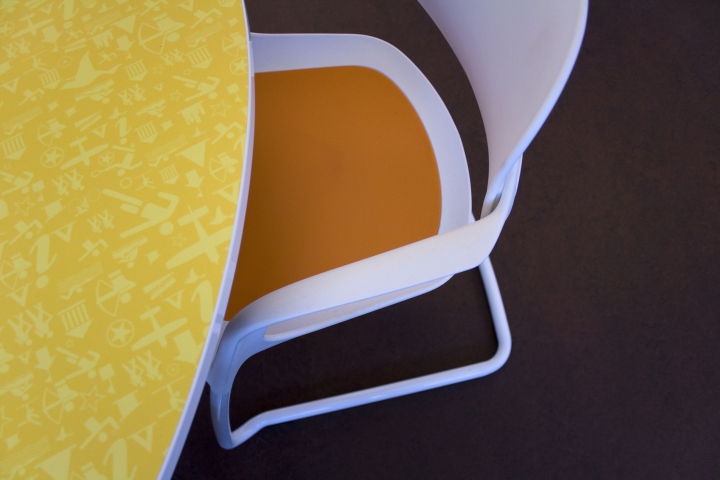
Our agency designed also sixteen colourful patterns for this organisation, representing the various professional fields. All VET colleges are representing one or more professional fields like trade, communication, transport etc. These patterns have been printed on wall coverings and furniture. This total approach makes it a project with an strong ‘identity layer’. The entrance to the building of this educational organization is highlighted by a colourful arch. COEN! created this art object called ‘gate to the future’, symbolizing the access to education.
Coen: “Why am we are so proud on this design? Because in this design, we combine communication, interior design, product design, graphic design and art into a strong image that reflects the identity of the organization. I call this the identity layer. By the way: all other projects of me and my studio, or made by dear colleagues as Marcel Wanders, Phillipe Starck and for example Ron Arad that carry this perfect ´identity layer´ that fits like a glove make me very proud.”
Spacious: there are no hallways in this project, all spaces combine with each other
Special: 300m2 special printed patterns are place don walls in this building
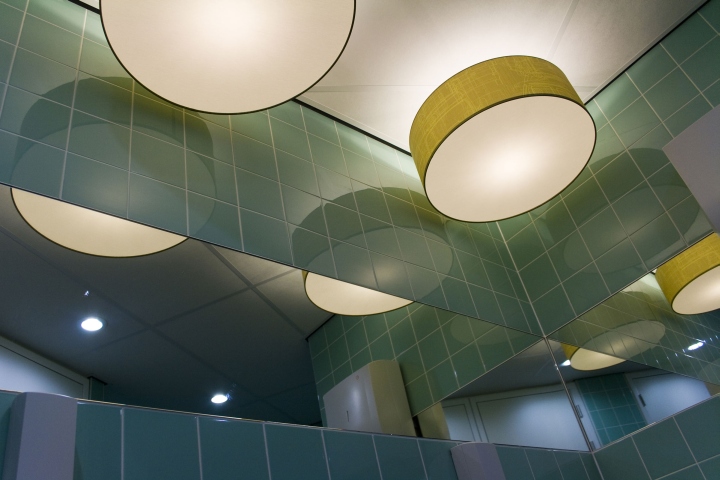
Colourful: eight colours form a harmonic whole: white, brown, orange, yellow, green, blue, purple and black.
Economic: only energy efficient lighting is placed in this building, working on motion detectors.
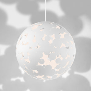
Cosy: 100 special designed hanging lamps create a cosy atmosphere
Identity: the specific identity of the ‘MBO Raad’ is evident throughout the head office.
Whole: all three wings of the tripod shaped buildings have been integrated to form a coherent and recognizable environment.
Arty: The characteristic items used for the design are at the interface between applied and autonomous art.
Timeless: the interior design is timeless and open with colourful accents.
Affordable: in spite of the limited budget available, it was possible to create a powerful concept.

Architect: Bos en Alkemade, Frans Alkemade en Fred Bos, IJsselstein
Identity/interior designer: COEN! design agency, Coen van Ham, Eindhoven
Project leader: Van Aarle de Laat, Germaine Zielstra, Bilthoven
Constructor: BAM/HABO, The Hague
Interior builder: Gielissen, Eindhoven
Photos: COEN! bureau voor vormgeving


Add to collection