
Add to collection
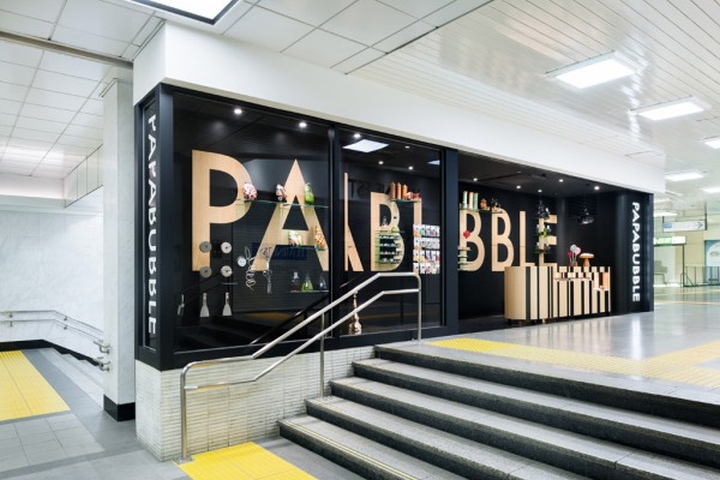

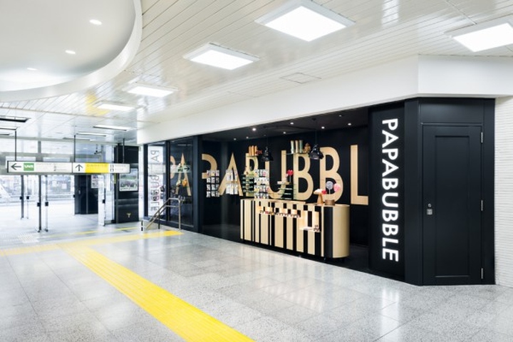
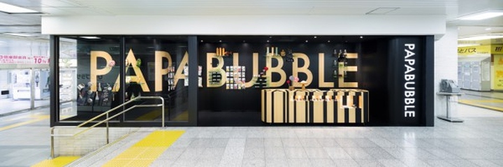
We performed the interior design for papabubble, a Spanish candy artisan, which opened a small art-candy-store on a tiny 10m2 lot inside the concourse of the JR Shinjuku station. The inside of a station, with a high traffic volume, colorful signs and rows of stores lined up on a tiny strip of real estate, etc., is a peculiar environment in which we were tasked to create a store that would not only stand out, but also allow the brand image to be easily recognizable.

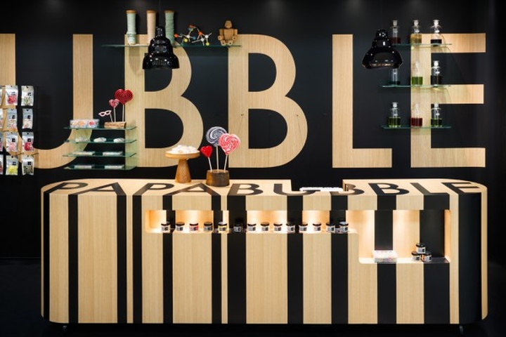
Using the lot’s lack of depth to our advantage, we planned to use the whole store as one big signboard by applying a large logotype over the entire back wall. Furthermore, we sought to set the space apart and direct clients to the storefront located at a traffic line junction by contrasting the black flooring, walls and ceiling against the white-based environment surrounding the premises. The wall serving as a wall-to-wall advertisement also functions as a merchandise display on which products are placed directly. Moreover, we inlaid the papabubble logotype into the checkout counter, taking after the idea of a candy that reveals the same pattern no matter where it is cut.
By thoroughly applying a sense of depth onto the elevated plane borne from the peculiar specifications of the lot during the planning stage, we sought to create a store serving simultaneously as a signboard and a display for merchandise.
Designed by Torafu Architects
Photography by Takumi Ota


Add to collection