

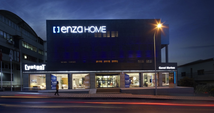
Yataş Flagship Store by YERce Architecture, Istanbul – Turkey
posted by retail design blog on 2014-05-10
Add to collection

The Board of Directors of Yataş requested us to design a new corporate store concept depicting its renovating structure to be applied both in domestic and foreign stores and to redesign the store, which is situated within the Headquarters on an area of 4.000 square meters and currently in use, as flagship store in accordance with aforesaid design. As a result of our mutual discussions, we defined certain topics on store concept regarding the renovated structure of the brand.
We highlighted that the stores should:
• Reflect the lifestyle culture as offered by the brand and present the same within integrity;
• Make customers fantasize and keep customer attention alive thanks to its ambiance but without shadowing the furniture;
• Assist with affordable design and product perception;
• Enable each of above occur as separate media according to their specific conditions;
• Make customer feel comfortable;
• Be structured to motivate the customer.
We also researched spatial responses of such above qualities. Based on renovated structure of Yataş and in line with the topics we defined, we thereby obtained the new corporate store concept. Then we addressed the store qualified as “flagship store” as the first application field of such concept.
Regarding architectural structure of such concept:
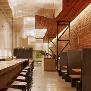
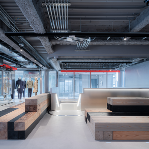
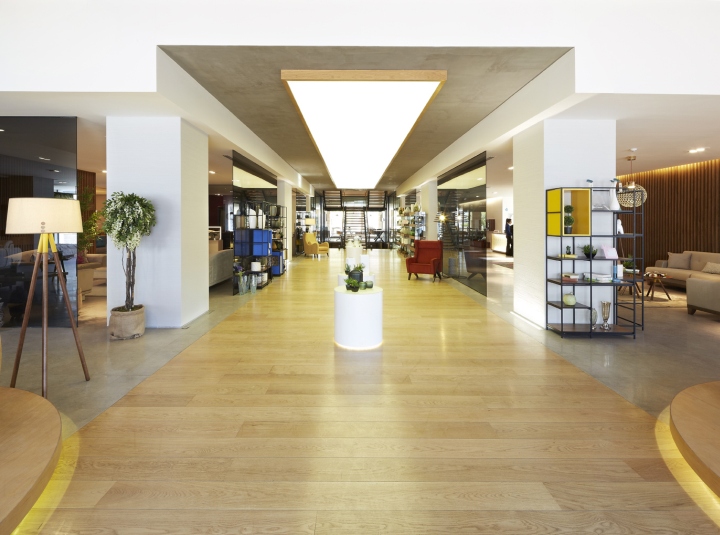
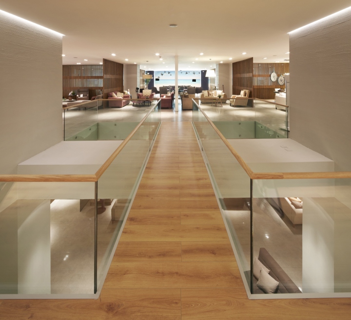
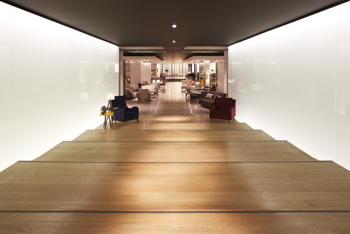
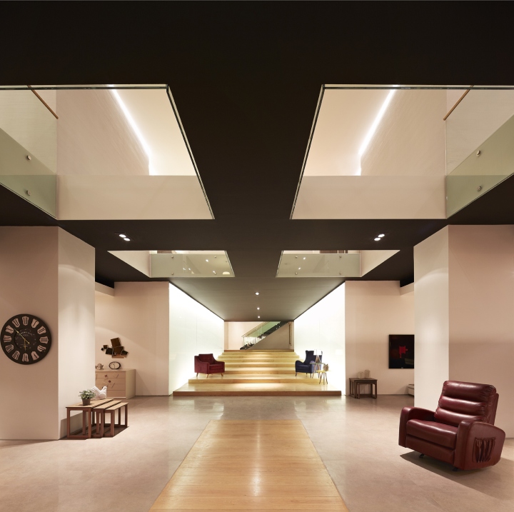
• Entrance and Podium: A wooden path starting from outdoors and continuing indoors. We devised an engrossing and constant surface that sincerely welcomes the customer as from outside through inside of the store. We named this indoor path as “podium”. Our purpose was to make customer feel special there.

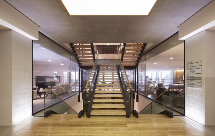
• Stairs and talking surface: We thought that customer should also keep connected with the rest of the store and products on stairs. The stairs of store was reinforced concrete and surrounded with walls as the first application of concept. Walls and reinforced concrete stairs were demolished. Walls were replaced with glass surfaces. Stairs were steel construction in thinner sections with no risers. System got more transparent allowing the person on stairs to have a stronger relation with the rest of the store. Glass surfaces around stairs with branding application functioned as “talking surfaces” reflecting the vision of brand.
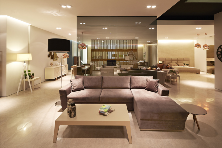
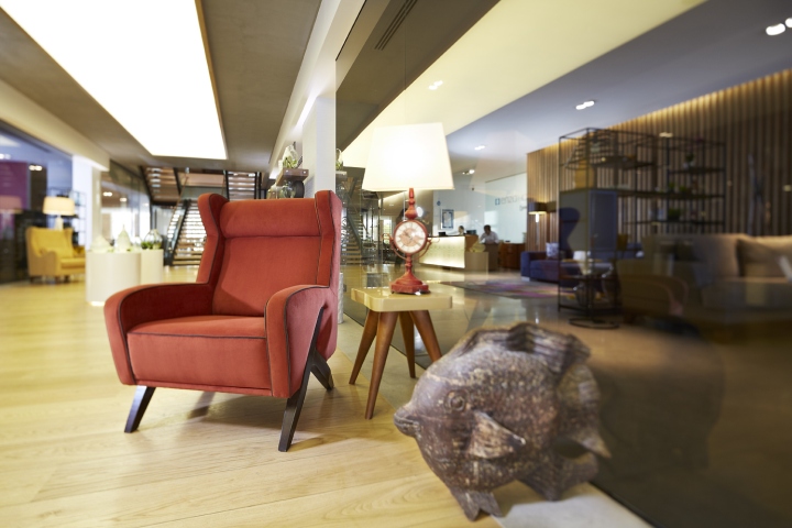
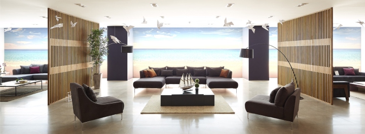
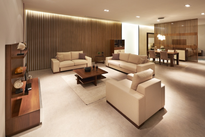
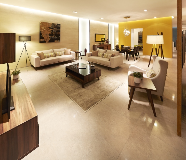
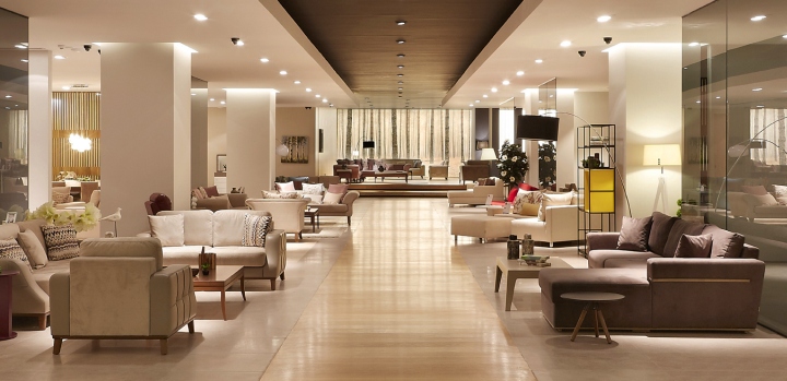
• Product Display Units: We decided that each collection be displayed within a “home” integrity consisting of living room, dining room and bedroom. Separations we used as space dividers were positioned without disconnecting the spaces from each other. As a continuation, we cared to make interspace transitions between collections soft and balanced. In other words we aimed to reveal fluid spaces both within parts themselves and within the integration comprised by such parts. In addition, architectural details were quite refined to let furniture express itself better. We shaped coloring and lighting designs accordingly. We also sometimes allowed for spatial surprises in transitions while navigating through product display units.
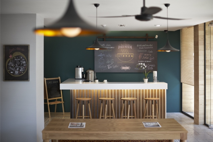
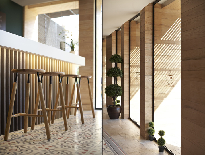
• Café and social areas: We thought that a space in quality of a real café should be available to let customers refresh their tired perceptions after examining the products, have a small break and socialize with others. At the same time, we envisaged employees using such space at certain times. We also located a playground adjacent to café for families with child.
Architect: YERce Architecture, Nail Egemen YERCE
Lighting design: YERce Architecture, Nail Egemen YERCE
Façade design: A Graphic
Construction: Akrotes
Photographer: Emin Emrah YERCE


Add to collection