Dunns store by TDC&Co., Johannesburg – South Africa
posted by retail design blog on 2014-08-13
Johannesburg
Add to collection


Dunns is an affordable fashion retailer with more than 250 stores throughout predominantly rural towns in Southern Africa. The brief to TDC & Co. and it’s graphic design studio CLRS&Co. was to analyze the brand and map out a new strategy that moves Dunns from a somewhat conventional and dated approach to fashion, to a more youthful and on-trend style. A new corporate identity and freshened up personality was required to reflect this younger, trendier target market and more fashionable offering, which needed to be communicated across all brand touch points (store design, graphic design, visuals, wayfinding, tone of voice).
To create this new identity it was necessary to find Dunns’ key differentials from its competitors, which are: Celebrating and catering for the distinctive curvaceous African figure, whether male or female, whilst not excluding customers with different body types. Reflecting the beautifully unique relationships that exist in Africa, where men hold hands in the street and friendships are embedded in shared childhood stories. Telling the story of rural life and it’s sense of freedom, whilst showcasing its peoples’ inherent personal style against the backdrop of an instantly recognizable landscape. Embracing and adapting to the continuously shifting highly individualized South African youth identity that is shaped by global trends, whilst being firmly rooted in its heritage.

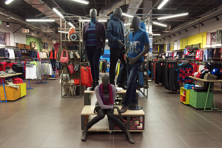
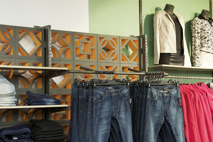
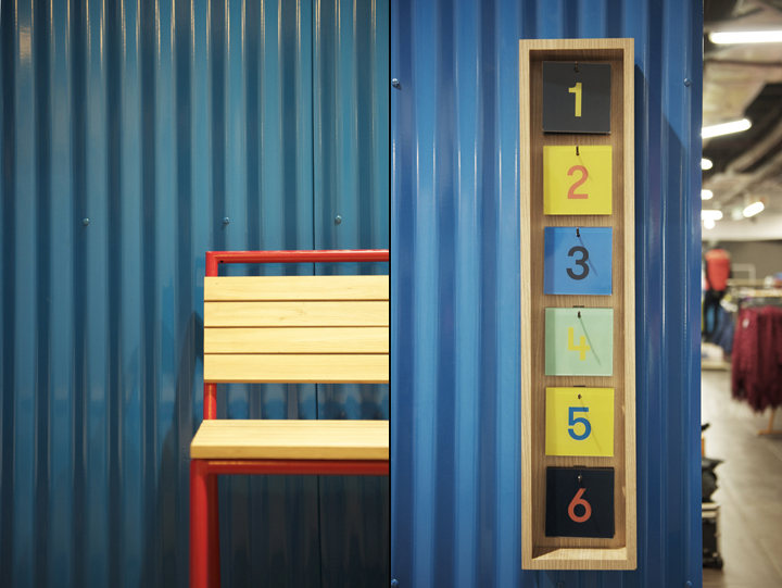
Essentially Dunns didn’t want to be just another fashion retailer, rather striving to create a leading aspirational and quality fashion experience that is uniquely South African. It was this ethos that led us to the “South African town concept” – a distinctive, vibrant, colourful and adventurous store concept with an up-market yet approachable feel that creates an energetic and happy social environment that links back to rural South African life. Earthy colours and textures that reflect the natural elements of the rural landscape underpin the overall look of the stores, whilst the five newly developed bright pastel brand colours are introduced on walls, fixtures and the shop-front to bring contrast and excitement to the environment.

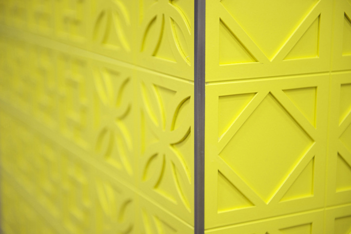
Inspired by the typical concrete breeze block walls found in every South African town we developed a geometric pattern that, together with the new logo and simple graphic design, represents the new corporate identity for Dunns. This breeze block pattern is a key design element in the store – it is laser cut into nesting tables, fitting room doors and the point of sale, or manufactured from polystyrene and 3mm MDF to form focal walls and plinths, creating a common thread throughout the 430m2 store.
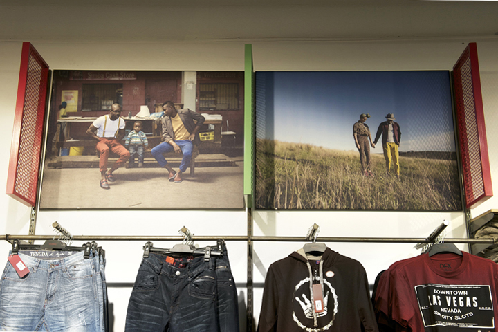
Another key feature is the bright blue corrugated metal shoe wall with its stair-like display and seating area, which separates the fitting rooms from the rest of the store. Right next to it customers will find a photobooth where they can take photos of themselves in their latest style combos, and print out photo strips or upload the pictures to the Dunns Facebook page. The large graphics of young and stylish Africans photographed in rural settings and townships are framed by colourful metal mesh frames, tying the whole store together and summing up the new Dunns identity with it’s most important message – “See the ultimate you”.
Photographer: Mareli Esterhuizen
Design by TDC & Co.


Add to collection