

Add to collection
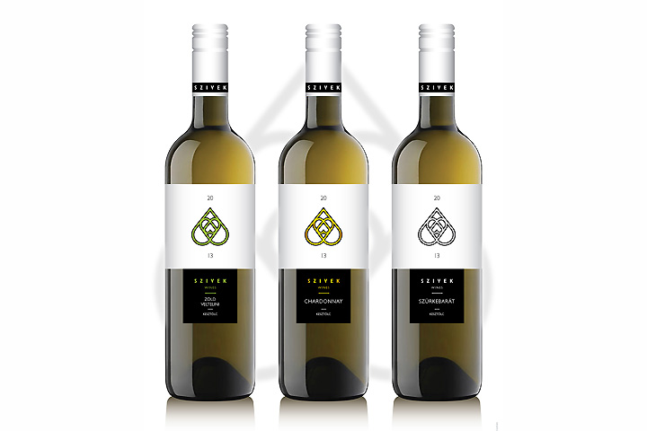

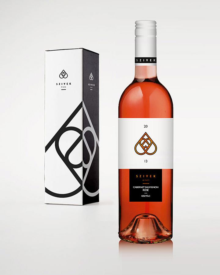
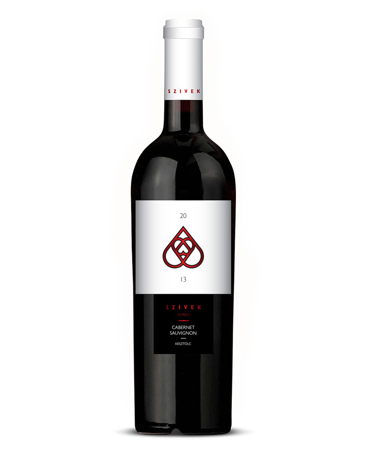
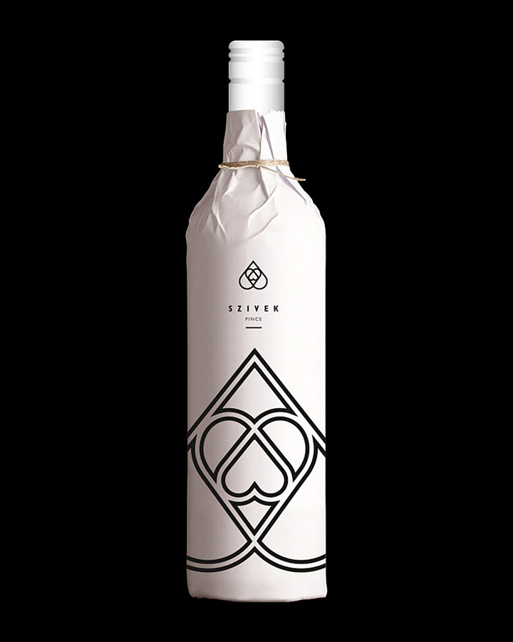
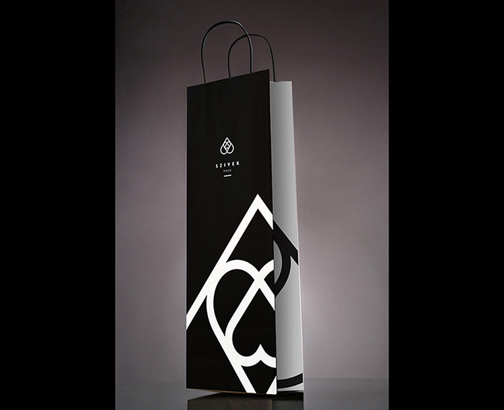
The winery is just a division of the Szivek Estate. They cover a wide range of agriculture (e.g.:chocolate, ham, fruit drinks, catering etc.) So, the logo should work as an umbrella brand that fit for the different sectors. The winery is positioned itself to the level of the high quality wines. They representing a small variety of grapes but with a special care, situated in the Neszmély wine region of Hungary.
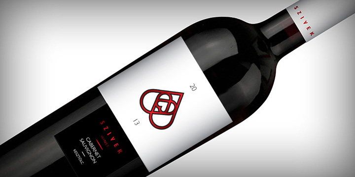
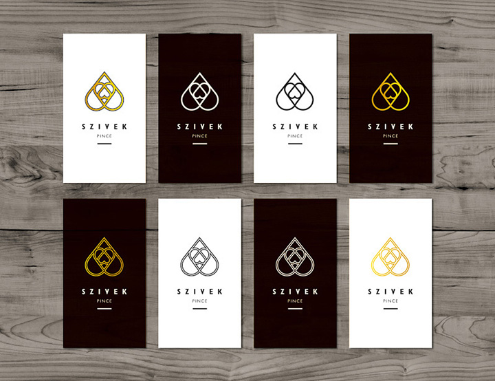
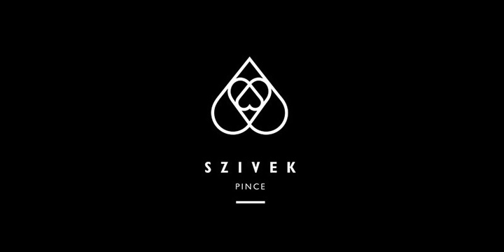
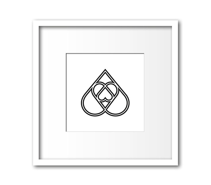
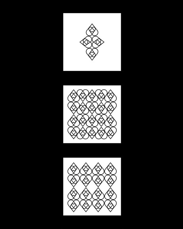
The logo reflects on the name “Szivek”, that means “hearts” in Hungarian. It illustrates 3 hearts in an abstract way, but also reminds us to a drop, the grape leaves, the symbols of playing cards and it looks like a fractal. One of the most important message of this symbol is “the whole is part of the whole” idea. These features altogether draw attention to the uniqueness of grape, pointing to the expertise of the wine makers and as a result the great wines.
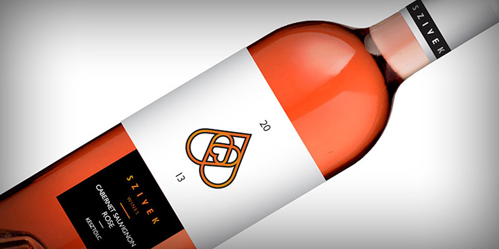
The leitmotif is the basic structure of the 3 hearts, but the logo can be used in two different ways – filled and outline format. The filled version works as the official emblem with the typography and the outline one is functioning as an illustrative symbol. The basic colours are the black and white, but the subbrands or the different types of wines can have its own pantone code. The logo structure is applicable to create varied wallpaper patterns.
Design by Zsombor Kiss


Add to collection