
Bafarat branding by Blacksheep
posted by retail design blog on 2014-12-05
Add to collection

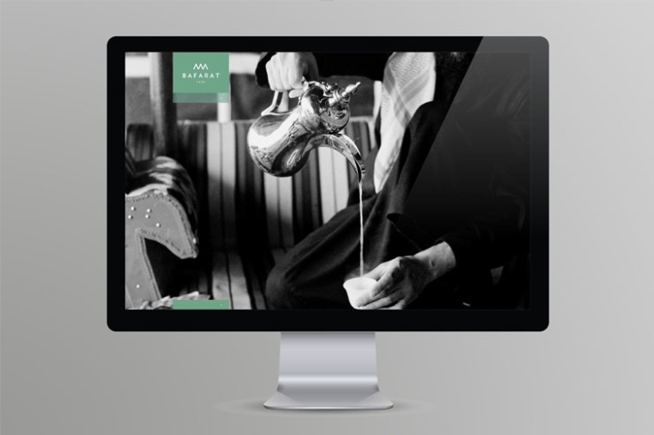
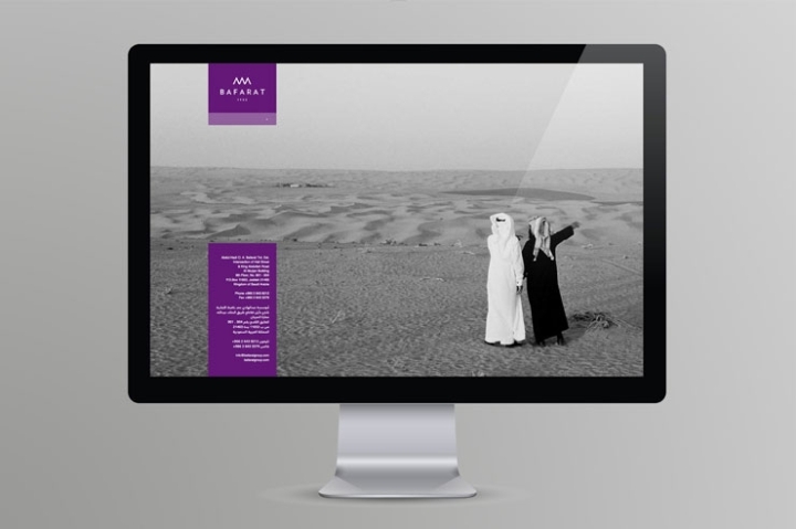
Blacksheep were tasked with rebranding Bafarat, a Middle Eastern coffee, herb and spice company located in Jeddah, Saudi Arabia. Bafarat’s design brief was all-encompassing, embracing all aspects of a brand evolution. This started with the development of a brand strategy and corporate identity through to stationery, product packaging, collateral, website design, signage and interiors. Our Solution: This well established company has been handed down through family generations for over 60 years. The younger generation, now at the helm of the company work in tandem with the old. Combine this with the culture of Saudi Arabia and you have a philosophy of contrasts. We approached the identity with this in mind, creating a balance between the modern and the traditional.
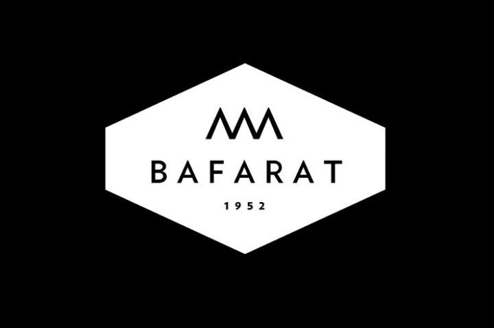
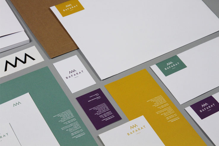
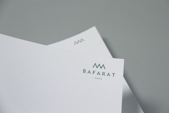
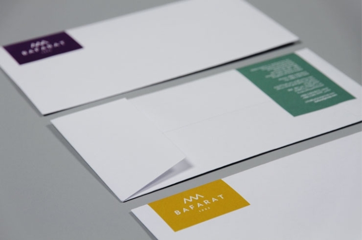
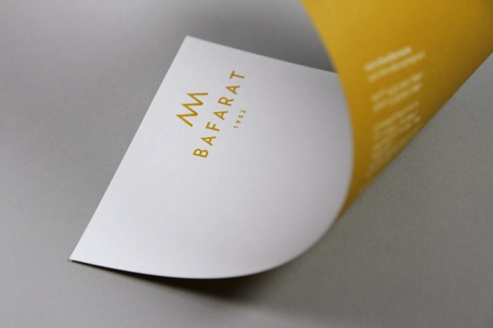
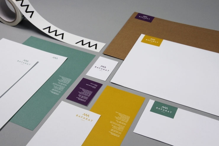
Geometry is a constant element inherent in the culture of Saudi and the Middle East, visible in many areas – nature, architecture and fashion, on both traditional and modern levels. We referenced this by using a geometric sans serif typeface for the wordmark. This led to the creation of the ‘triple peak’ logomark, the form of which is a combination of the three ‘A’s in the word Bafarat. The number 3 itself has been prevalent throughout the project, used extensively in the identity system.These triangles also led to the creation of six bespoke geometric patterns. These patterns are a homage to the traditional culture associated with the Middle East, however when used in conjunction with large areas of bold, flat colour, they offer a cleaner, more modern aesthetic. Three primary brand colours and three secondary colours were chosen from a palette that reflects a variety of aspects relating to the culture of Saudi and the Middle East with darker, rather than brighter, hues to keep them authentic and grounded.
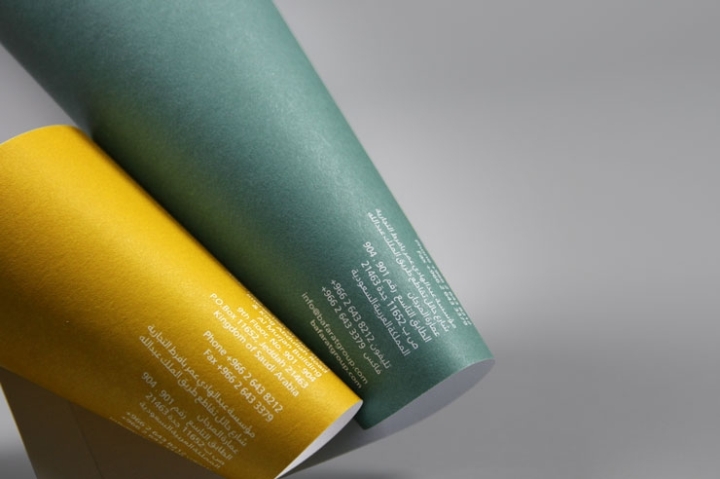
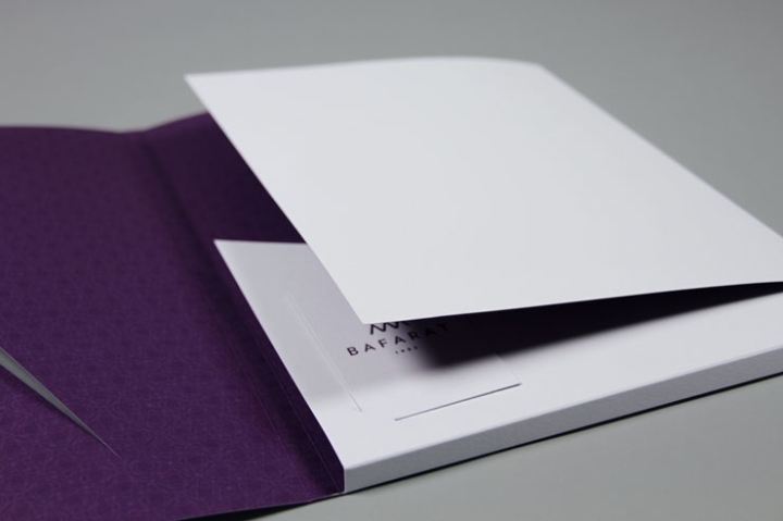
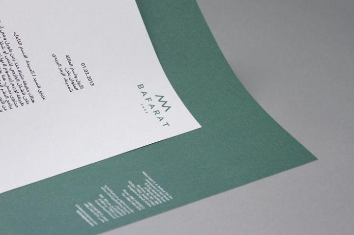
A large suite of stationery has been designed, each element offset printed on both sides with one of the three primary colours. The reverse sides are printed in full colour leaving the front sides as a bright white canvas. A subtle deboss on each piece creates a tactile implementation of the Bafarat logomark. Although the company is located in the Kingdom of Saudi Arabia, they have aspirations to expand internationally – therefore it was essential to include dual languages throughout the brand communication. To create a flexible platform accounting for differences in language, we chose to employ right aligned text across most applications.
Design by Blacksheep


http://blacksheep.uk.com/project/bafarat/all


Add to collection