Add to collection
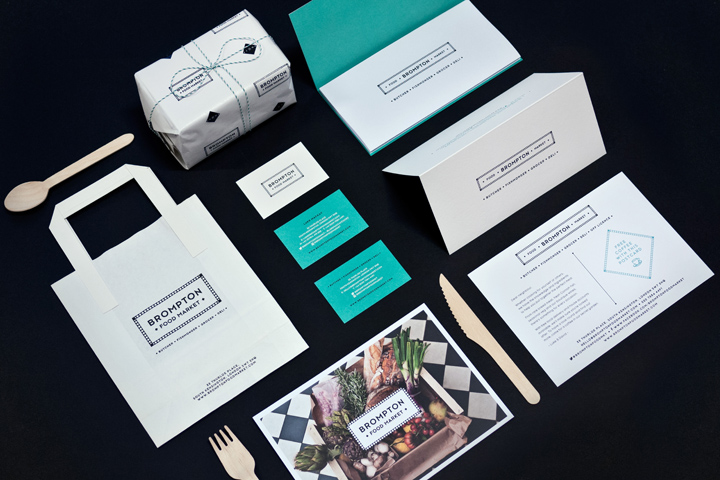

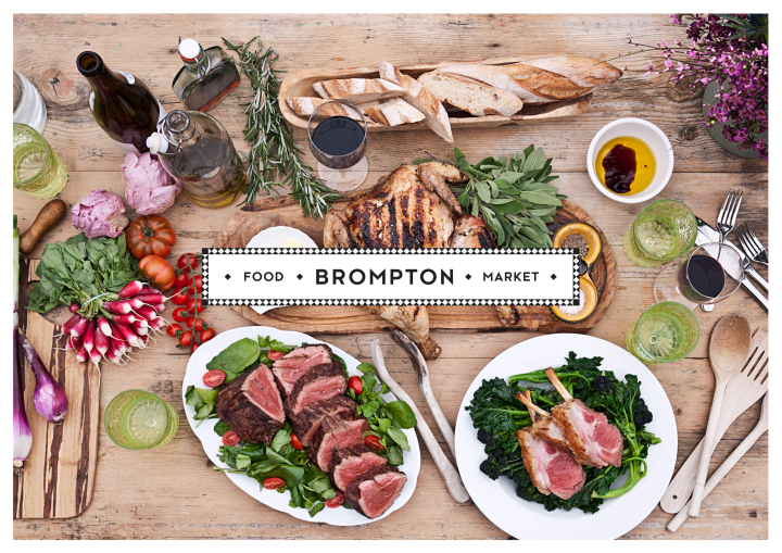
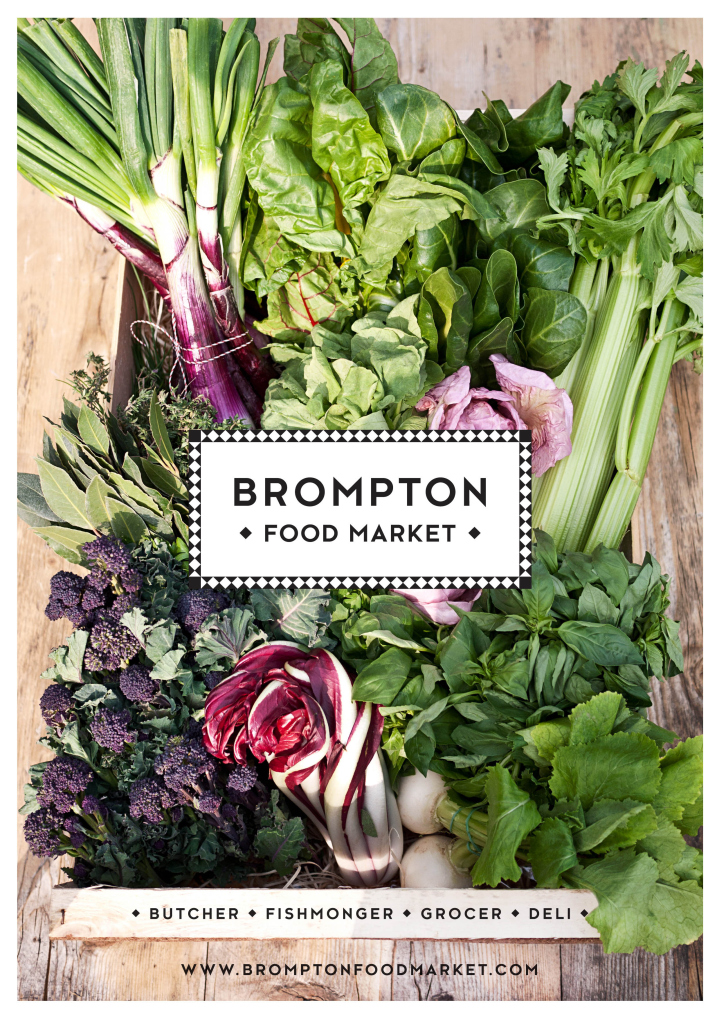
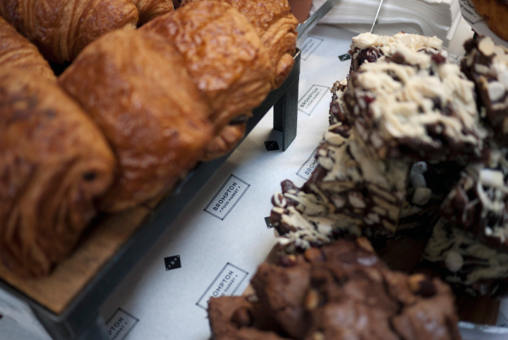
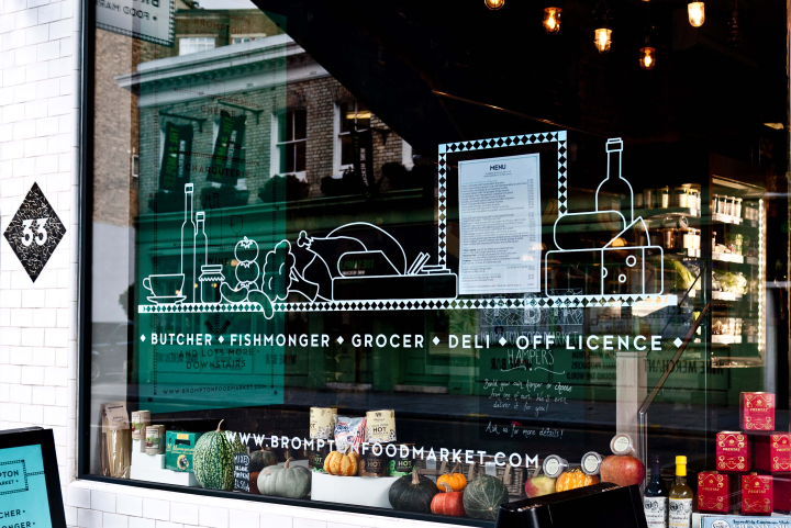
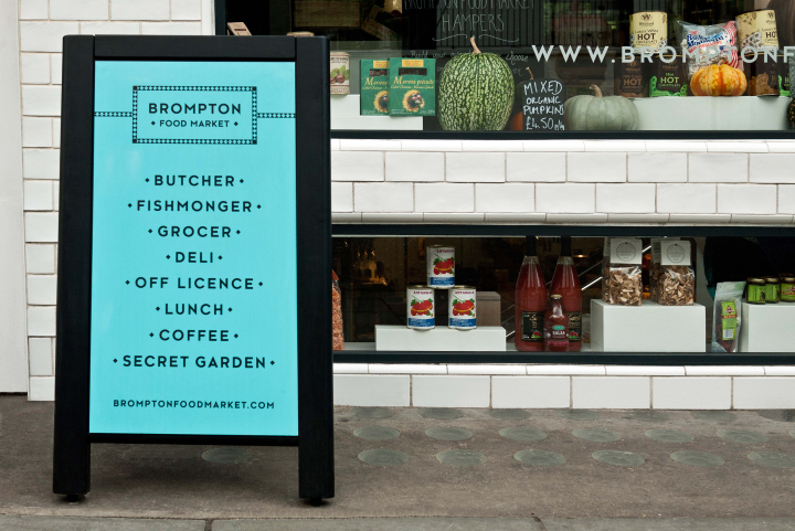
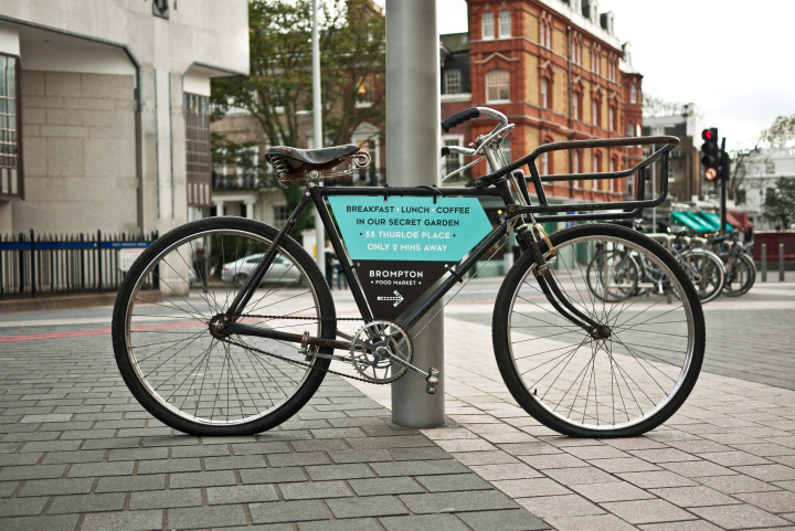
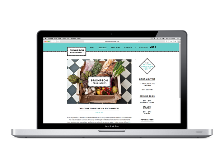
When David Turcan and Luke Mackay popped into the Design Friendship studio for a quick chat, they were both on the verge of quitting their day jobs to embark on turning their dreams into a reality. The branding brief for their new venture was simply… “We want to create the perfect food shop that we have long been looking for in London but never quite found. A haven for food lovers with a heady mix of top quality produce, immaculate service and style.”
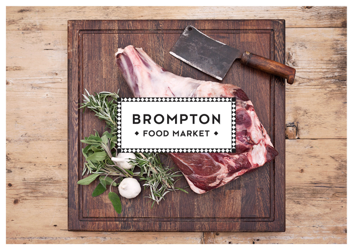
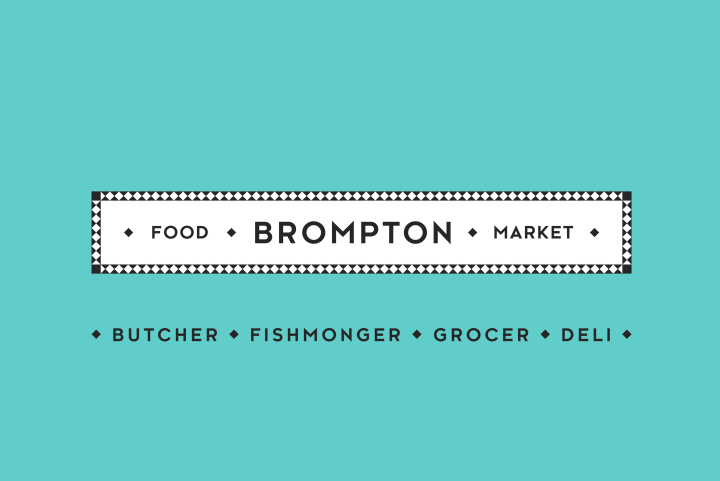
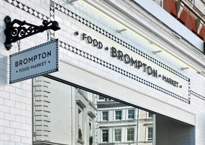
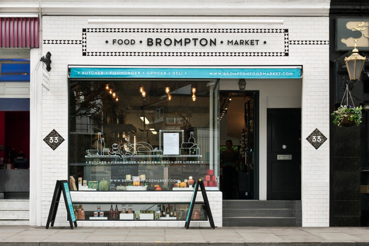
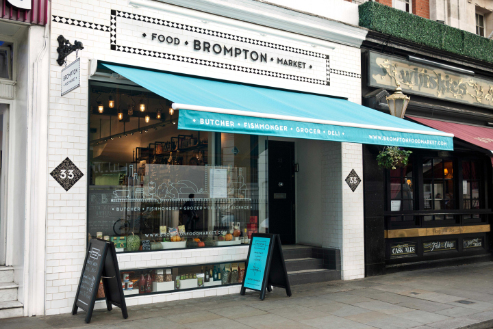
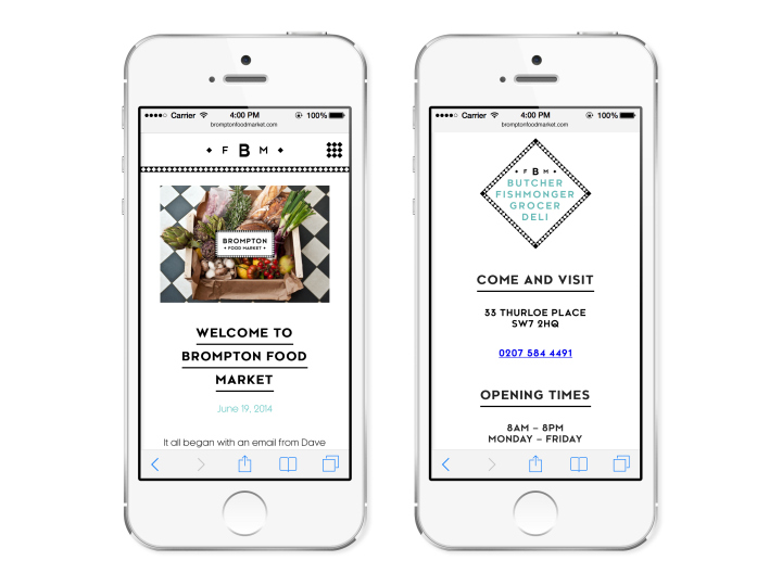
“We see ourselves as an old fashioned grocers where nothing is too much trouble and the experience is as important as the quality of our produce.” Our direction was to create a brand inspired by a bygone age, fused with a clean and contemporary aesthetic. We created an identity inspired by South Kensington’s love affair with classic Georgian geometric mosiac styling. The shop masthead was based upon a traditional sign writing layout, the font Kessel was chosen for its Art Deco look and feel, which also has strong aesthetic ties to London’s Brompton Road area.


Add to collection