Pince & Pints restaurant branding by Bravo Company, Singapore
posted by retail design blog on 2015-01-27
Add to collection


We were tasked to create an identity for a local restaurant and bar that specialises in lobster dishes. With that in mind, we named it after the two prominent elements in the restaurant – the lobster’s pincer and the pints of beer.

We created a lobster centric identity for Pince & Pints, one that looks modern yet rustic at the same time. We wanted Pince & Pints to step out of the fine dining environment where everything is prim and proper. At Pince & Pints, there is no dining etiquette. There is no proper way to eat a lobster, consumers would eat their lobsters whatever way they want. Our idea of Pince & Pints is a comfortable place people head to after a hard day’s work where they wouldn’t mind dirtying their pincers and making a mess.
Featuring a sea of delivery and packaging icons, the placemat relates to Pince & Pints’ hearty belief of providing the freshest and premium quality lobsters. In Pince & Pints, lobsters are packed and flown in straight from Canada. We wanted the placemat to illustrate the effort they take to ensure that. Specific icons were chosen and stylised accordingly, from the “Perishable” sign down to Canada’s maple leaf symbol.

Designed to serve a duo purpose, the back of the coasters provide fun unknown facts of lobsters to contribute to a more casual dining experience. We wanted to play with the format of the food menu and was inspired by the cage that lobsters are caught in. Steel rods which were powder coated black were used to make the cage. It includes a locking mechanism for easy menu replacement. The menu layout follows the grid-system set by the structure of the cage.
We took the form of the drinks menu from the crates that the lobsters are stored in. The rubber band that is used to hold the drinks menu together is also used to hold the claws of the lobsters so that they won’t engage each other when stored in the same crate.

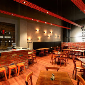
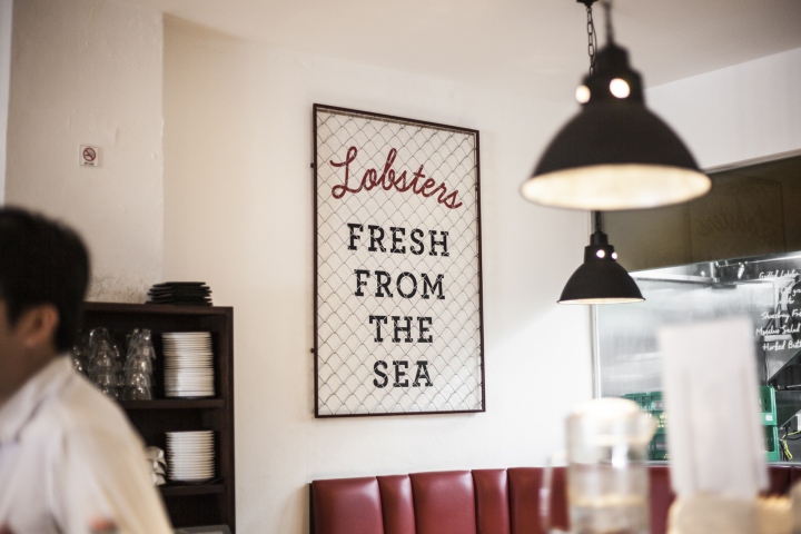
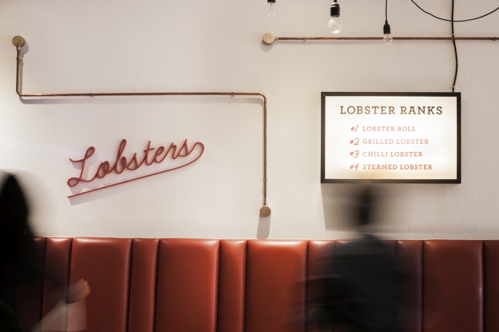
Upon acquiring the space, the owners of Pince & Pints felt that it was too spartan and clean. It didn’t conveyed what Pince & Pints stood for, so we were brought in to decorate the restaurant. Following our idea of how Pince & Pints would be as a restaurant, we added rugged touches to the interior such as copper pipes and locking typographic posters in frames that we designed and made. These touches contributed to the casual environment that Pince & Pints promotes today. Ultimately, consumers shouldn’t feel like lobsters with their pincers tied up.


Branding & Art direction: Bravo


Add to collection