

Aplos packaging by mousegraphics
posted by retail design blog on 2015-03-09
Add to collection

The briefing (in brief):
“Our Greek enterprise, based at the island of Rodos would like to launch a series of dairy products. We would like the name and identity design which will convey the locality, basic values and earnest approach we favor”.
The target consumer:
The Greek market.
The design:
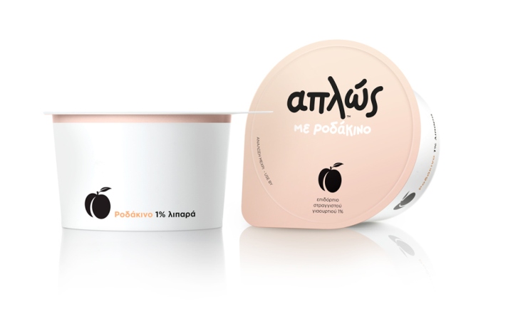
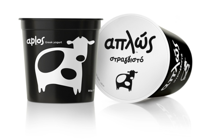
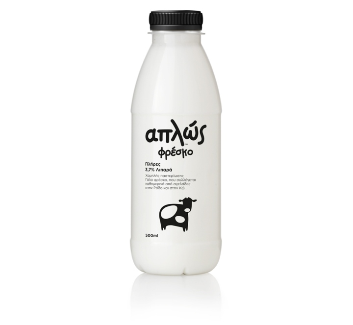
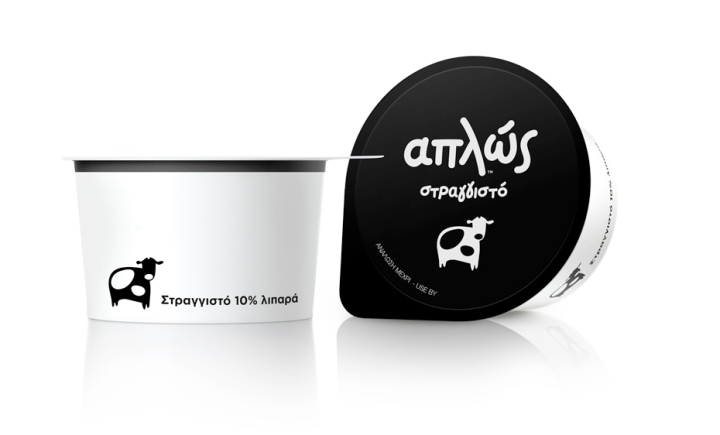
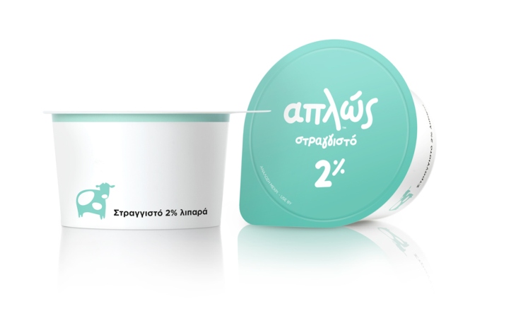
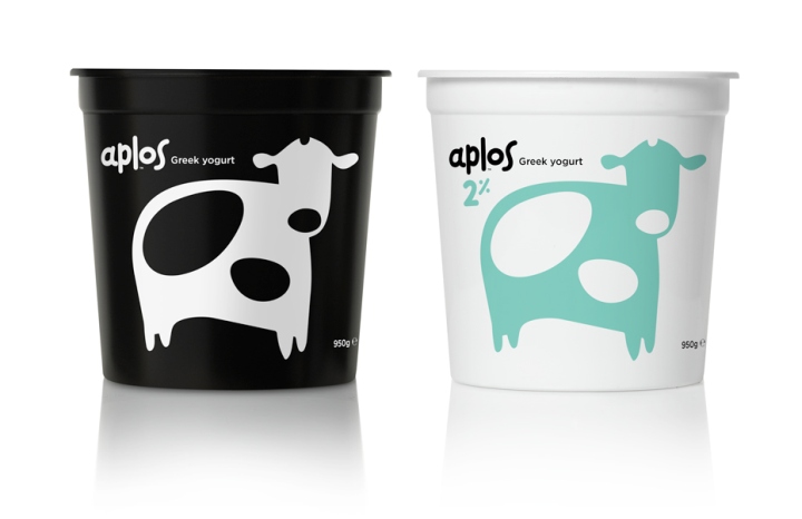
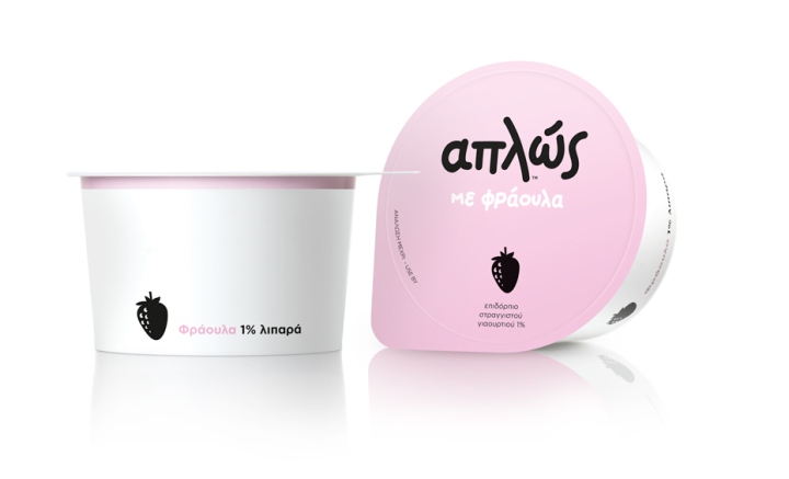
We translated the brief directly and precisely. For brand name we suggested the word which was most frequently used during our meetings with the client: Απλώς (=simply). It is also a word used everyday and by everyone for all kinds of reasons. Thus, as a brand name it will be casually repeated and naturally imprinted on client memory. The name is logotyped so that it conveys what it says, in a handwriting-like and easily read form. All other imaging is kept to the minimum. A cow or fruit silhouette and the outmost essential colors are used depending on product type.
Design: mousegraphics


Add to collection