Add to collection
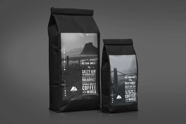

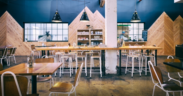
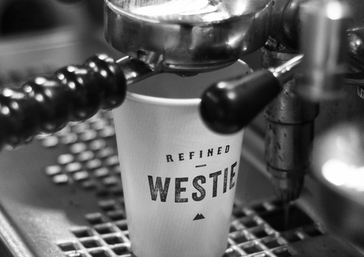
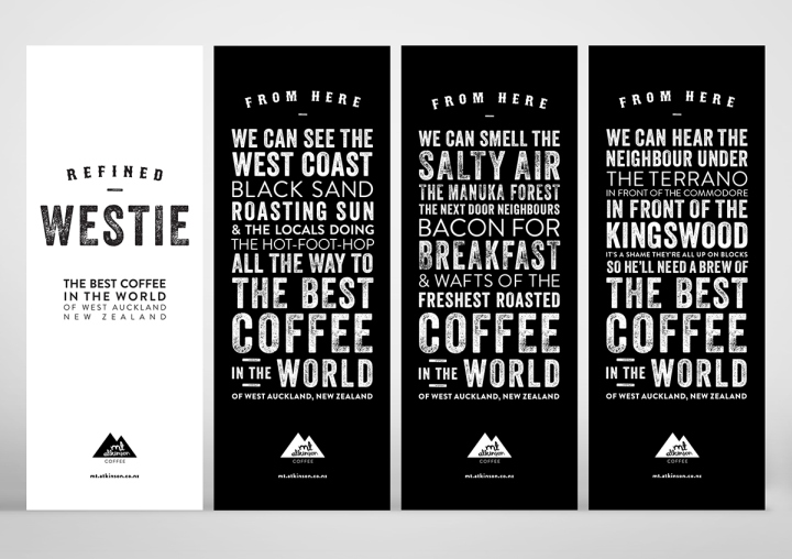
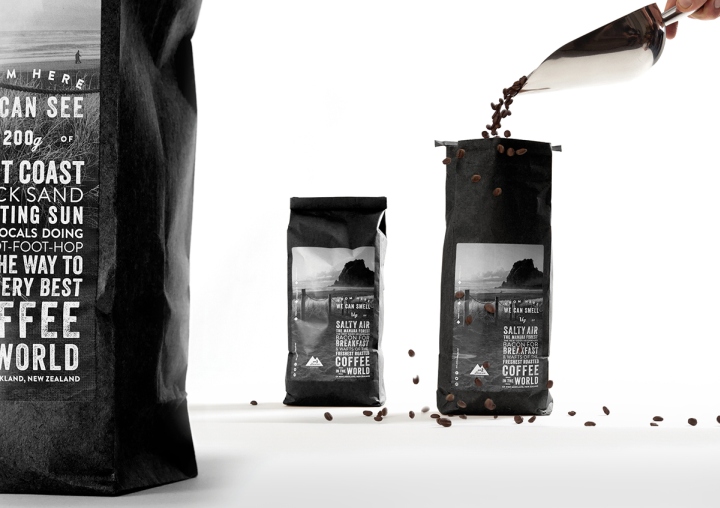
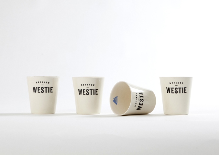
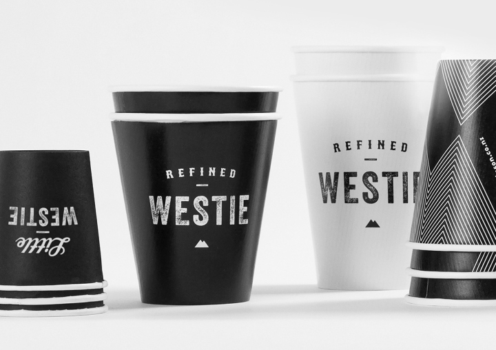
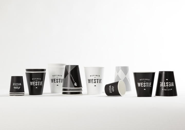
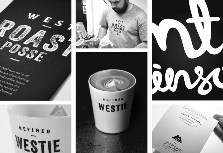
Being a premium West Auckland (North Island of New Zealand) coffee roaster, we liked the contradiction between coffee being refined, sophisticated and fashionable – yet produced in an area that is generally the opposite of this. Kind of ‘heavy metal gothic’ meets your ‘rich uncle’. The strategy was to be blatant but approachable, black and white, combining these two different worlds into one. A ‘Refined Westie’. (Westie [wes-tee] noun. The term ‘Westie’ is used as a stereotype to describe a people group loosely defined as: a) working class, b) bogun, c) unfashionable, d) rough around the edges, e) good natured but cheeky, f) brash, g) often defined by clothing like denim, black heavy metal tees and black skinny jeans).
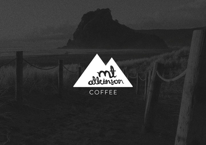
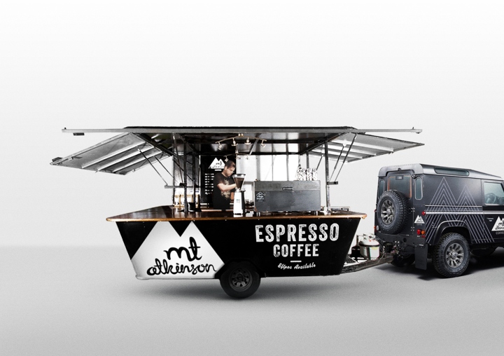
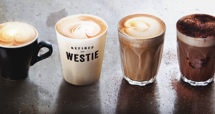
The ‘Rough’ stereotype, the location of the business, and the sensory values of coffee were the key ideas joined to the brand. Helping to give it’s own distinctive personality. A simple black and white palette runs through the packaging, the identity and interior spaces – reinforcing the character.
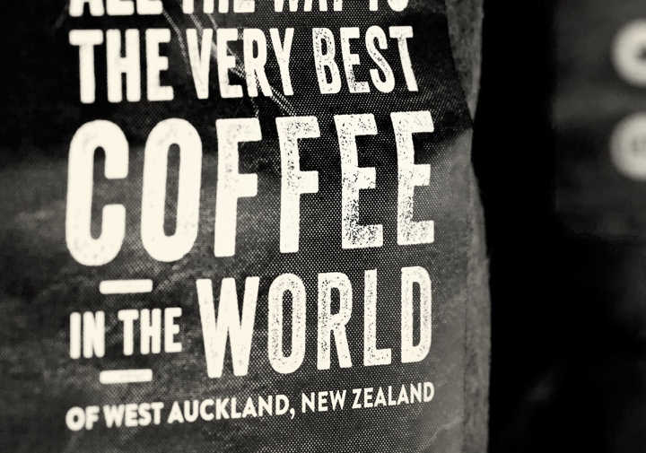
We felt that there was a rich story to tell – so all the packaging pokes fun at the contradicting social classes through rhythmical short tales and statements. We think it’s okay to be a little ‘rough around the edges’.
Design: 485 Design / Design Director: Nathan Chambers / Senior Designer: Danny Carlsen / Senior Planner: Debbie Giness
Photography: Luke Harvey / Jamie Wright
Client: Mt Atkinson Coffee Roasters


Add to collection