Add to collection

CLIENT & BRAND BRIEF:
Chumbak is a vibrant & cheerful brand. The myriad of products on offer not only tickles the humour of the customer but at the same time adds vivacity & positive vibes to his living environment. ‘Make it a happy place!’ is what came from the client as a brief. Although that single line brief was loaded with ideas! The eclectic mix of products ranges from small to big in size, from being useful to being decorative, something to be found in the traveller’s bag to something that keeps you cosy at home! So essentially the task was to house these assorted offers in a space that is articulate enough to give them an apt backdrop. A backdrop that’s equally a mix on its own way!
DESIGN STRATEGY:
The brand’s vision was to elevate the perception of CHUMBAK from being an accessory to a lifestyle brand. These new born categories had to be introduced in a space that’s synonymous to nothing less than celebration and something bigger than just a store! Inspirations were drawn from happy elements, quirky colours, play of textures and even few things very stupid. We aimed at elements that could leave the customers enthralled and keep their clock from ticking for a while. To portray the versatile & creative facets of the brand we extended our ideas of highlighting the products in a rare manner. Thus few eccentric sculptures were crafted out of the damaged products of the brand itself which never fail to command an awestruck gaze from the customers time and again. A diverse fixture type is designed for product display which helps in building up the eclectic character within the space. The design strategy therefore was simple! A visual engagement that makes you return to the store for more.
STORE DESIGN SIGNATURE:
The store design signature lies in its eclectic nature. The hues, textures, patterns, materials all retain their own personality while building up the atmosphere of the store in harmony. We let ourselves the liberty of creating a diverse range of fixtures that keeps the eye hopping from one place to another making monotony redundant. To uphold the diversity of the product range on offer, the store had to be boisterous about the happy nature of the brand which we chose to do with finishes and furniture style.
STORE FRONT DESIGN:
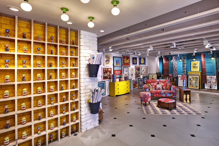
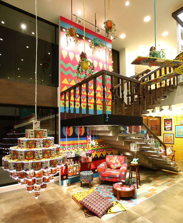
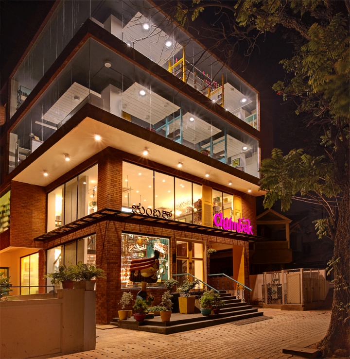
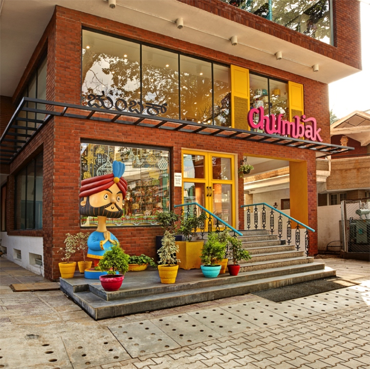
The intention was to make the store a landmark in this high street. The brand’s office being housed in the upper floor gave us the opportunity to do so. We united all the floors to give it volume and wrapped it with an authentic architectural material – the brick to emphasise on the genuineness of the brand. We identified spots on the brick canvas and splashed some brand home colours to bring the whole facade to life. Dummy window shutters in bright yellow were created to frame the window display at the mezzanine floor. The elevated entrance to the store is planned through a huge glass door with yellow frames led by the teal cast iron railing from the road. On the left is the window display that showcases the chandelier made from the damaged products allowing a sneak peak of the store from the road. We created a huge bobble head as part of the facade which kept the conversation going with the passer-byes.
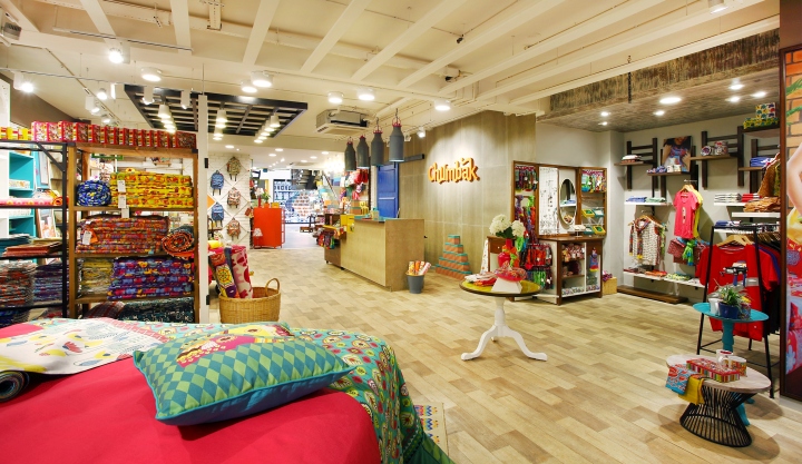
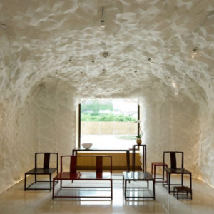
STORE INTERIOR DESIGN:
The brand is synonymous to being happy and vocal about it. There are lots of colours & patterns on the merchandise so we chose to stay subtle on the store environment with accentuated corner. No walls or partitions were created to categorise spaces instead we used the fixtures to do so. Imitating the product variety we created furniture & fixtures that were eclectic both in finish and styling.
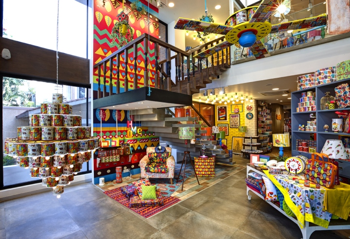
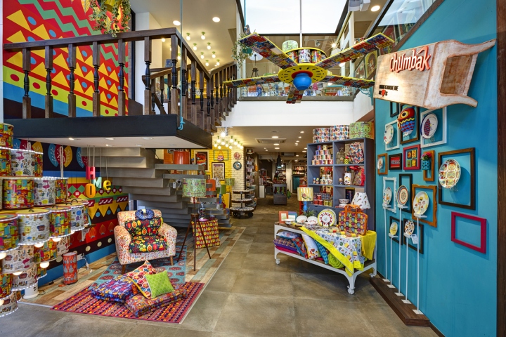
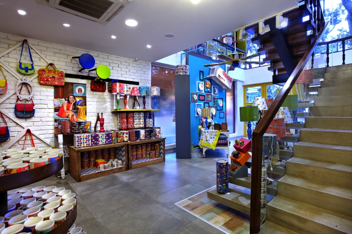
The two floor plates are connected with a staircase that adds the architecture flavour in the store. With the lower flight finished in concrete boards & the upper flight in wood, it offers display spaces below its landing and extended steps on the lower flight.
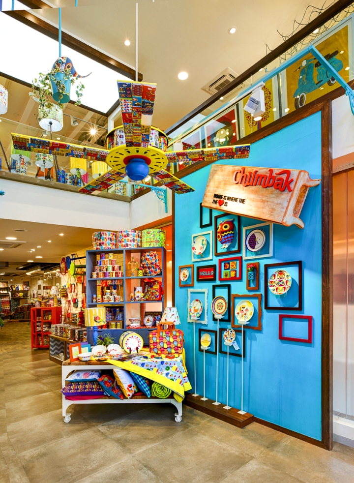
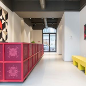
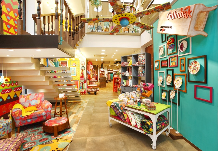
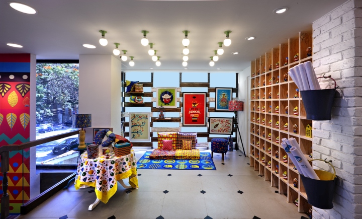
Just as you enter the left is occupied by the staircase which frames the living room set up whereas on right to this is the teal colour partition which introduces the new crockery launch by the brand. The walls play a major role in creating the changing look and feel of the environment. Ranging from rustic white, bright quirky yellow to wooden vinyl and paint, it grows from being colourful & younger to subtle & matured as you proceed inside the store. Then there are the tables, display shelves & display cabinets that looks like collected from random places which has come together to make up the place. Wood, paint, metal, veneer and glass are the few to name amongst the materials used. The floor is finished with vitrified tiles and vinyl flooring which demarcates major zones in the store. The ceiling is left exposed with some portions highlighted with grids and rafters to create accents. At some places are a series of bulbs that tries to capture a glimpse of celebrations in our homeland. Places of highlights have been soaked in brand home colours like the yellow brick wall, teal partition and the full height patterned partition near the staircase. They add the ‘CHUMBAK’ effect to the otherwise subtle space.
The design allows shuffling of categories at any time. The furniture is planned in a way that it can accommodate any category. All the furniture uses the principle of levels for display to create a visual interest. Simple fixtures are turned interesting by adding shutters, castors, coloured brackets or even hooks giving them their own personality. This changing finishes, styling & material usage keeps the space pulsating with lively & energetic vibes keeping the customers interested and interactive.
INNOVATION USE OF MATERIALS & FINISHES:
LIGHTING:
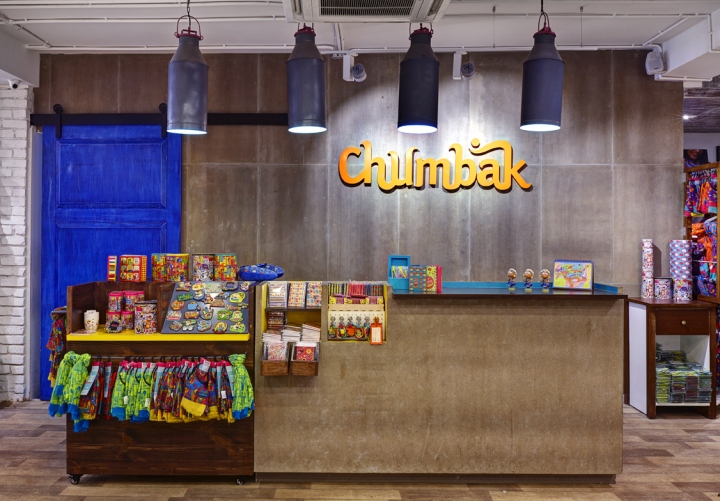
While the light focuses on the merchandise, lights have been used to create special zones in the open space. Like the light chandelier marking the window, the bulbs that’s reminds us of a celebration, the pendants from the grid ceiling that highlights the nesting table in the crockery section and on the cushion shelves, the wire lights over the dining table and the lights in the carpet area. Milk cans dipped in brand colours forms the focus lights over the cash counter. All the highlight light fixtures have been designed & customized to suit the concept. The rest of the store is illuminated with tracks that are carefully placed along the store perimeter to highlight the products and the aisles.
STORE ZONING & LAYOUT:
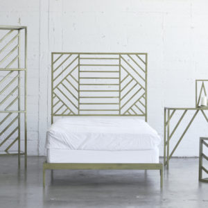
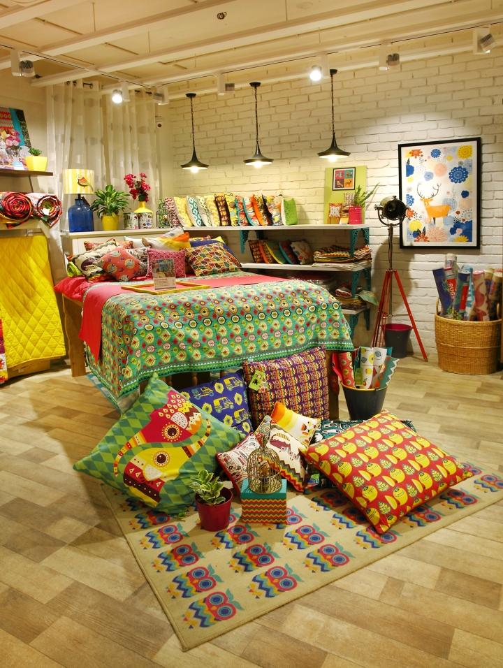
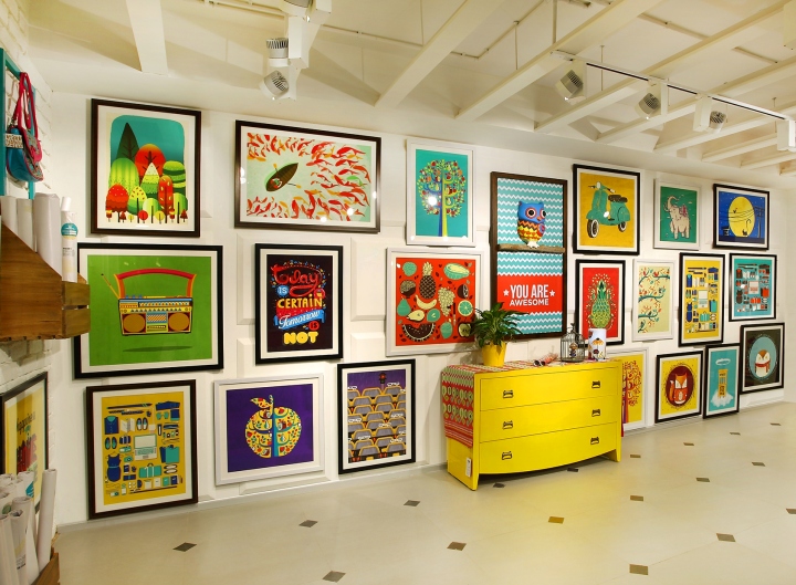
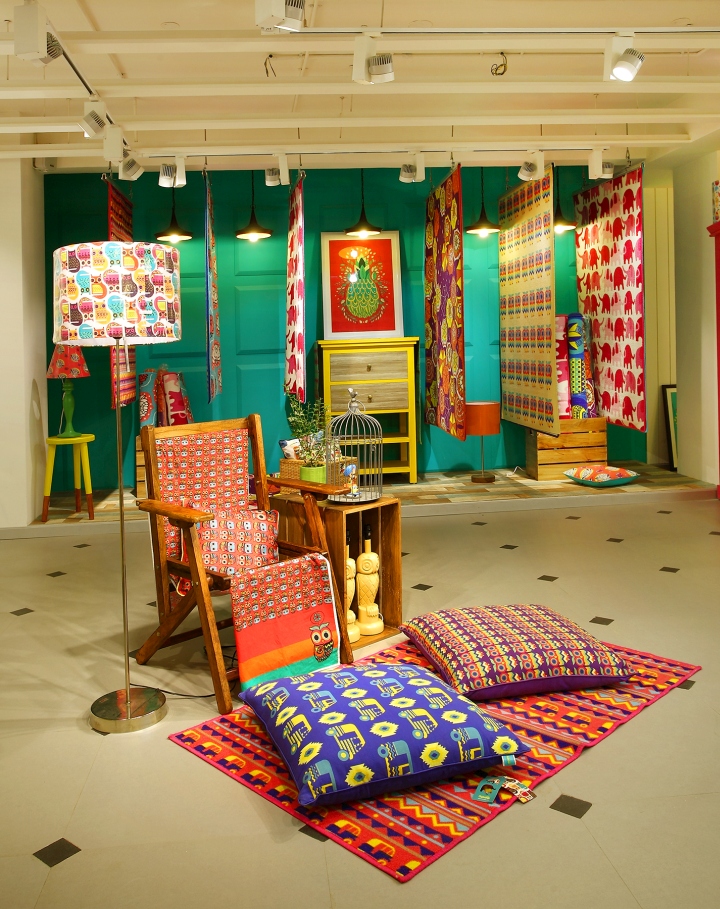
Two floors make up the store. The ground floor has the living room set ups and crockery display at the entrance. Further in is a peek of the wall arts that are actually displayed on the mezzanine. Lamps, cups, tins and all impulse purchase items are strategically placed in the vicinity of the cash counter for their easy access while billing. The cash counter which oversees the entire store sits facing the bag & crockery sections. And on the rear is placed the quilt & cushions and apparel & accessories section. The mezzanine displays the furniture and carpets in its own style.
The store has an open layout and designed to suit any change of zoning in the future. The journey of the customer is mapped more like discovering new products at every corner.
VISUAL MERCHANDISING & DISPLAY:
VM has been an important medium to help the store voice its character. Elements have been collected and coloured in hues of the brand that distinctively gave them Chumbak’s character no matter where they came from. Cane baskets, ice buckets, photo frames, wooden crated, antique frames, flower and most importantly living plants planted on colourful earthen pots are dispersed throughout the store to support the product display. The VM fuses itself seamlessly in the store. The furniture is also conceptualized in a way that it forms a part of the VM adding visual appeal throughout.

GRAPHICS & SIGNAGE:
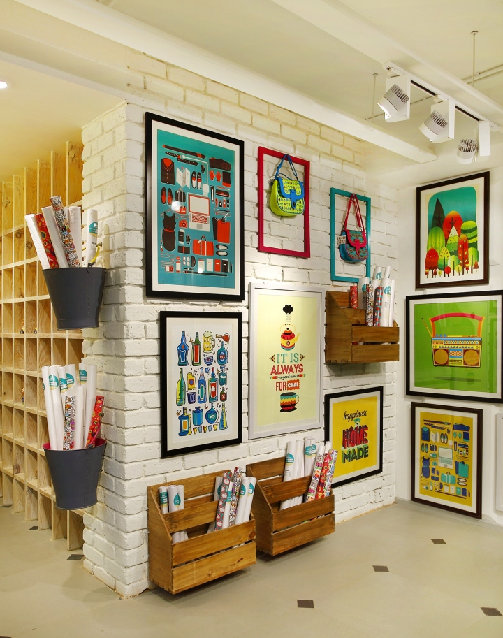
The graphic language is more illustrative than words. We created cut-outs of the newly introduced characters of the brand which hang on planters from the ceiling overlooking you when you go up the staircase. Full length partition of the staircase is adorned by the graphical pattern you can identify best with the brand. There are not many words within the store leaving the products to communicate with the customers.
SHOP-FITTING DESIGN:
Not many furniture/ fixture look alike in the store. The concept was derived from being eclectic and varied. So we conceptualized designs that would be varied in nature but display efficient & flexible. Few styles were borrowed from colonial designs with modern tables, display shelves were made quirky with articulate brackets, cabinets & chest of drawers were immersed in bright colours, simple chest of drawers were given shutters on hinges. The materials used are wood & metal but in forms of polished, antique, rusted & painted.
Design: 4D


Add to collection