

Add to collection


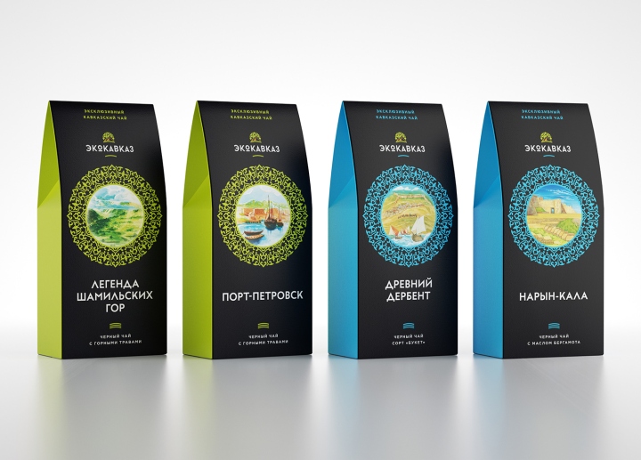
Ecokavkaz is a premium herbal tea brand. Using unique herbs and ingredients from the highlands of Dagestan, Ekokavkaz stands out in the market of herbal beverages.
The goal
Unicorn Studio Moscow had faced two main objectives: the packaging should reflect the premium positioning of the product and it should display ecological values of the brand. Also, the base design should allow creating future product units quickly and easily.

The concept
Our concept can be described in three words: purity, integrity and respect. We implemented this idea through pure colors, balanced composition, easy-to-read fonts and clear semantics of the featured design elements.

The package
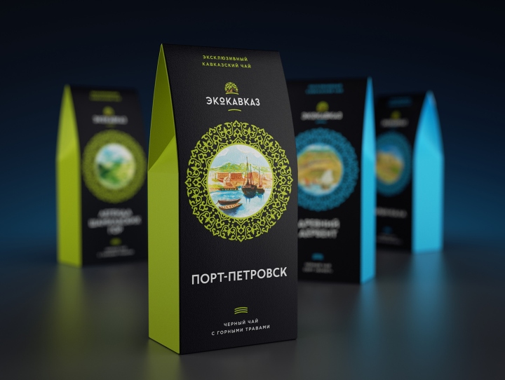
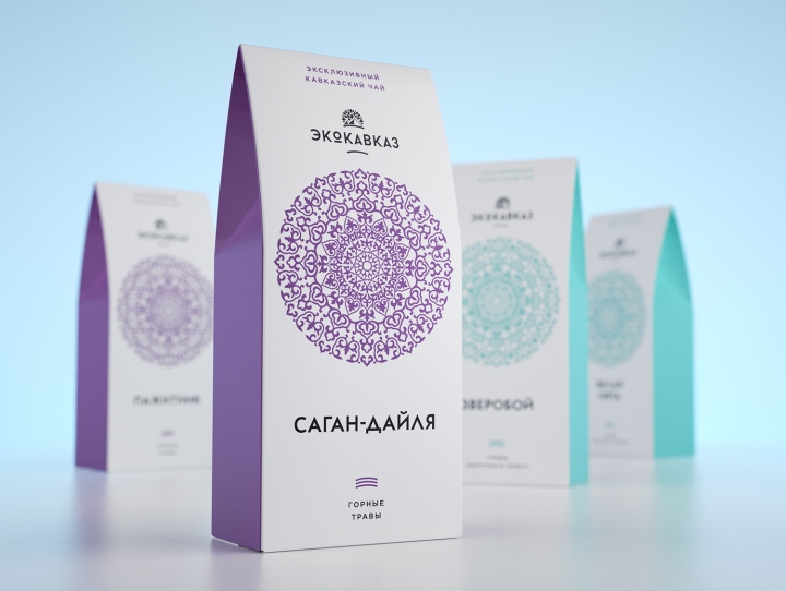
The main graphic element of the packaging is a complex ornamental pattern, a true eye-stopper. This pattern can be re-imagined in almost infinite number of color versions. At the present, we use a white background for the two current lines of herbal drinks and black background – for a line of drinks on the basis of black tea. If in the future our client will have new ideas for the original lines, they are not going to have any problems finding new and interesting color schemes.
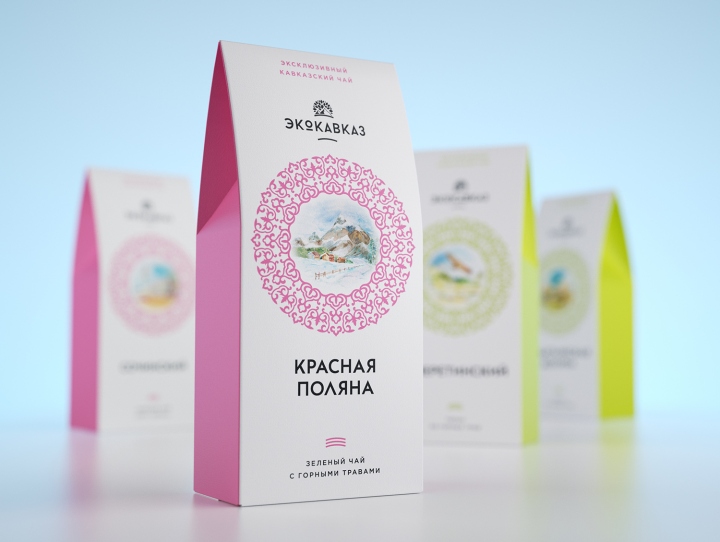
Products differ by color coding and also by degree of ingredients complexity. The package for simple single herb teas (St. John’s wort, peppermint, etc.) includes only ornament and fonts, when package for blends (herbal mixes, green and black tea with additives) also features watercolor landscapes of the Caucasus.
Design: Unicorn Studio Moscow / Nikolay Kupriyanov


Add to collection