
TONIK Health Club Renovation by Estúdio AMATAM, Lisbon – Portugal
posted by retail design blog on 2015-10-25
Sacavém
Add to collection

INTRODUCTION
The initial assumption was simple: updating the Reception and Foyer image and layout of Tonik Health Club – located in one of the premium locations of Lisbon, Laranjeiras. The club is located in a contemporary modern building; however the inside reflected a simple environment, lacking in coherence, with noble but unwelcoming materials and with some flows in the program distribution and its use, specifically in the two areas above identified. Our intervention should make the environment of these two main areas of the club, more welcoming, refined and sophisticated, as they establish the first impression before the clients.
PROGRAM
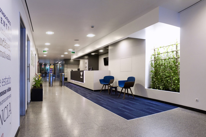
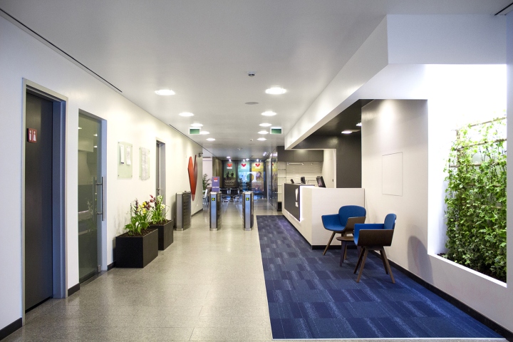
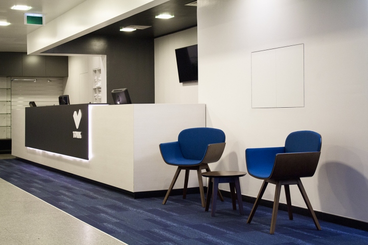
The Reception desk is always the core in any building services. In this case, although wide, the relationship between the zone of passage into the club and the attendance at the reception desk was unclear. Also, in addition to that, the existing counter no longer meets the current usage needs, denoting some impoverishment. There was also the need to create a waiting area by the reception area, before passing into the club and also a merchandising sales point for the Tonik brand.
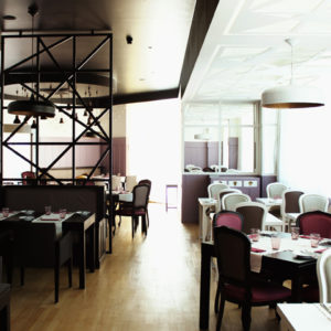
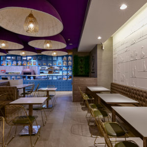
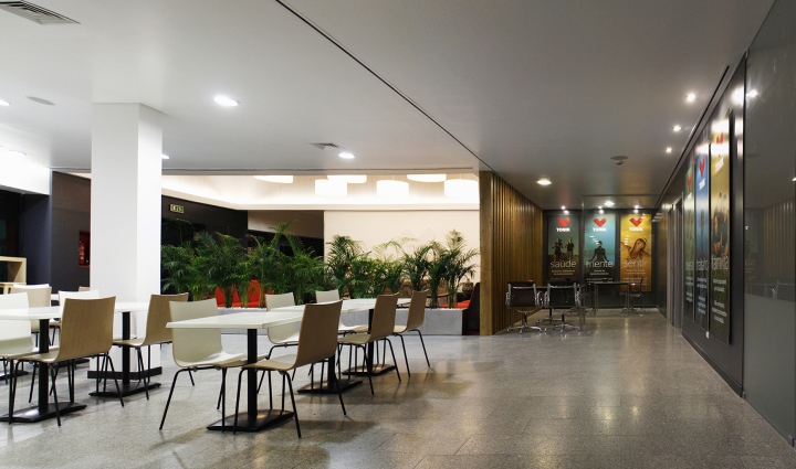
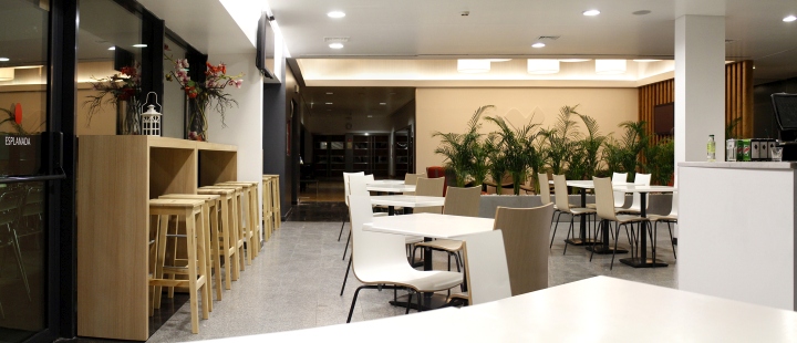
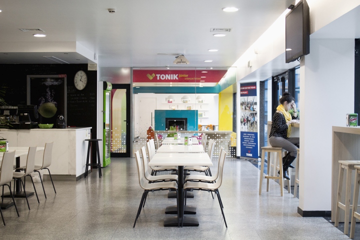
Following the reception and after validating your entrance in the club, the Foyer space arises – a space that holds the Memberships service area, a cafeteria and a lounge space. However, these spaces were poorly distributed and had some features that made them unwelcoming environments.
MATERIALITY
The sophistication and comfort were themes we tried to explore in this intervention, in contrast with the more institutional existing environment that we tried to blend. The colors of the brand have become the aggregator element of the proposal, also serving to identify specific areas and as the dominant color theme in the decoration and furniture used.

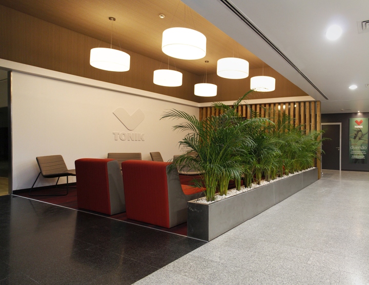
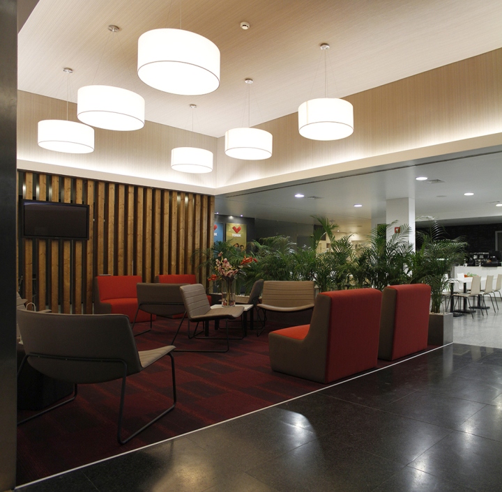
At the reception, the blue is present in the carpet and marks the area for customer service at the counter, thus clarifying the circulation flows. Following on the carpet display, it also highlights the waiting area, where we have created a green wall that inspires a certain tranquility and harmony. The roof over the reception desk has been redesigned in order to emphasize the area of customer service, having been chosen a palette of colors between white and gray, creating an elegant and distinguished atmosphere.

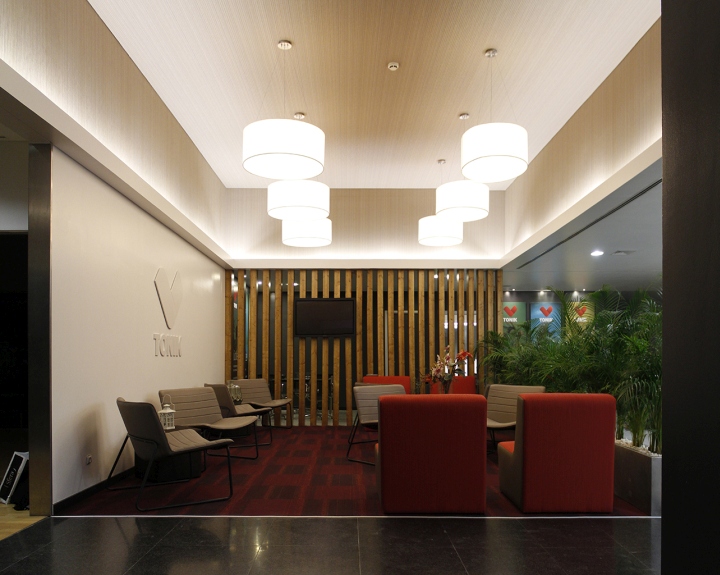
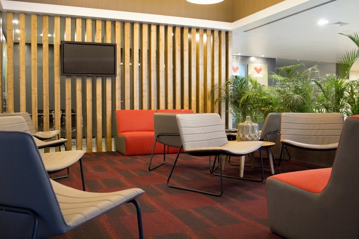
In the Foyer, the existing traffic flows were modified, resulting in the clear distinction of the different functions that coexist in this space: the cafeteria, the lounge space and the Memberships service area.

Consequently, a new layout for the cafeteria dining tables was developed and we took advantage the existence high-ceiling to delimit the lounge space, remaining in-between these two areas the circulation into the club training areas. The Memberships service area was positioned frontally to the flow axis from the entrance of the club.
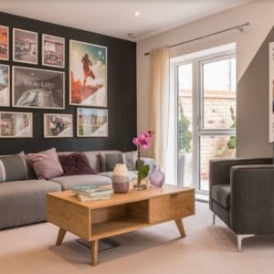
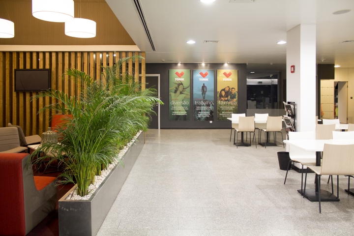
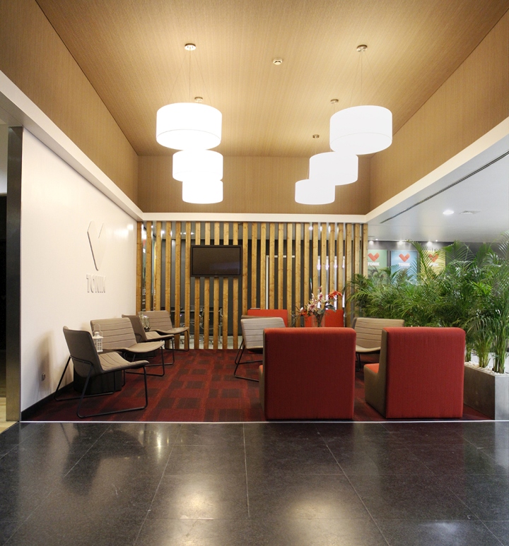
The lounge space stands out for its unique spatial characteristics inside the building, as well as for the materials used – proposed in order to equip this space with qualities associated with comfort and refinement. The use of warm colors and different textures, through the application of carpet, wood, textured wallpaper, green plants, the very choice of a unique set of design furniture pieces and the development of a carefully study of light display, allowed the transformation of this space according to the initial assumptions for the project, but above all gave to this area a certain privacy and modesty, without creating overwhelming physical barriers.

In short, our intervention in the different spaces aimed to provide features associated with the Tonik brand identity until now inexistent, and turned out developing a diversity of environments that interact in harmony despite their peculiarities.
Design: Estúdio AMATAM


Add to collection