KALORIAS Club by Estúdio AMATAM, Montijo – Portugal
posted by retail design blog on 2015-11-19
Arrentela
Add to collection

The KALORIAS brand is in a period of rejuvenation. Following the adjustment of its corporate image into a new dynamic and modern design, the placement of a new unit at Forum Montijo translates a new business dynamic.
Based on this invigorating impetus, we were proposed the transformation of an old retail store into the new KALORIAS Club unit embed in the new brand concept. It should not be just another gym, however the development of a new image and unique identity replicable in future clubs. The aesthetics and the space should reflect concepts such as dashing, dynamic, simple but unique. Despite the creative challenge the budget was not proportional to the task, which made increasingly high the level of difficulty of the task upon us. The search for suitable materials at affordable costs, the choice for simple constructive solutions; the prioritization of nuclear areas in order to enhance the identity of the space; and the efficient use of resources were always present concerns. Above all, our thinking was in the assumption that this should be a gym for everyone, young and old, athletes and sedentary, a welcoming and socializing environment, a real club for the family, modern and contemporary.
PROGRAM
The target space of intervention is characterized by a huge room with a length of 62m in its longest side, a width of 26m corresponding to the store front and a ceiling height of 7m, covering a floor area of 1300m².

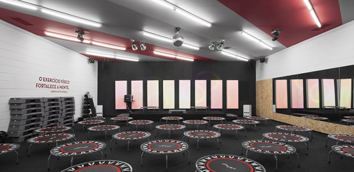
Analyzing the program requested and the physical dimensions of the space, we verified that many of the proposed uses did not need to take advantage of the huge ceiling height, related to an efficiency reason and also because of technical impediments. So our approach was defined by the strategic placement of closed lower dimension volumes, connected by the huge void of the existing space. We aimed to emphasize the spatial fluidity by painting in black (above 3.5 meters) all structural elements in order to dissimulate their physical limits, thus creating the illusion of a wider area. On the other hand, in the new raised volumes was decided to paint them in white achieving a more efficient diffusion of the natural light, which penetrates the existing glazing into the gym. In those volumes, the three Studios and the Kids Area were installed, since they have a more specific function. The dressing rooms and technical areas were positioned at the opposite end of the store front, creating a clear distinction between the activity gym space and the private use areas, enhanced by the clear marking of the physical boundaries that define them.
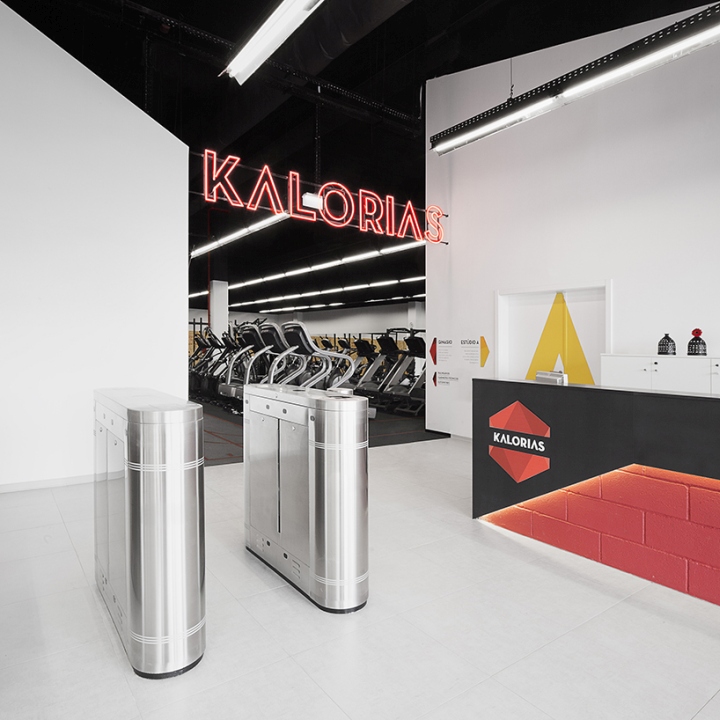
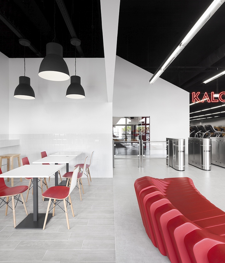
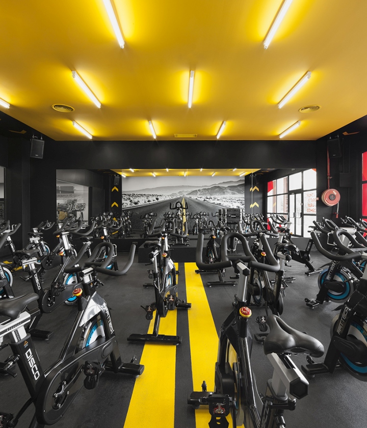
The programmatic arrangement and the placement of the interior volumes, which define areas with different functions, had as its main premise the correct relation to the need for natural light of the different activities, as well as to the commercial impact of those activities near the public. To promote the commercial impact of some activities, was explored the visual relation between interior and the exterior of the gym, captivating the people circulating in the gallery along the glass facade of the gym. As a result of this strategy, the Kids Area (one of the most significant amenities provided by Kalorias Clubs), the studio A with an exclusive use for Spinning classes (one of the most requested activity by costumers), the reception and the cafeteria area occupy the longitudinal strip of the outside glass facade. With this starting point, we sought to define a hierarchy of mass and voids trough the strategic placement of the different programmatic volumes, with the aim of allowing the maximum of natural light to be reached into the exercises open- space area, in the interior of the gym. Also, by the placement of this various volumetric forms we establish and define routes, identified by the tension created between them.

One example is the layout of the reception area, placed in the emptiness set by the Studio A, and the Kids Area, which takes advantage of the volumetric dialogue between engaging plans, whose diagonals emphasize high ceilings, creating a moment of monumentality inside the intervention space. Between those volumes an opening emerges that leads to the interior of the gym, marking the circulation axis to the area of the dressing rooms. Attached to the circulation area is an open space dedicated to workout exercises, whose strategic location takes advantage of the visual axes to the outside of the building, might it be trough the void in the reception area, or by the glass wall of Studio A.
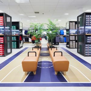
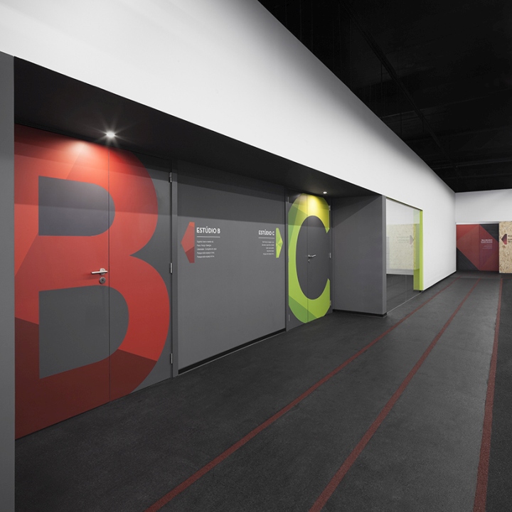
On the opposite side of the open space were placed two studios for group activities, B and C Studios, with approximately 130m² each, framed in a huge white parallelepiped that defines the limits of our visual field. Glazed walls attached to the studio entrances allows permanent visual relations with the different spaces, therefore enhancing the social dynamic of the club, since all are seen and observed, inviting people to participate in the different activities taking place.
At the end of the axis established from the reception to the technical areas, arises the first visual barrier, whose inflection path is related to the need of enhancing the sense of a greater privacy. At the right side of this new area is located the Men Dressing Room and at the left side and consecutively, the dressing room of Professionals, Children and Women. Technical and commercial offices emerge in the interstices of these spaces.
MATERIALITY
For the identity of this gym were established concepts of urbanity, dynamism and diversity. We sought to translate these concepts not only through the space shape, but also through the materials, its colors and textures. Also, as well as responding to the creation of this identity, we always had in mind vectors of more technical nature that guided our choices, related to the specific uses of the different spaces. Since this is a facility for the practice of physical and sporting activities there was a careful choice for durable and impact resistant materials. This results in the application of OSB and Valchromat coverings in walls more likely to contact. Always as possible were used concrete block, not only to speed up the construction timeline (one of the project constraints), but also due to the rough and rugged appearance that transpires. In the pavement the solution passed by the application of recycled crumb rubber, whose impact and shock absorption resistance properties are suitable for this type of installation.

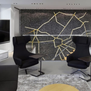
In the prime areas, specifically near the Gym entrance, smooth plaster covering convey a simplicity and elegance that contrasts with the occasional use, but careful, of color and textures in the different surfaces of walls and floors, around other gym areas. The Reception Counter, designed specifically for the this gym, follows the spirit of Kalorias brand, and the movable furniture was chosen to be an highlight inside the space, whose design embodies the identity of the designed atmosphere.
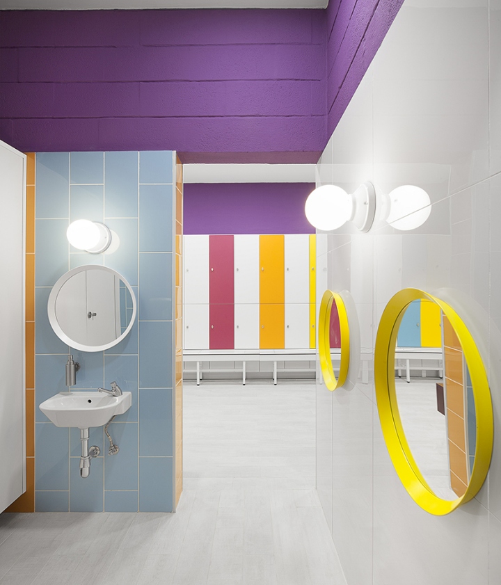
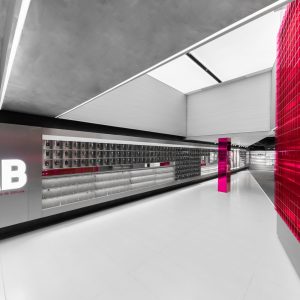
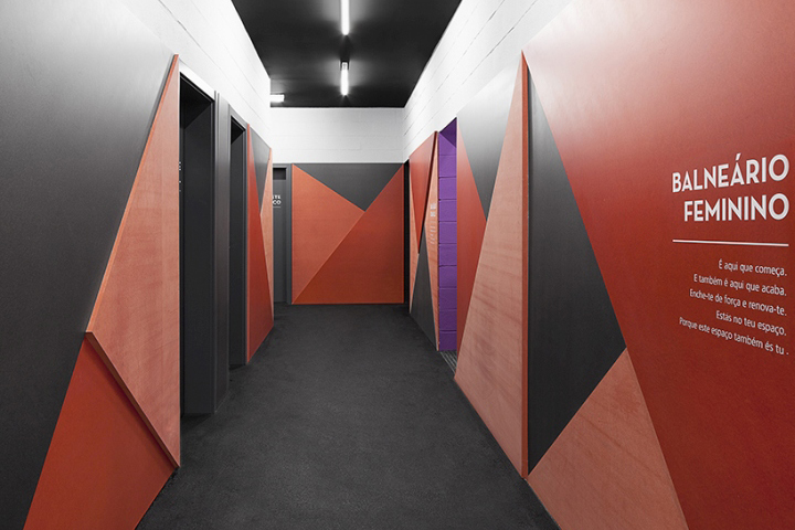
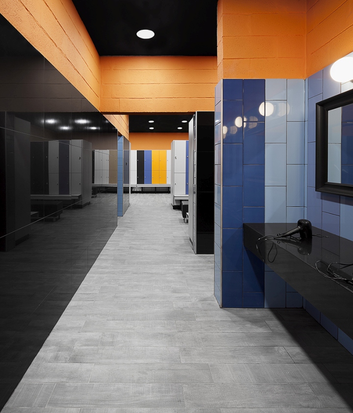
In the dressing room there was a more daring and experimental attitude, concerning the creation of different environments for distinct genres and users. The developed color study associates specific colors for each dressing room, as well as specific ceramic and lockers front panels patterns and metrics, emerging from the combining elements rhythms and contrasts that symbolize the three guiding pillars of the initial concept: urbanity, dynamism and diversity.

In the less public areas and of restricted use (the office rooms and the professional’s dressing rooms), we opted for a simpler and even elegant aesthetic language, highlighting the contrasts between black and white colors – in the case of the office rooms – and the grayness of the concrete block against the yellow color – in the professional’s dressing rooms. Having sought a solution that discharge the use of opaque false ceilings, a square mesh network nylon was placed, bordering the horizontal plane but as well establishing a permeability to the existing emptiness, leading us to the imaginary of net sports.
The Kids Area is one of the less expected functions in a gym. However to help families, due to long working hours, lack of time and alternatives with whom to leave the children, Kalorias Club provides this service in order to increase the attendance of its members. Therefore, the Kids Area turns out to be a “world” aside, for a very special and demanding public. Programmatically the space was divided into two areas, one dedicated to manual activities, reading and studies, and one other more suited to the physical activities. This separation is present not only conceptually, but also visually by the means of a diagonal line whose difference of material, color and texture, enhances the different space use. In the reading area stands out the black tone of the floor and slate wall – which serves as a writing and drawing pad – where next to it furniture was arranged for different age groups. In leisure area the synthetic grass takes us to imagine how it is to be in a football field, but also triggers the idea of a mountain, where applied vinyl’s tell us stories and lead the children to arouse their imagination.
Design: Estúdio AMATAM
Photography: Invisible Gentleman


Add to collection