
Super Jay American Pale Ale Branding by Pope Wainwright & Wykes
posted by retail design blog on 2015-11-19
Add to collection

Combining a warming back-story, an illustrative packaging style, and organic American Pale Ale – Super Jay is born!

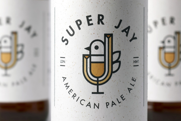
PWW is a strategic design firm based in London and Seattle, and Super Jay is our very own craft beer made from the bottom up. During beer production, the flavour comes first and the brand identity second, and this is what differentiates Super Jay from other craft beers. Super Jay’s brand identity firstly combines character and individuality, with the beer itself following on to match. The creation of Super Jay is the result of two back-stories merged together. Beginning with the ‘Jay’ part came from PWW’s Graphic Designer Mark Johnson, growing up near Lake District and surrounded by Jaybirds, this became his focal drawing point and inspiration for Super Jay’s graphic design.
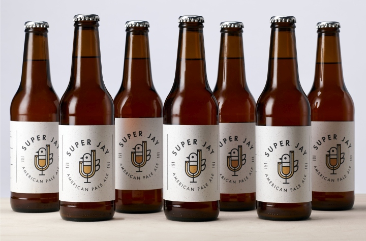
Directly linking to the history of beer, Jaybirds colonised Asia, Europe and Africa, to then eventually migrate to North America, which is close to PWW with our second studio based in Seattle. Consequently, beer made the same transition between multiple continents, growing in Europe, to then eventually end up in North America within the leading craft beer movement. The ‘Super’ part comes from PWW’s final beer in the craft series, which will be marketed and available to buy. The recipe will be for a strong shandy, with a memorable flavour. Before the final recipe for Super Jay is brewed and produced, we are experimenting with a different type of beer every couple of months. Creating brand consistency, the Super Jay logo will feature throughout each beer design, while the label will be designed according to the style and background of the beer.
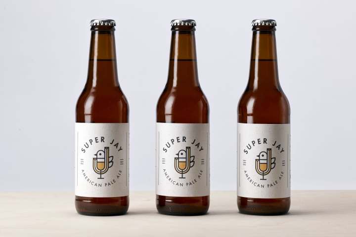
Our first batch was American Pale Ale, a popular, modern style beer that created a poignant and hoppy flavour. The packaging design was a combination of typography and soft graphic design, with a capital ‘J’ merging into an illustrated Jaybird and beer glass.
The Super Jay story is about combining different beers from different times and places, therefore our second batch, which is currently in the fermentation process, will be Saison, a French pale ale with a light and rustic taste. For the packaging design, French typography will be used in an avant-garde style, to communicate precision and symmetry, closely fitting to the sharp taste of the beer.
Super Jay will differentiate from other craft beers with its strong character communicated through bold graphics and typography, alongside distinctive flavours to match. While PWW are still experimenting to create the perfect beer to identify with Super Jay, keep an eye on our website for updates and follow Super Jay on twitter @SuperJay_NW1.


Add to collection