Add to collection

Little Balena is a team of passionate Nebraskan quilters. They sew all the Play Quilts with love for your baby. Their sewers sincerely love to quilt and they have set the wage for their time and effort. Your Play Quilt is cut and built by hands and sewing machines in the United States, not overseas factories. They use the finest quality fabrics and cotton batting to keep the Play Quilts durable. Little Balena is honoured to be part of such a special time for a family.
We worked with the concept of: “Whales Loves Trees”
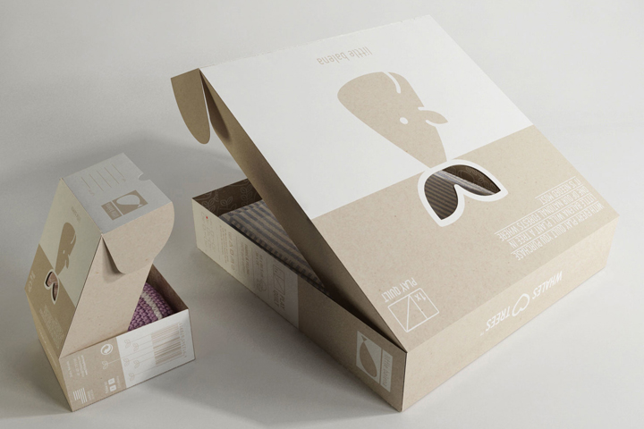
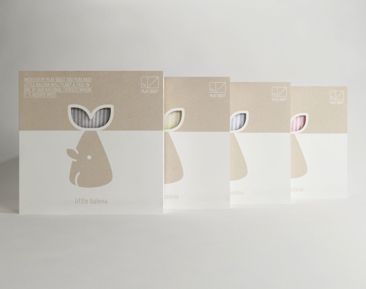
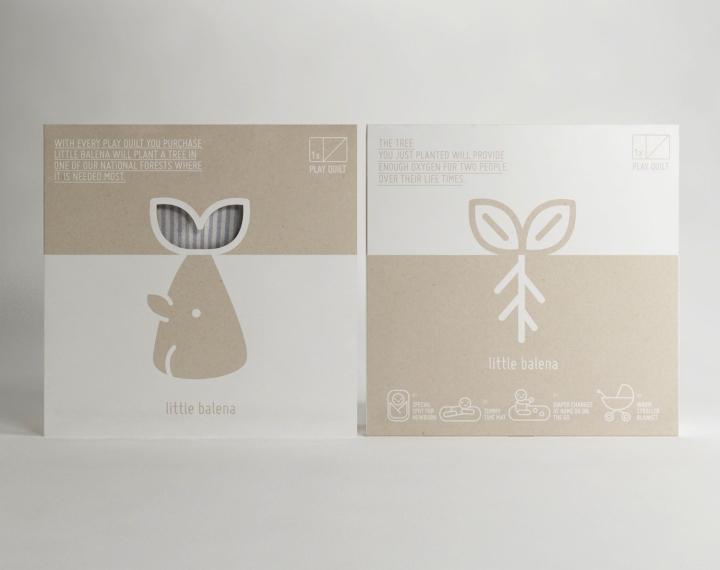
We united these two worlds through a morphological similarity. This coincidence allowed us to open the game and think about the possibility that they are “one.” Instant recognition of both is achieved in a few seconds and depends on the line drawn on the horizon if we talk about one or the other. This idea is effective and simple to recognise. Above all we wanted to reinforce the main idea proposed by the client with a connection of the Whale with the Tree. This is the main core and soul of the product. We can see that above the horizon line (sky area) we have the same shape in both representations. It is what we initially call: “one”, joining these two universes through a morphological similarity. We emphasised the shape to reaffirm the idea of what we are describing in terms of visual union. The colour is a part of the light spectrum, and has vibrational energy. This energy affects humans differently, depending on the wavelength (colour) producing sensations of which we are normally unaware. Our work was to combine the current palette of the products of Little Balena with the ones that we wanted to use in the new Pack. For this, the more appropriate use is white and kraft because of the type of product, the target and the concept. Later we will explain in depth why we chose it.
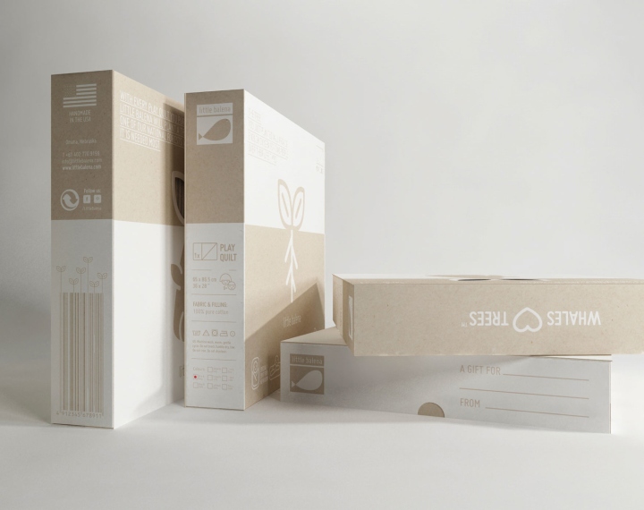
It is also not by chance that we only used one colour on kraft cardboard. This lowers the cost of production. It is a more environmentally friendly package, with maximum effectiveness and uses the least amount of items. Why the choice of white colour? White has a positive connotation as it is associated with light, goodness, innocence, purity and virginity. It is considered the colour of perfection. It is also safety, purity and cleanliness. In advertising, white is associated with coolness and cleanliness. It is well suited to promote products for children and for leisure. Why the choice of kraft?Working with kraft texture exemplifies values such as natural, organic, ecological, human and above all warmth. This material bonded to white emphasizes the values named above. This also enables possible future extension of the product family if required. It is very important to take this into account because the flexibility of the identity and the concept ensures Brand durability over time. Each graphic element is used to have the same aesthetic coherence. Therefore, both the illustrations, as system icons like typography should follow certain parameters to create a homogeneous and balanced identity. Finally, we proposed that the inside of the pack is lined with a pattern. This detail shows that nothing in the package is left to chance, and every corner of it is designed and planned.
Designed by makebardo


Add to collection