Add to collection

Goals:
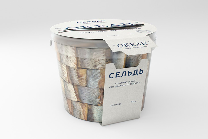
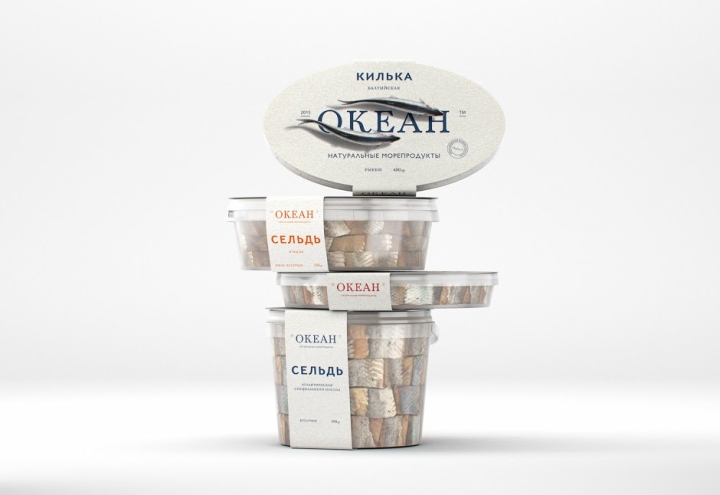
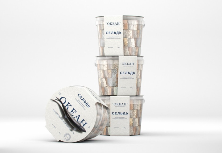
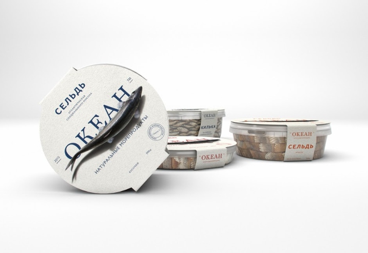
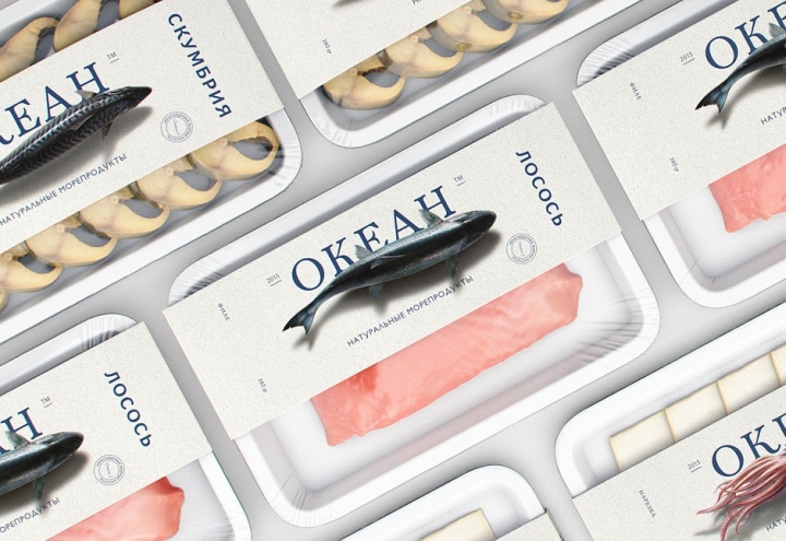
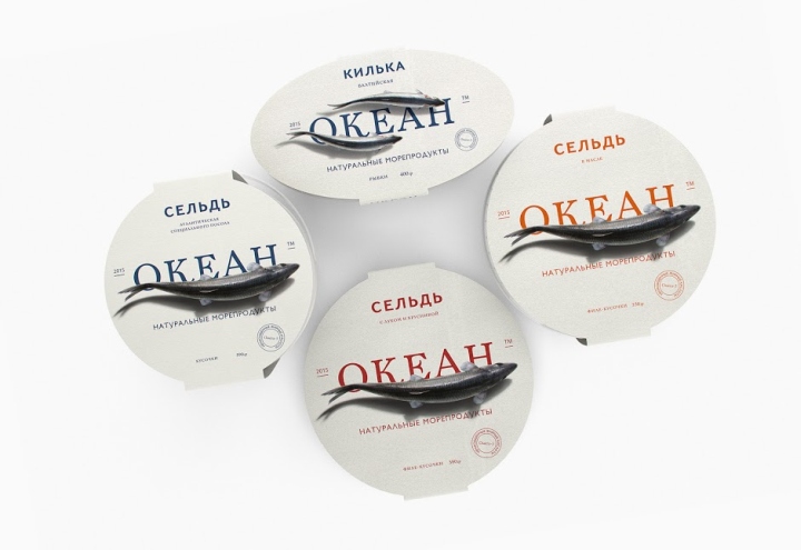
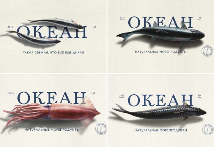
The packaging should reflect the highest freshness of the company’s products and its positioning “So fresh, that is still wild”. Our client always repeated: “«Make the logotype a little bigger, just much bigger, so it can be seen from afar. And the product, give us also more of product”.
Solution:
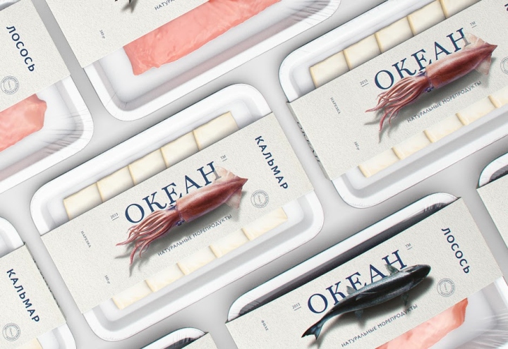
“Ocean” – a brand of fresh seafood, which gives priority not to artificially farm-raised, but to wild fish.’ In order to demonstrate the freshness of the product we decided to show that the consumer buys almost live fish. That is why the photorealistic illustrations of swimming fish appeared on the packaging. As we are observing them sitting on the quay or on the deck of the boat. Not from the side as in the aquarium, but from above as the fishermen see them.
The logotype should be described separately. If we say the word “ocean”, our imagination immediately draws us the giant, boundless element. Endless, unpredictable, majestic. That’s why we decided, that the logotype will take the most part of the packaging and of all the composition. Besides, it is a part of spatial perspective and gives to the illusion the bigger “reality”.
Designed by Jekyll and Hyde
http://www.packagingoftheworld.com/2016/05/ocean.html


Add to collection