
Starbird Chicken identity by Strohl, Sunnyvale – California
posted by retail design blog on 2016-09-05
Sunnyvale
Add to collection


America has a long-standing love affair with our fast food. Channeling the joy and nostalgia of a bygone era, Starbird is reinventing both fried chicken and the modern dining experience.

The Culinary Edge, an SF based food strategy firm, approached Strohl with a new concept for a fried chicken restaurant where the food is both healthier and sustainably raised (not to mention super tasty). Building off their initial vision, we embarked on workshops and strategy sessions to position them within the marketplace- seeking opportunities to bring this unique vision to life.
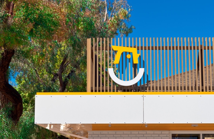
The Starbird brand identity was created with the intention of cutting through the visual clutter found in the world of traditional fast food. The resulting mark communicates a bold freshness, combining the simplest forms of a chicken and egg (the latter as a nod to their breakfast offerings). Accompanying typography is clean and direct, matching the optical weight of the mark, while still having character to be distinct on its own.

The physical presence of the building, as well as the signage, play a major roll in the initial brand experience. With this flagship location built from a former Pizza Hut, the new design used a facade of wooden pickets to reinvent the infamous “hat” roof. Complimenting this high level of finish, our signage is crafted from dimensional aluminum, lit from within.

The response has been overwhelmingly positive, and the bright, modern design stands out among all of the cluttered, dated chains that are Starbird’s neighbors.


Add to collection