Shopping Mall Remodel by Taipei Base Design Center (TBDC), Taichung City – Taiwan
posted by retail design blog on 2016-12-21
Add to collection

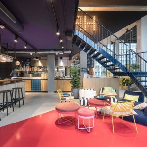
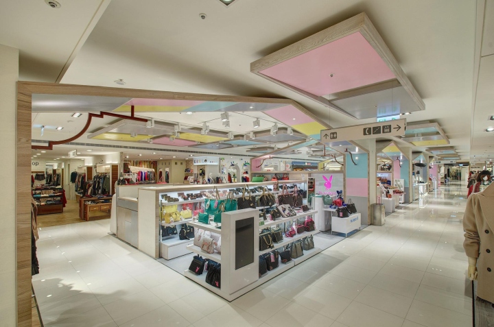
The design frame is based on an inclined-ceiling house and is positioned in as higher area as possible within the limited height constraints of the ceiling. It is then integrated with the pillars and props to enhance its contours. In response to the type of pavilion and product, the timber and original white base area are filled with irregularly-spaced colorful boards to create an energetic tone. A slightly different technique is used for the shoes corner, which is separately planned. For walls that require large display areas, the display props system that was originally arranged in parallel is changed to an irregular staggered arrangement, integrating various design methods for the surface props. The public area colors are then extended here to ensure uniformity in the space. Bright and colorful ribbons are finally used to outline the interesting shopping environment.
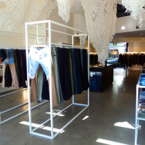
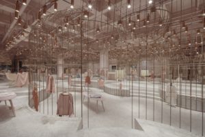
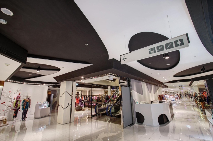
After making moderate adjustments to the original space, and using the ceiling design system as the consistent theme, points and lines are then used in the design concept. Points are joined to form lines, which are then interwoven into a surface, thus creating a visual effect that is clear at times and blurred when in motion, much like the light, graceful movement of women. White is chosen as the main background color, and then combined with neutral and gentle colors as partial decoration, creating a tone of irregular rhythm. The tone of the overall space matches the characteristics of this pavilion: reserved and low-key, yet charming and cosmopolitan.

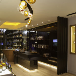
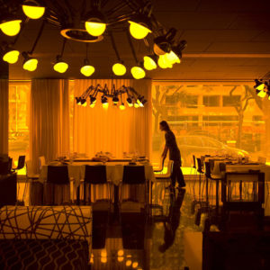
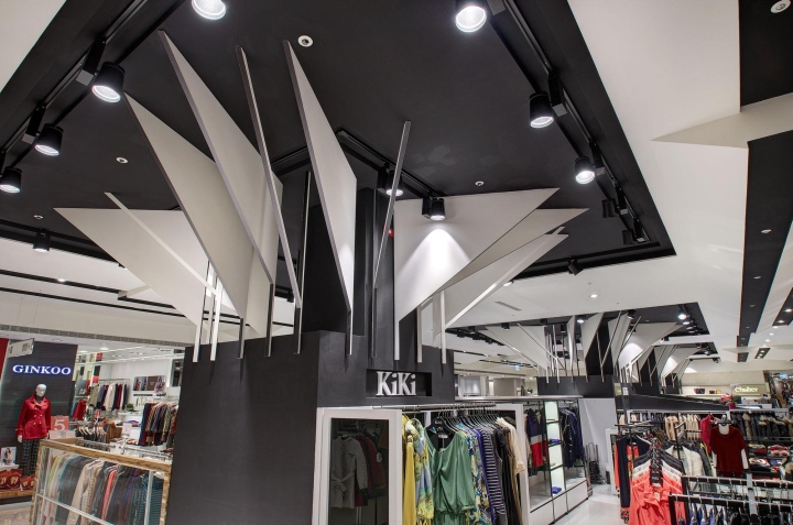
The design concept of this pavilion is “Fashion and Tension”. The ceiling’s irregular mesh opening presents a tense and tough quality. When extended to designs like the vertical pillars, the design strength is further enhanced and expanded. The choice of color combinations is black, white and gray, not only emphasizing the sense of depth, but also reducing unnecessary details. The entire space is simple and stylish, characterizing female determination and directness.
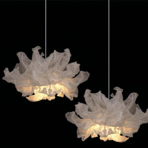
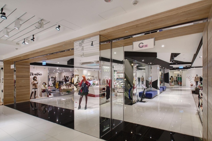
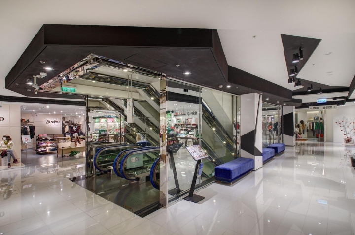
This space is defined by the colors black and white. Large areas of white highlight the spaciousness and brightness of the area, while black is used to moderate the more complicated lighting and design installations by letting light through the scattered gaps, thus creating a visual focus. At the same time, a collage of standard patterns and undulating flaps is used to create a graceful and changing sense of rhythm. This shows the display strength that can be achieved with only the two colors black and white.

A Restroom: This level is mainly used by more mature women. Therefore, it features a simple and liberal design. A wide aisle and a circular open space add to the variability and usability of the area. A full view of the space can be visually appreciated through the connecting arched doorway. In addition, the restroom is presented in bold and starkly contrasting purple and blue hues, with white sinks and lamps used for decorative purposes.
Design: Taipei Base Design Center (TBDC)


Add to collection