Add to collection


As a company grows, it needs to respond to market changes, even in the transitions in mindset of the founder. The branding of the company needs to adapt and visually reposition itself to both business partners and consumers. This Shanghai based company has pivoted to the art industry, doing art buying, curating, exhibitions, residency programs, artists related events and collaborations.

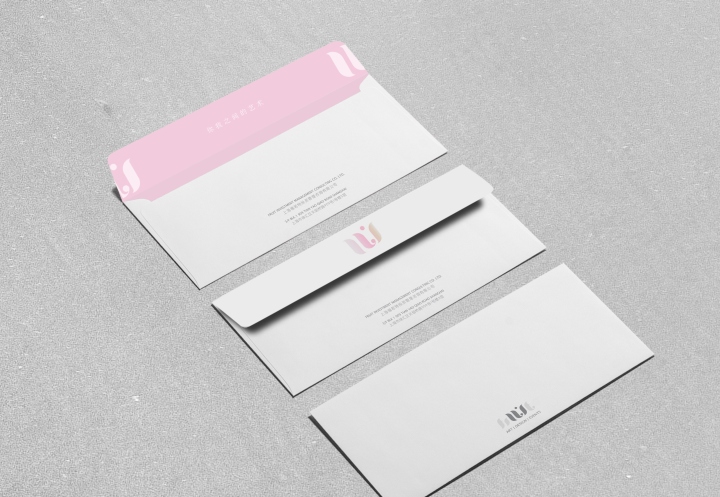
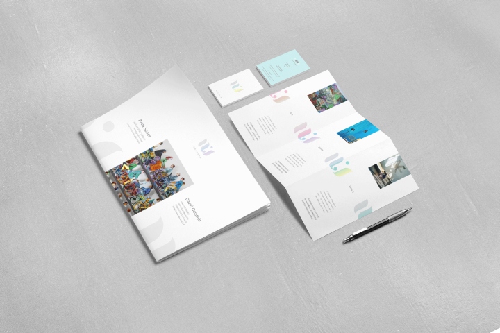
Interestingly, the client has a different take on what art means relative to prevailing perceptions in the China market. They believe art should be accessible to everyone, regardless of age, social status, and career background. Not only for the rich and social elites. Hence UI came into being. Part of the old entity FRUIT, and placing special emphasis on this relationship and interface between, you, I and Art. Presenting UI.

The Art of U & I. Visually, we want to express the relationship, this literal space, between you and I. Setting the brand element apart we place content in the middle. This treatment made multiple posters into a series, and brochures into contiguous pages. And this can be done ad infinitum. Tone and manner wise, we took special care to balance the relationship between colour and white space. We meant to present a quiet confidence.
Design: United Design Practice


Add to collection