dmail store by Migliore + Servetto Architects, Milan – Italy
posted by retail design blog on 2017-04-04
Add to collection

A dynamic and lively sign able to express the meaning of a young, curious brand, is the new logo designed by Migliore+Servetto Architects for dmail. The circle is the generating element that defines the soft borders of the single letters, while two dots, placed over the beam of the “i”, mark its uniqueness. From a chromatic point of view black and white are combined with a uniform bright yellow, a symbol of light and energy.
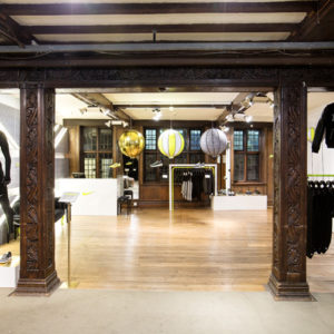
The new corporate identity is declined then within the stores embracing the whole communication system. Here the generating element of the circle becomes the mark which underlines and enhances the objects selected by Dmail, during its untiring research. Characterized by the presence of the graphic mark the store in via San Paolo in Milan re-opens as the pilot project of the new format store for all the following sales points.
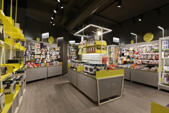
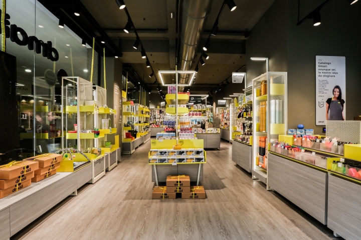
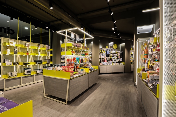
A place with a strong identity, characterized by a vivid yellow which dialogues with the white of the tubular steel poles, with the metal sheets folded to create wide exhibition basins, and with the transparencies of metallic meshes. All is set within an architectural enclosure which, subtending the set up, presents itself as an homogeneous container, defined on the ground by the warm, dark oak shade showing chromatic continuity with the walls and the ceiling.
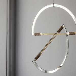
Carefully built upon a rich, heterogeneous products’ supply, the set up is a sort of versatile and flexible “machine à montrer”, able to keep up with the liveliness and the constant turnover of the brand’s offering. Light is the essential element in the whole interior design project. Emanated directly by the furniture, it marks and frames the products’ partition: linear light rods punctuate the showcases and the wall furniture, hence framing the “focus areas” with a zoom on selected products, while suspended light ring define the central areas, with the lightness of the metallic tubular poles.
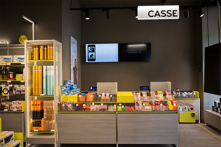
Always connected with light, an intuitive and informal graphic system develops at different levels, through a set of icons and keywords that, supported by the sharp freshness of yellow, guides the information and the shopping experience, allowing the visitors to orient themselves among the various product categories and to deepen the knowledge of the objects on display, also through the narrative technological interfaces.
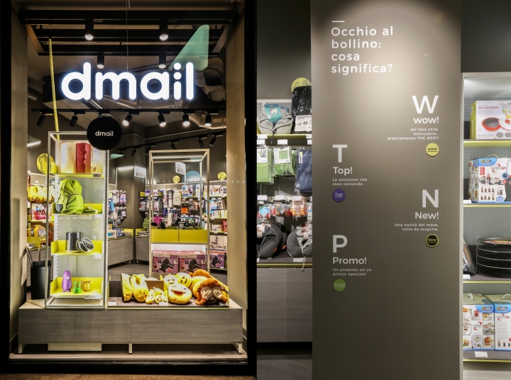
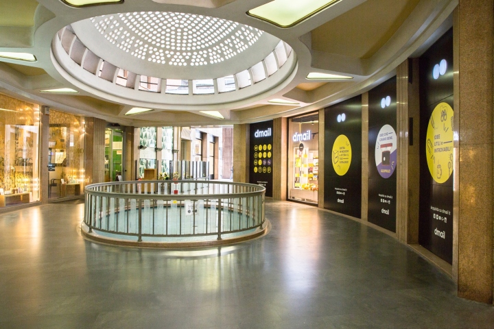
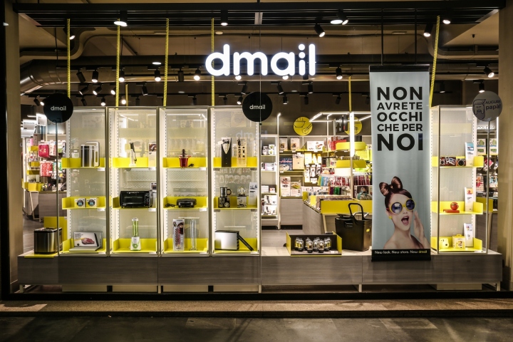
Indoor and outdoor of the store are structured to build a close dialogue between the parties. The extremely permeability of the windows, made by a freestanding structure at full height combined with the targeted presence of the graphics for an easy-to-read immediate display, offers to the visitor a wide overview of the interiors. A narrative, communication space, where light and the graphic mark open glimpses and exploration views. A new meeting place full of curiosity and innovation.
Design: Migliore + Servetto Architects


Add to collection