Bread Station store by Dana Shaked, Ramat Gan – Israel
posted by retail design blog on 2017-05-05
Ramat Gan
Add to collection

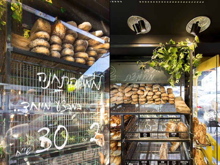
The owners of an old bakery in Ramat Gan wanted to change the bakery character and to open up to a younger customer. They decided to name the new place “BREAD STATION”. In Hebrew “Flour Mill” called “flower station” so the name bread station is a paraphrasing to the place essence.

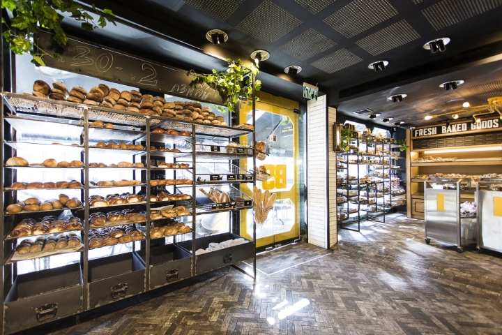
I’ve decided to take the concept of a bread station to the look and the feel of a real station. Metro / train / bus, such a thing that shows exactly the values the owner wants to add to the place – express, young, fresh and up to date.

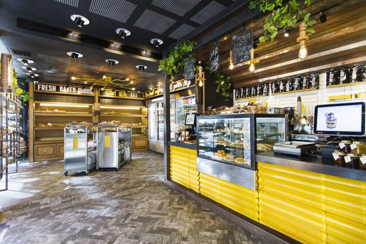
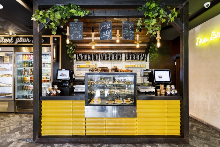
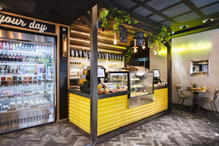
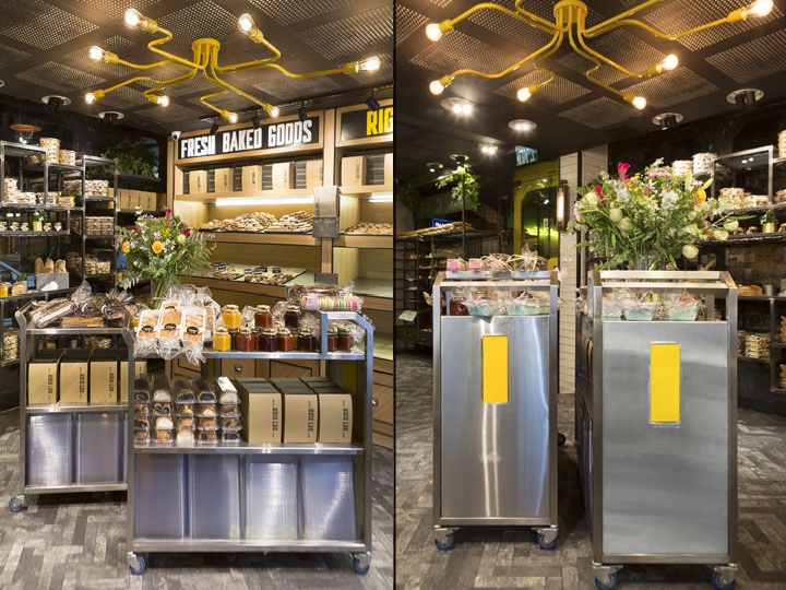
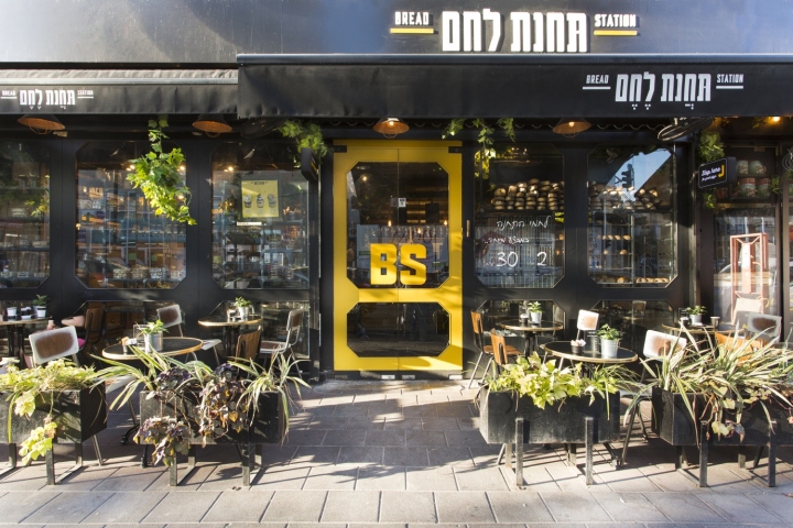
Colors – black, white and yellow.
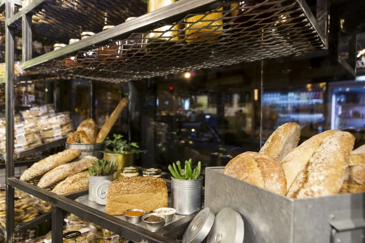
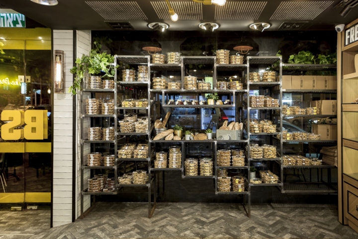
Materials – a lot of iron, tin, nets and stainless steel, white ceramics tiles and lots of plants.
Flooring – street-like paving stones.
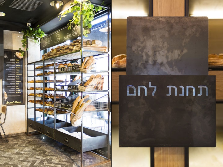
Signs – neon signs, street signs, and posters with information about the very best materials.
The design process took about six months while renovation was intended for the Pesach holiday – one week – the only time the bakeries can and want to renovate their business, without compromising in the flow of current daily income.

Cash register designed as a real rail station by iron constructions designed specifically, and over it surface of a thick corrugated oxidized tin. When I walked into the kitchen for the first time I saw the baguettes trays and I was certain that they were going to be an integral part of the design space.

They later became the cover of the checkout counter after they were painted yellow. Display stands in the center of the space and positions of sugars and services were designed as ticketing machine at the entrance of a station and were designed from stainless steel.
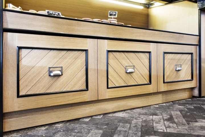
The stands of warm pastries and also the refrigerator display were covered with woodworking units combined with oak wood in 2 colors. Cookies stands were designed in a way that allows peeking inside from the street and therefore it was built of iron profiles and nets.

The facade was shaped like a bus / train wagon and the entrance doors have handles with the brand’s initials.
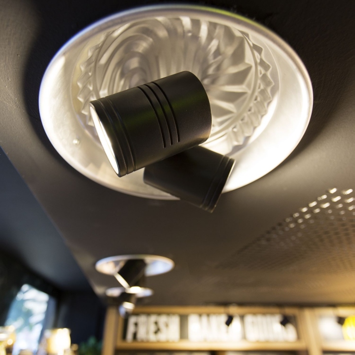
Because of the short schedule we were asked to think of creative solutions for given problems. The old lighting fixtures left holes in the ceiling so we designed new lighting fixtures made of cake bowls from the kitchen.
Design: Dana Shaked
Photography: Tomer Rubens


Add to collection