Add to collection
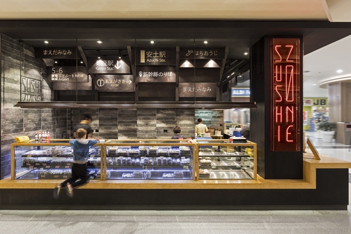

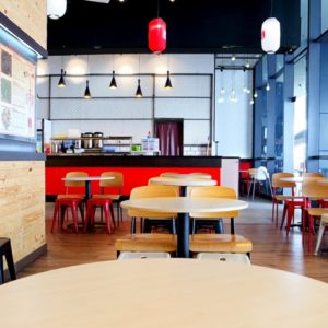
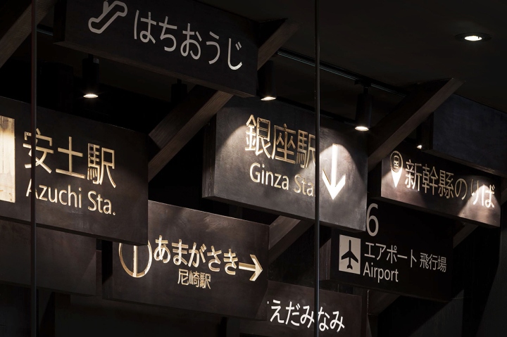
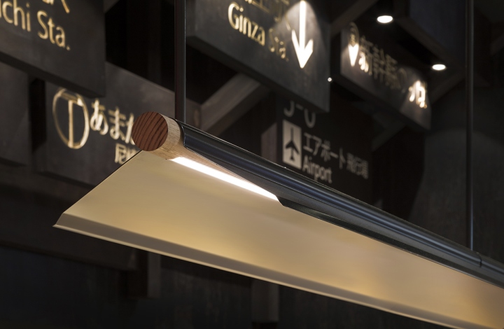
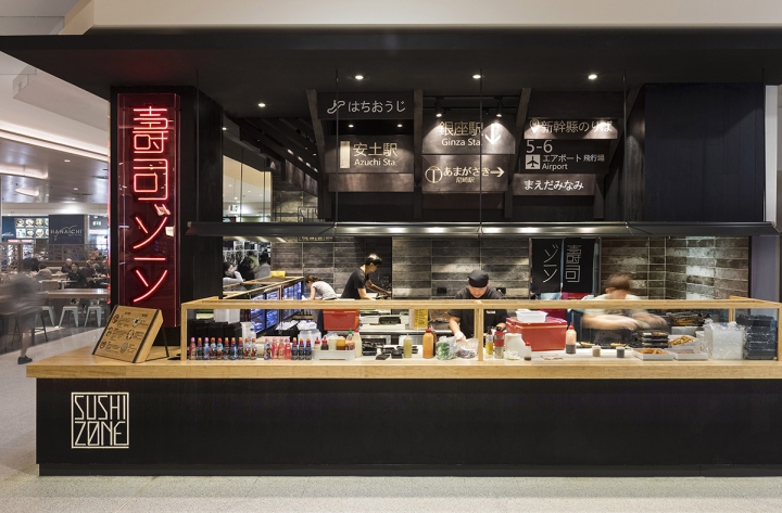
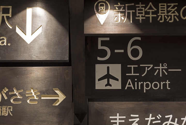
The brief of the client is to design something that’s different from traditional Japanese appearance and draw Japanese essence from other elements. The concept is developed from the brand name “Sushi Zone”, which is about transportations. The intension is to bring Japanese urban city atmosphere to this small shopping centre food court shop. In order to connect with the transportations related shop name with Japanese elements, the characters of the transportation system is been used throughout the design.
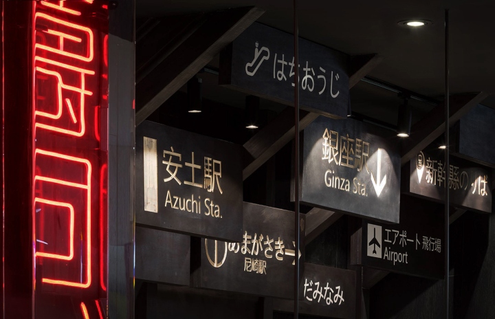
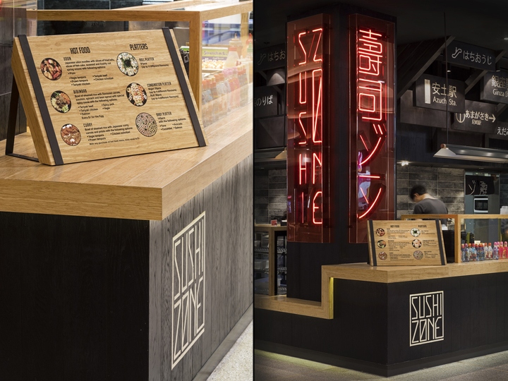
This is shown in a ceiling feature with signage boards developed from the typical indicator lightboxes in subway stations in Tokyo. The neon signages contrast with dark background and associate graphics are a celebration of the vibrant colours of Japanese street night views. The long shopfront can provide the comfortable experience of the “grab’n’go” process and the viewing of sushi preparation process which creates an open kitchen looking from the mall. A bold design with the Japanese ethos, this is the Sushi Zone, a flagship location in the Eastgardens shopping centre, New South Wales, Australia.
Design: Span Design
Photography: Andrew Worssam


Add to collection