

Add to collection

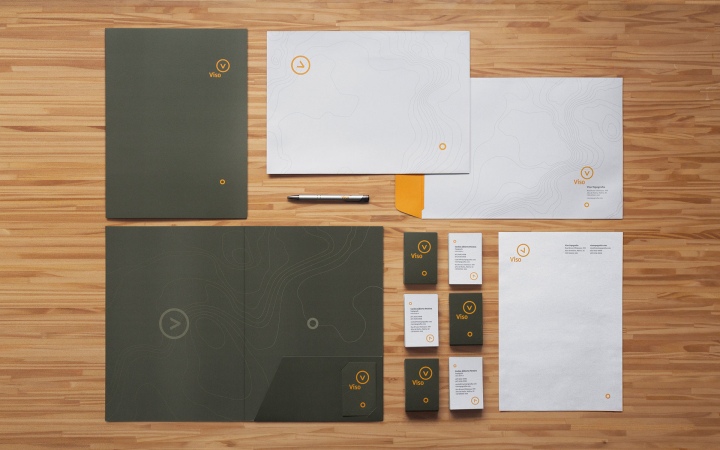
Viso is a surveying company born with more than 40 years of experience. The services include fieldwork in land measurement, mapping, geo-referencing, documentation and bureaucracy.
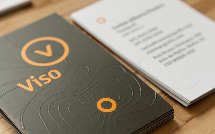
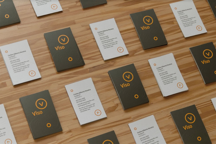
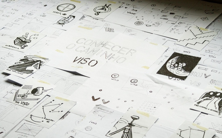
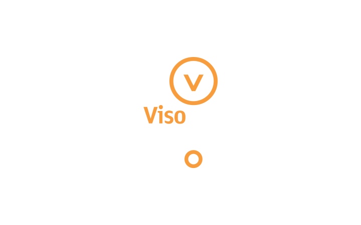
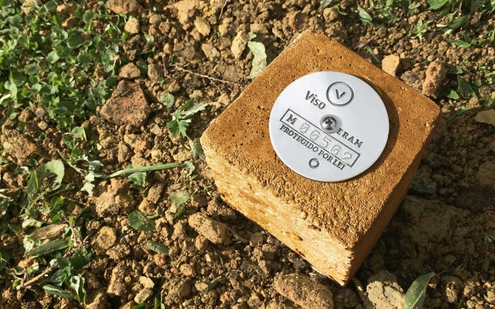
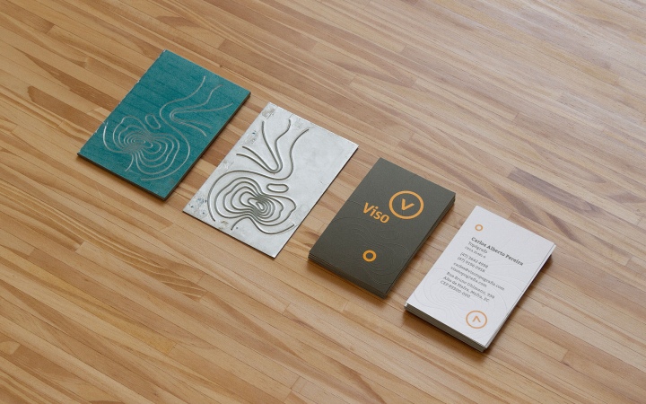
The new company needed name, logo, visual identity and stationary. I (Carlos Bauer) created the concept “Knowing the way” to guide the brand expressions. The name Viso means to look or to aim for, combining the gesture of the surveyor when using his equipment with the wide vision that only the experience can provide.
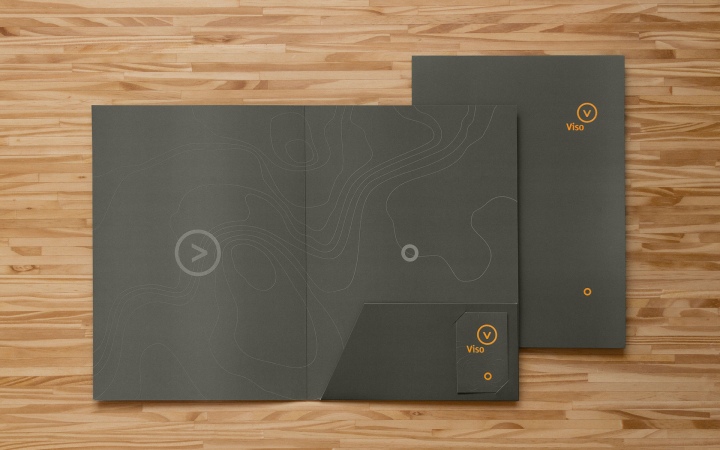
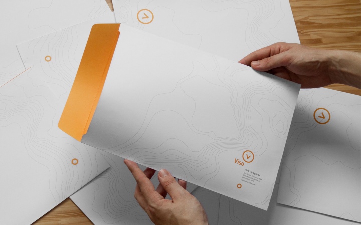
The visual identity is based on the behavior of the symbol: the stamp with the initial V points to the secondary element, like a compass indicating the correct direction. The sober color palette has orange as a highlight in contrast to the rural environment where field service is performed. Differentiation and credibility are the main results associated with the new brand.
Also, this project has been selected for the 12nd Brazilian Graphic Design Biennial, 2017.

Photographer: Maria Mion


Add to collection