

Ace & Tate eyewear store by Spacon & X , Copenhagen – Denmark
posted by retail design blog on 2017-08-22
København
Add to collection
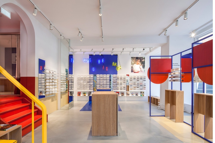

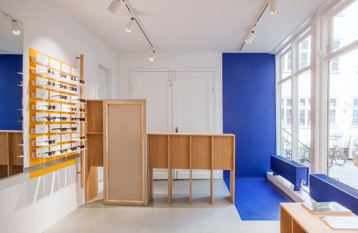
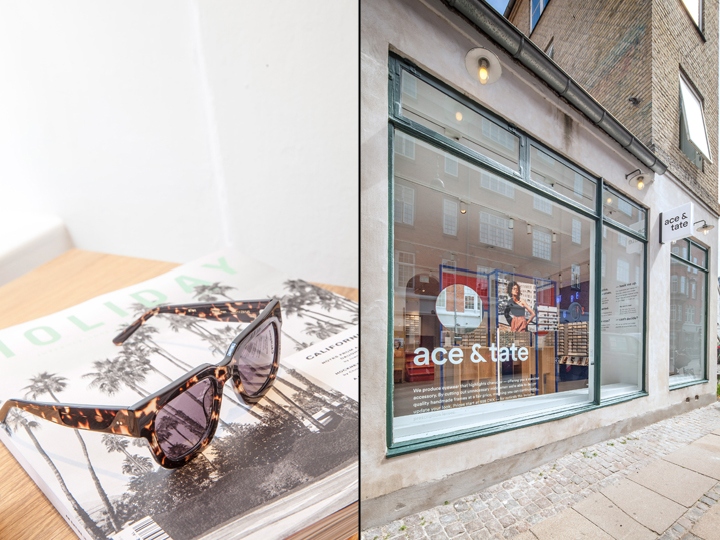
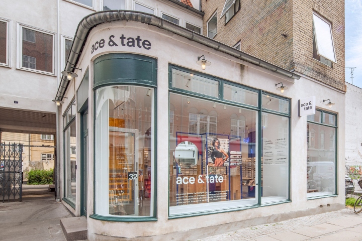
Spacon & X designed the interior for Ace & Tate’s new glasses store in Copenhagen using geometric shapes and primary colours to evoke the experience of entering an artist’s studio. The new space is located in the old town of the Danish capital on Ny Østergade. It consists of stark, minimalist concrete floors and white walls that have been animated by blocks of red, blue and yellow. Spacon & X wanted to use the bright colours to create an “energetic and playful aesthetic” that would match Ace & Tate’s visual identity.
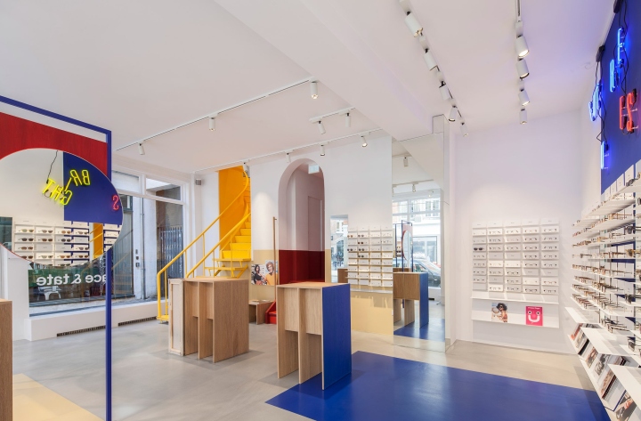
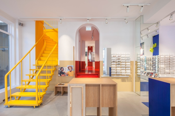
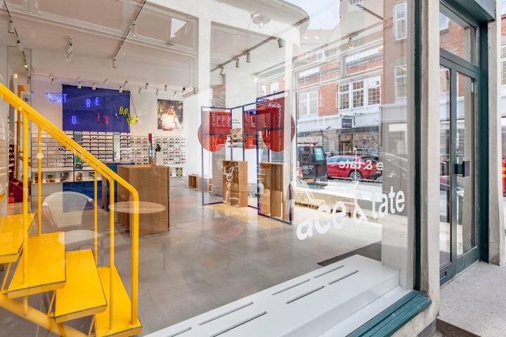
The store is divided into a front and back section, separated by a curved archway and a yellow spiral staircase leading up to the first floor. Floor-to-ceiling windows wrap around the store, allowing natural light to flood the front room. Spacon & X found inspiration for the decor by imagining what the studio of avant-garde artist Franciska Clausen would look like. The Danish cubist painter often worked with primary colour combinations.
Accordingly, the design studio took an experimental approach to its colours, while preserving clear graphic lines.
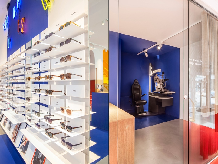
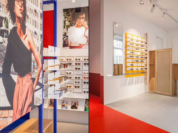
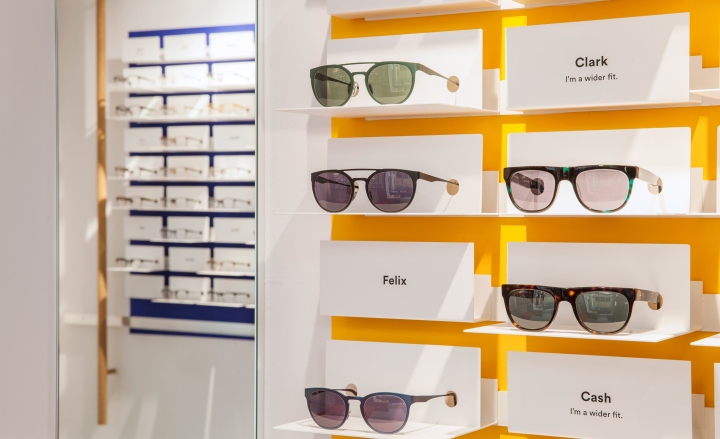
“What we see in Ace & Tate is a clear, crisp and witty tone in their visual language,” the designers told Dezeen. “They have an energetic and playful aesthetic, speaking a colourful language of the times.” In addition to adding a playful aesthetic, the colour combinations are intended to make the products stand out from the walls.
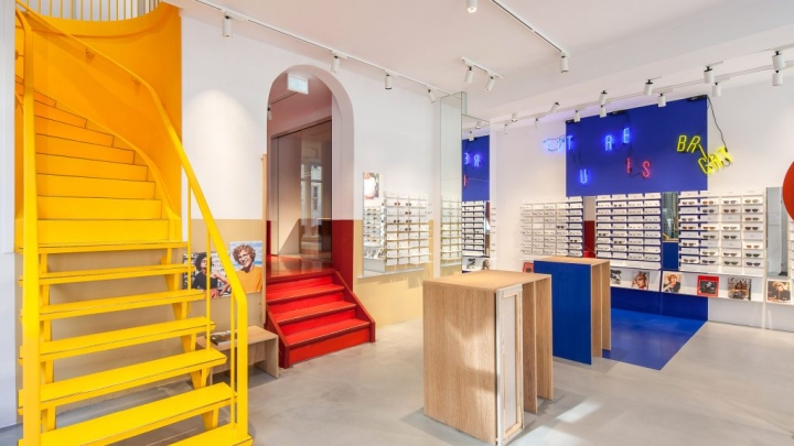
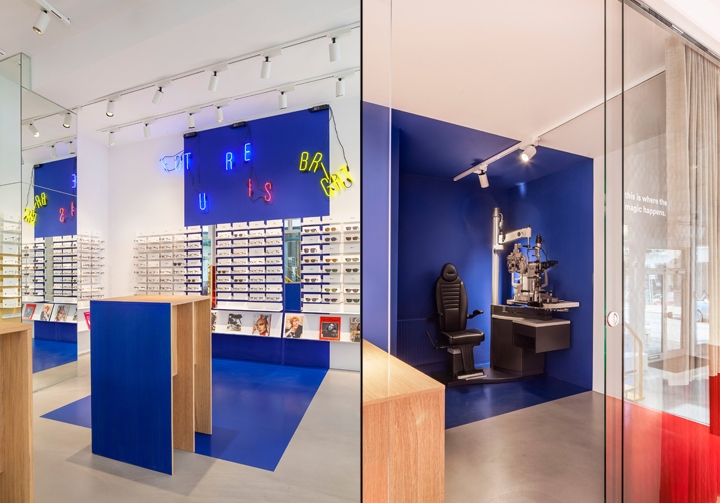
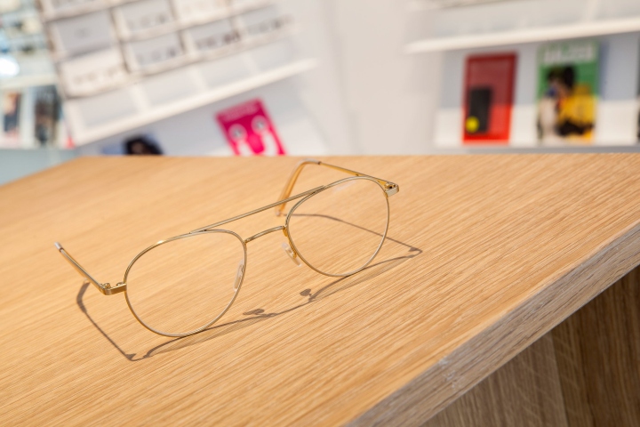
A cascading neon sign reading “future is bright” breaks up the strict colour-block scheme, as the designers hoped to inject a bit of “randomness” into the otherwise systematic design. Spacon & X also created mirrored stands from oak for customers to try on different pairs of glasses. By painting some sides in blue, the warmer oak still ties in with the retailer’s “graphic and artistic” visual language. Panels made to look like reversed canvases on the stands also add to the artist-studio theme.
A red colour-blocked curtain draws the eye to the back of the store, where the vision-testing room is located. The alcove in which the customer’s seat is placed has also been painted in blue, to create a more isolated feel. Before the store’s interior was built in, Ace & Tate collaborated with emerging artists by offering them their empty shop as an exhibition space, which further influenced the artist-studio narrative. Now the store is filled, the retailers support lesser-known artists by the Creative Fund grants they offer.
When a customer purchases a pair of frames from one of their stores (with various locations in the Netherlands, Belgium, Germany, Denmark and Sweden), the purchase contributes toward these grants. Artistic spaces often inform Ace & Tate’s visual identity – their store in Utrecht was designed based on minimal exhibition spaces and another in Antwerp features a clean and stripped-back interior with colourful artwork.
Design: Spacon & X
Photography: Wouter van der Star


Add to collection