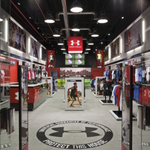

Fund Grube Varadero by Mostaza Design, Maspalomas – Spain
posted by retail design blog on 2017-08-31
Maspalomas
Add to collection

Briefing
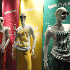
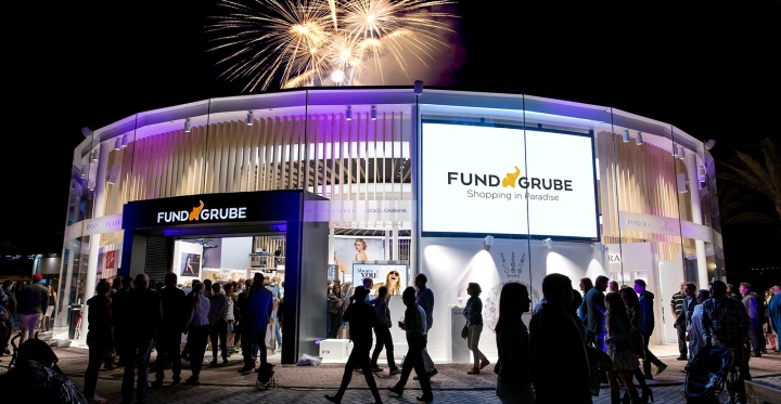
After almost 6 years working for Fund Grube, the big moment to undertake the renovation project of their most representative store, due to its privileged location in one of the best seafront promenades of the archipelago, its proximity to the central offices and the unique aspects of the building that contains it, finally came in 2015. Additionally, it is one of the most profitable stores of the brand, with sales well above those from the rest.
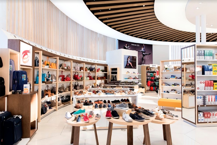
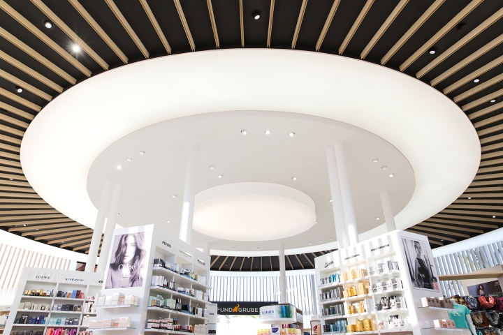
The city hall adopted an architectural renovation plan for the seafront promenade “kiosks” that allowed the erection of a 6-meter high cylindrical volume, thus marking the kick-off of the renovation project for a store that, while operating very well, was already outdated and had many possibilities. On the basis of the design line already created, the premise was to maximize the brand shopping experience by designing a unique and innovative space that would become the reference shop and project the brand at national scale, setting itself apart even more from its competitors.
Major challenge
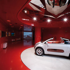
The renovation of the entire building, that is, demolition, civil engineering, interior design and product implementation works were made in a record time of just 50 days since the license was granted. The reduced time and complexity of the architectural space, forced us to a great deal of prior work and coordination between the parties, much more demanding than usual. Setting up a store inside a very high glass building involved changing the normal operation of a commercial space.
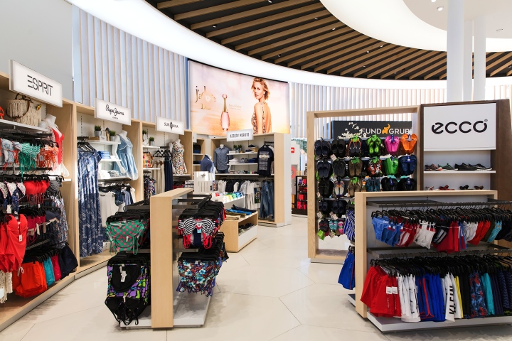
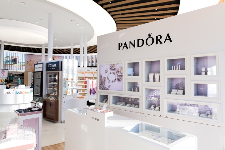
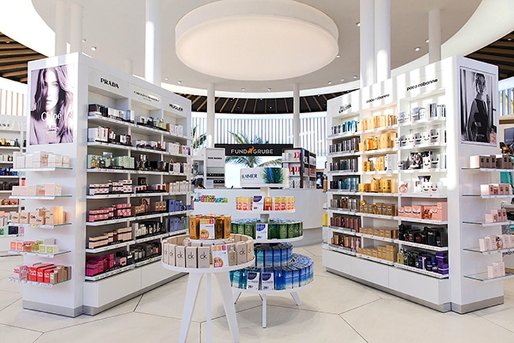
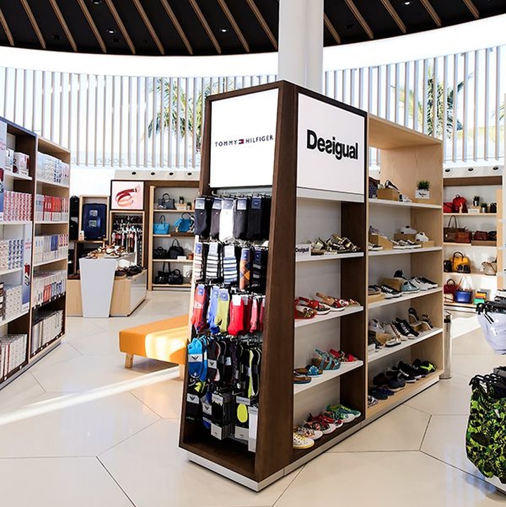
On the other hand, in spite of the large volumetric size of the building, the sales surface was far below from that of their standard stores, which required an efficient use of space to accommodate all their product lines.
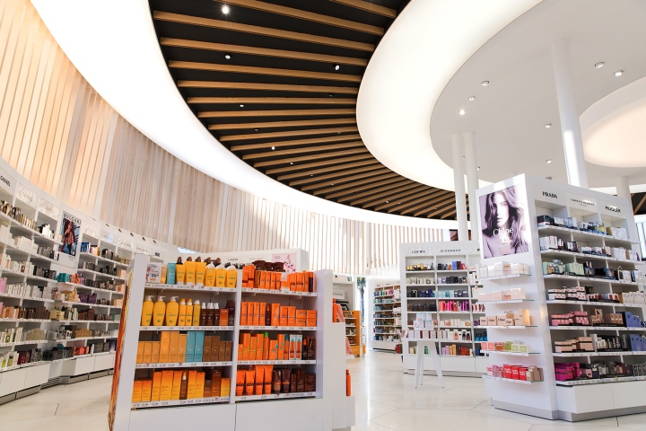
For the store to be visible from the outside and to have tall furniture at the same time, T-shaped perimeter back walls were created, with a curve shaped that freed up part of the facade, allowing to toggle between a closed shop window and store visibility from the outside.
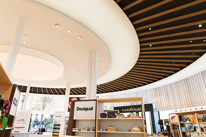
The proposed ceiling design included slat rings and backlit surfaces that would unconsciously help the customer to circulate around the shop and would confer a spectacular view from the outside, further highlighting the shape of the building. Another great challenge was the technical lighting of the store from a ceiling located at 5.5 meters. We needed to get high luminosity on the product, and we wanted to do so by placing in-ceiling grouped luminaires without hanging intermediate elements.
That would bring great clearance for the space. We solved this with a single technical luminaire, modified specifically for this store with different possible optics and lenses to reach all locations. The great sunlight exposure of the building was dealt with using vertical slats arranged in the upper part of the cylinder, a distinctive element of the interior design of the stores; interspersed with 3 curved screens at strategic points of external circulation.
Great results
The refurbishment of this commercial space has meant not only great recognition for the brand at all levels and presence in the media. The high sales have been increased by 20% since the opening due to an increased penetration and higher.
Design: Mostaza Design


Add to collection