
Precita jewellery boutique by Stefano Tordiglione Design, Ho Chi Minh City – Vietnam
posted by retail design blog on 2017-09-27
Add to collection


Emerging young jewellery brand, Precita, has opened a strikingly stylish flagship in the centre of Ho Chi Minh City. Traditionally focused on monetary value, the Vietnamese jewellery market is challenging for international trends. With this in mind, Stefano Tordiglione Design has sought a balance between sensitivity and boldness, introducing fashionable jewellery pieces in a modern and chic light with an eye on the classic vogue.
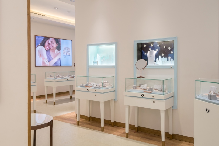
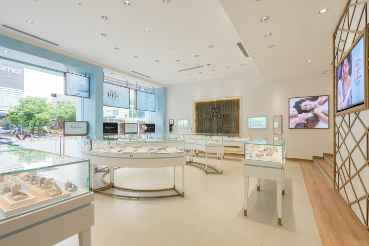
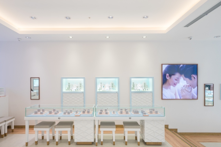
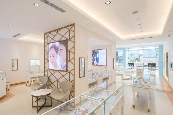
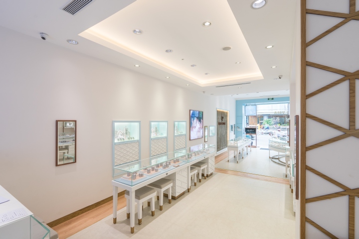
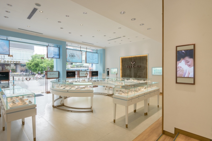
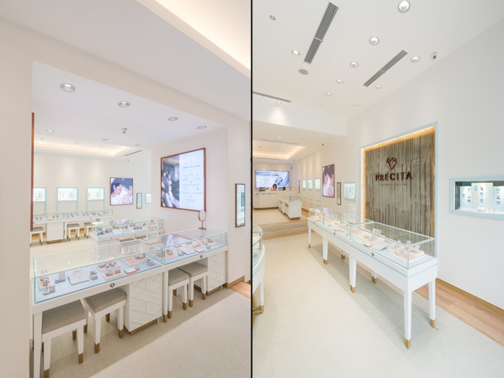
Visitors are led into the bright store by the jewellery cabinets with smooth lines of subtle blue edging. The grandeur and the historical structure of the Vietnamese building is dissolved by soft stucco white walls and large wall cabinets reminiscent of windows, where a sense of contemporary is highlighted in a touch of sky blue–the official colour of the brand. The feature wall behind the circular display unit highlights a geometric pattern reinterpreting the word ‘Precita’ in oak and glass, a unique expression of the brands identity created by the designer.
The VIP area displays higher value items in a secluded area inside the boutique. Here transparent cabinets and mirrors are accompanied and differentiated by wooden lines, which descend to hold them suspended in an atmosphere of lightness and curiosity. The floor is a deliberately open space that looks out over the entryway, inviting a breath upon entry and exit with an ample double-height space over the 8- meter high façade.
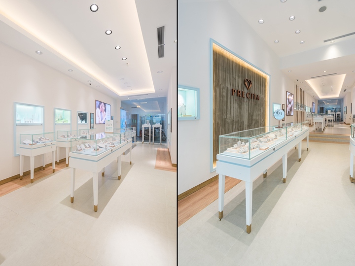
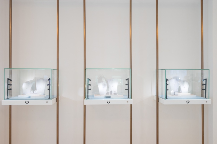
The materials were chosen to represent the character of the brand. The cabinets are off white, with subtle recalls of the Precita pattern in relief, rose gold coloured metal edging the glass and brand pattern and colour. The brand logo frame is given modern assurance by a scraped concrete background, while clean grey stone flooring is surrounded by oak to add warmth. Wood also holds the legs of the cabinets where they meet the floor, giving a sense of lightness. The store lights marry form and function, illuminating the precious pieces and also forming a starry night from the exterior.

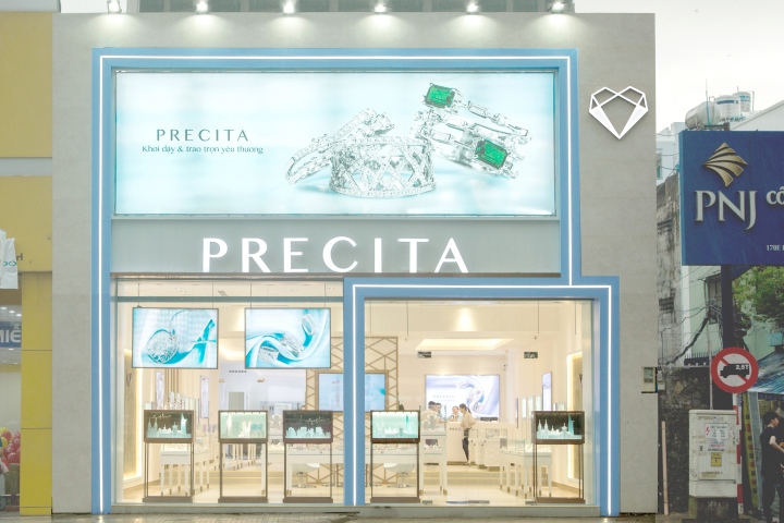
The façade, inspired by American 1950’s style, stands unique and clean. It expresses the defining elements of the store in layers – the cool blue lines against clean beige stone, the unique Precita pattern that forms the visual identity of this new brand. Together with the repeated light fixtures, they all combine to create a tone of graceful dynamism. At night the LED lights come on, framing and confirming the presence of a new brand, and a refreshed way of thinking about jewellery.
Design: Stefano Tordiglione Design Ltd.
Photography: Precita


Add to collection