

Add to collection
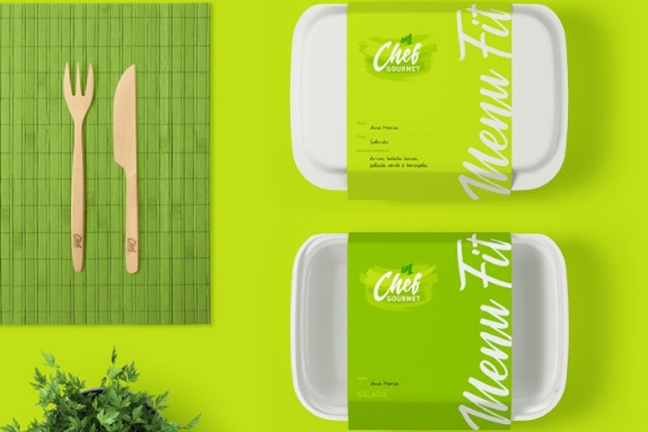

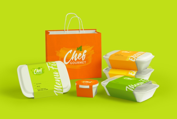
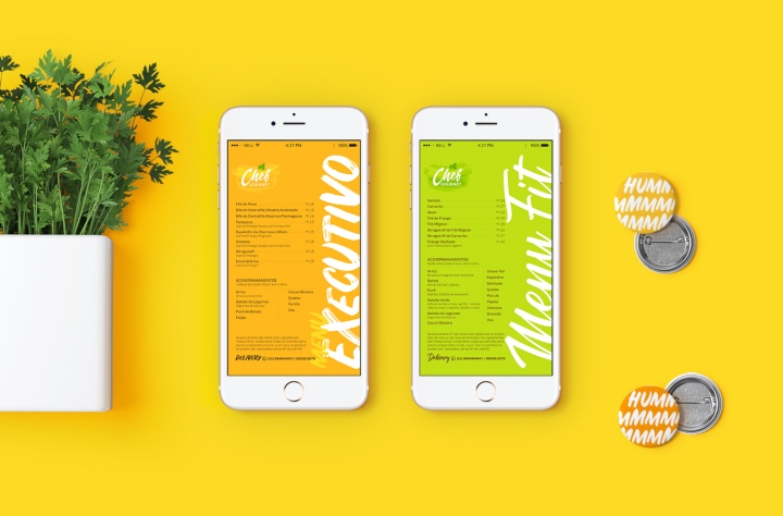
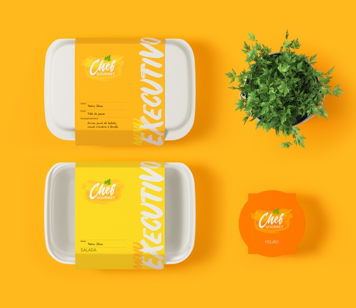
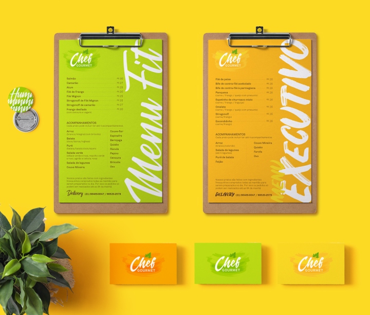
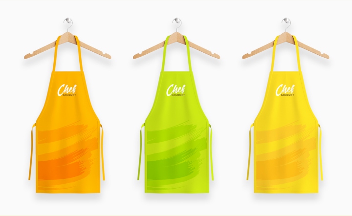
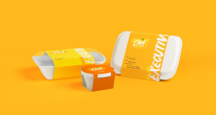
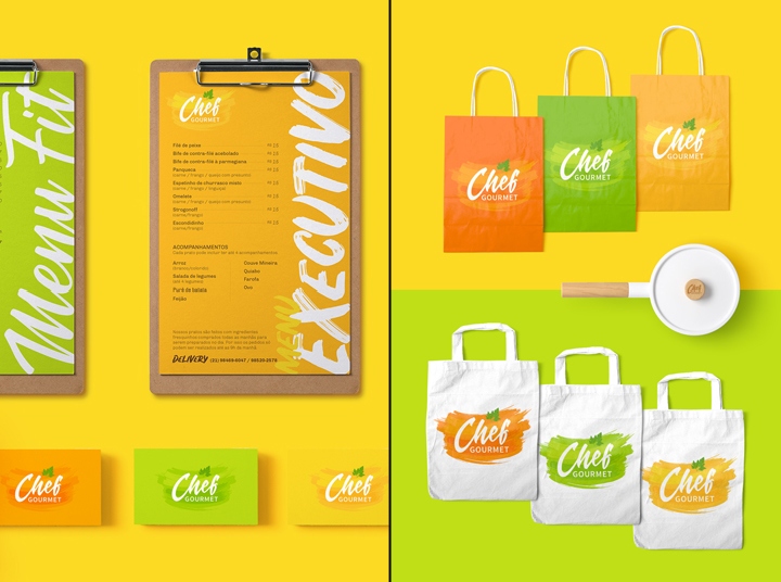
Chef Gourmet is a delivery restaurant based in Rio de Janeiro. Directed to the public that has a dynamic and busy life, the restaurant’s proposal is to offer a healthy and balanced diet, combining quality, comfort, and practicality. Our role was to redesign the brand and create the new visual identity, differentiating its two products: Executive Menu and Fit Menu.
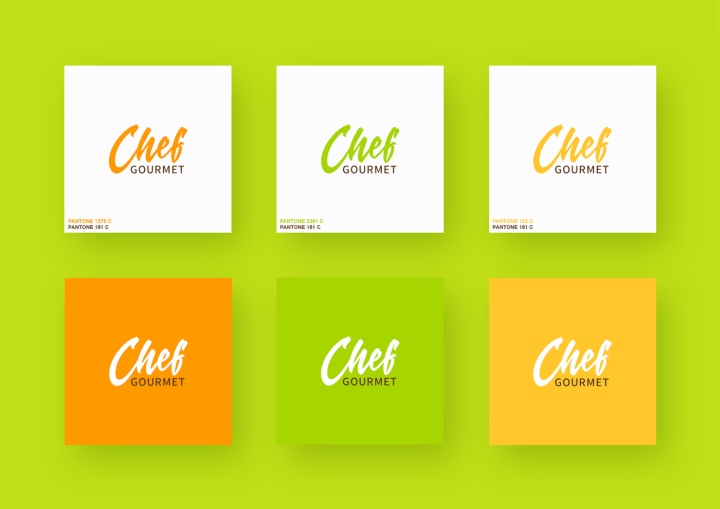
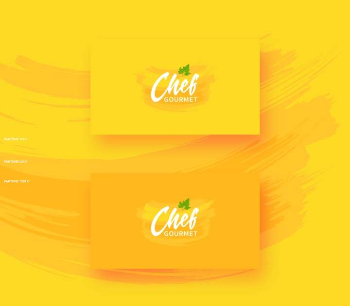
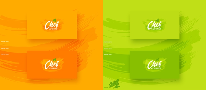
To give different personalities to each of the menus, we chose two different styles of handwriting typography and a varied color palette. The Executive Menu uses shades of yellow and orange and a typography inspired by the vernacular calligraphy, referring to the popular dishes of Chef Gourmet. Tones of green and a brush script typography, smoother and more fluid, refer to the lighter dishes of the Fit Menu.
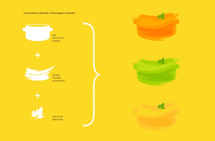
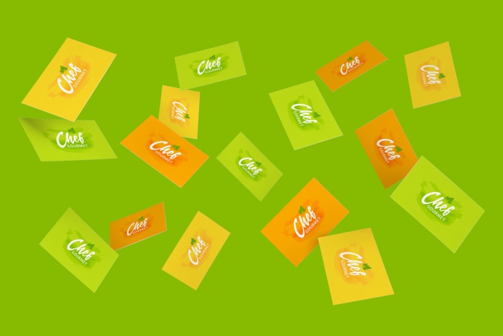
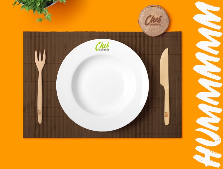
The main supporting element of visual identity is composed of brushstrokes that form the stylized figure of a pan, where, in the kitchen, the magic happens. These brushstrokes, like the handwritten typography, refer to the manual preparation of the dishes. The final touch is the decorative sheet of parsley, representing the care and the affection with the flavor of each dish. Chef Gourmet is colorful, vibrant and a delight to Brazilian cuisine lovers.
Design: Natalia Azevedo and Rafa Mota / Ricebean Studio


Add to collection