ABC department store by Kinnersley Kent Design, Lebanon – Beirut
posted by retail design blog on 2018-02-28
Add to collection

ABC S.A.L. and leading design studio Kinnersley Kent Design have launched the latest ABC department store in the famous Verdun quarter of Beirut, Lebanon. ABC is a name that has been engraved in the hearts and minds of the Lebanese shopper for over 80 years, ever since the retailer opened the Middle East’s first department store in Beirut in 1936. The new 107,640 square foot ABC department store – the anchor for the new $300 million ABC Verdun community mall – features a stunning design by Kinnersley Kent Design, an award-winning design consultancy based in London and Dubai. The design studio was responsible for creating the interiors concept, masterplanning the store layout and adjacencies, customer flow and circulation, developing the overall store personality plus look and feel of each department. Kinnersley Kent Design also developed the brand guidelines for the concessions, to ensure a unified fit out while providing individual brands with the freedom and flexibility they require.

The new Verdun department store follows the design consultancy’s redesign of ABC Achrafieh department store, which re-launched at the end of 2016. Kinnersley Kent Design’s interior concept unifies the Verdun and Achrafieh stores with a single design vision. Beirut is a city of contrasts, with an “energy, soul, diversity and intoxicating atmosphere that make it a vital, addictive city”. Taking inspiration from Beirut’s unique and distinctive personality, the store concept is based upon juxtapositions, energy and theatre. The interiors are a vibrant mix of glamour, elegance and sophistication, with standout materials that contrast the gritty with the glamorous. The resulting aesthetic is premium, bold and contemporary, with an urban edge.
The concept features subtle ‘ABC’ branded elements which underscore the retailer’s identity and heritage. ABC’s visual merchandising team collaborated with Kinnersley Kent Design throughout to bring creative new ideas in-store, and carefully curated the brands as a mid-premium mix of fashion-forward local and international brands. Clearly defined focal points in-store such as ‘Stylist Pick’ showcase the retailer’s edit, helping strengthen its own voice. New multi-brand areas within men’s and women’s fashion are used to launch or trial new brands in the market.

Throughout, the concept is designed to subtly remind the customer that they are shopping in ABC. In doing so, the concept elevates the department store from ‘a house of brands’ to a branded experience in its own right, reflecting its status as one of the country’s leading fashion retailers. Tania Ezzedine, Head of Real Estate at ABC, commented: “We are very happy with the retail concept of ABC Verdun Department Store. With Kinnersley Kent Design, we have developed a clear design and identity for our department stores that can be rolled out to other projects. The new addition of Verdun to ABC’s portfolio has elevated the standards of the Lebanese retail scene, and initial feedback from customers and tenants is very promising.”

DESIGN APPROACH
Layout and uniquely ‘ABC’ design elements
ABC Verdun department store is designed around a central core at its heart – an atrium void connected by escalators that flow between the four levels of the department store. Speaking about the project, Paul McElroy, Partner at Kinnersley Kent Design, commented: “The design of each of department follows a similar visual language and logic, but with a subtly different look and feel on each level to create strong individual departments. We developed new brand elements for ABC such as bespoke patterns, which strengthen the retailer’s own identity in a stylish and understated way,”

Distinctive new design elements created by Kinnersley Kent Design include patterns built around the shape of the brand’s logo. As pattern is intrinsic to Middle Eastern art and design, the bespoke motifs subtly celebrate the retailer’s heritage. These ‘own brand’ elements are strongest in the areas around the atrium, reinforcing the strong central architectural feature while also strengthening the personality of the store. ABC patterns appear in metal screens behind the cash & wrap areas, and a statement pattern floor which surrounds the atrium void on each level. Comprising white, light and dark grey ceramic tiles, the floor references traditional Lebanese tiles but with a thoroughly contemporary approach, and creates a unified look throughout ABC’s department store portfolio.

ABC’s seasonal edit of the latest looks is showcased on geometric plinths in this area, animating the surrounding space and creating visual ‘pause points’ that break up the branded concessions. Alongside the escalators in the atrium void, glass box vitrines appear on each level. They function as mini shop windows for each department, showcasing seasonal collections. Cladding is applied to the escalators throughout in perforated metal powder-coated in off-white, with bold lines of inlaid LED strip lighting.

Overall look & feel and material palette
The overall colour palette is stylishly muted, with glamorous accents such as gold or bronze which vary by floor. In line with the interiors concept, the material palette combines elegant and industrial materials, such as brass against concrete and decorative details versus slick contemporary forms. Core materials include white and grey ceramic tiles, with white appearing around concessions and lighter grey signalling walkways; metal merchandising frameworks in white, brushed brass and black; cool bright LED lighting; and standout materials such as polished white marble and linear-veined, bronze-tone travertine. The restricted colour palette of off-white, greys and matte metals increases the premium feel of the store, complementing rather than competing with the brands and products on offer.

Lighting scheme
The lighting throughout was developed by IDEPCONSULT – Mounir Saroufim and Partners, and coordinated with Kinnersley Kent Design and local architect A-Consult. The scheme is based on the psychology of the customer and wayfinding strategies in line with the Limbic Emotional Assessment (LEA) theory, which asserts that various target groups respond differently to various lighting implementations, and that the effectiveness of lighting and the buying behaviour of the addressed customer group are very closely linked. Speaking about the lighting strategy, Chérine Saroufim, IALD at IDEPCONSULT said: “The lighting concept was slightly altered on each level of the department store to cater for the different target customer groups and enhance their sense of wellbeing. This extends the amount of time customers spend in store, boosting sales.”

DESIGN WALK THROUGH
As well as designing the overall store concept, Kinnersley Kent Design also created the interior identity of each department and developed the design of the façade.
Façade
The main entrance to the building opens onto the street in a curve, with huge double-height glass walls offering views into the store, inviting the shopper to come inside and discover. Kinnersley Kent Design revised the original proposed façade, introducing large, over-sized display windows encased in dulled brushed bronze. The design studio also added a unifying grey basalt stone tiles to the department store’s exterior walls, inlaid with illuminated ABC logos. Also used successfully in the redesign of ABC Achrafieh, the basalt exterior creates a unified aesthetic across the retailer’s portfolio of stores.

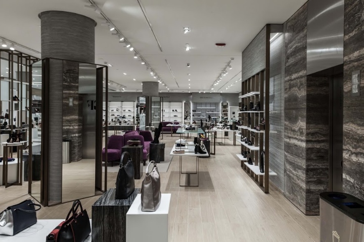
Level 0: Beauty, Accessories & Women’s Shoes
The overall aesthetic of the ground floor is light and airy, with a material palette of pale marble, light grey and timber-effect tiles. Dulled bronze and ‘gold’ satin brass metalwork screens are used to divide the space, whilst brand canopies above the Beauty concessions are primarily black to ensure consistency. The overall effect is glamorous yet understated. On this floor, the cash desks either side of the escalators are made of high-gloss white marble, backed by screens formed of ‘ABC-pattern’ fretwork and white gloss. An embedded digital screen in the panel communicates brand and product promotions to customers.

Feature lighting appears above the statement pattern floor surrounding the atrium void. It comprises striking inlaid lighting strips that cut across each other in curved, abstract lines. The space is further illuminated by numerous LED spotlights, which create a glimmering impression. Fragrance, which lines a perimeter wall, is delineated by vertical metalwork in ‘gold’ brass which stabs upwards and downwards. The metalwork acts as semi-open screens while also giving the sub-department greater prominence. The department is designed as an ‘ABC’ retail space with an identity that is consistent with the redesigned ABC Achrafieh, ensuring the customer receives the same unified, premium level of experience across the retailer’s portfolio.

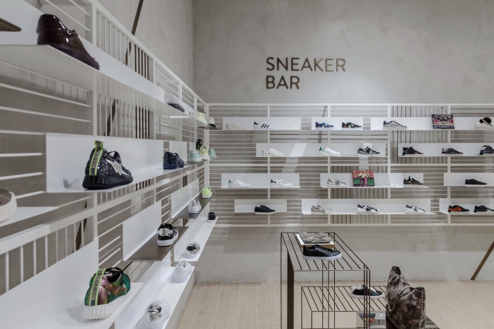
Again, Women’s Shoes has its own distinct yet complementary look and feel. Running down almost an entire elevation of the store, it is differentiated from Beauty and Accessories by the use of light timber-effect floor tiles and grey travertine polished plaster walls. Dulled brushed bronze is used as a framework throughout the department, from the legs of mid-floor units to vertical display shelves that act both as both screens to divide up the space and shelving, displaying the products on floating white shelves. Bespoke geometric mid floor display units in matte off-white and black soapstone act as solid plinths to champion individual products. Plush sofas upholstered in ‘ABC purple’ velvet add a splash of colour, inviting customers to sit down and try on the shoes. Housed in the corner of Women’s Shoes is the Sneaker Bar, an ABC-owned ‘shop-in-shop’ mini department. Appropriately for the product, this corner has a more urban aesthetic. Walls are plastered in rendered concrete while the white powder-coated shelving framework is reminiscent of metal walkways.

Basement: Kidswear and Toys
Kidswear’s whimsical ‘townscape’ concept takes inspiration from pop-up books. Largely white, in keeping with the wider store concept, it is animated with pops of pastel baby blues, oranges and blue-greys. Little ‘houses’ appear throughout the space, from merchandising units to fitting rooms. Village scenes are formed of childlike graphic shapes such as 3D bikes, benches and trees, made of plain and white plywood cut outs slotted together. The house motif appears again behind the cash desks. Made up of light ash panels perforated and punched with colourful wooden pegs, they are evocative of traditional wooden games.

In Kids’ Shoes, house-shaped white metal units line the perimeter wall, displaying products on light oak shelving. The ‘house’ motif is echoed in the changing rooms, where the cubicles resemble playhouses, making the shopping experience fun for children. Wooden coloured pegs on the wall function as clothes hooks – both playful and practical. ABC introduced a kids’ entertainment area called ‘Creyayte’ to help make the department into an entertainment destination for families. The space hosts plays, puppet shows and storytelling, plus birthday parties and art classes to help kids unleash their creativity. The lighting levels were slightly dropped on this floor, and IDEPCONSULT carefully studied the contrasts in order to avoid overexciting children as they shop with their parents.

Level 1: Womenswear
The materials palette of Level 1 is similar to the Ground Floor, with the same predominantly off-white and light-ash materials, accented with brushed bronze accents. Kinnersley Kent Design defined the typical perimeter brand fits, with an elegant geometric bronze framework which is used to define concessions. The elegant, curved lines of the ground floor’s lighting scheme appear on this level, but offset rather than inlaid. Dramatic stage-like focal points are created by large hoop pendant lights, suspended over geometric plinths with mannequins modelling ABC’s seasonal fashion picks.

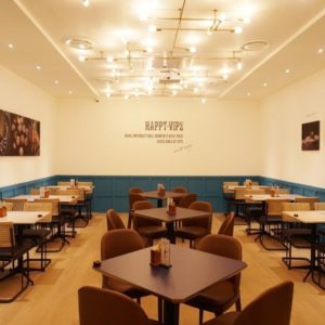
The look and feel of the Activewear department, ‘The Fitters Corner’, is inspired by gymnastic studios, with clothes rails that take visual cues from crossbars, and triangular flooring and pyramid mid floor units taking inspiration from gymnastic blocks. Customers can linger and dine on this level at La Mie Dorée, a casual dining patisserie with a traditional French feel, which boasts great street views of Verdun. La Mie Dorée is an institution in Beirut and also long-established at ABC Achrafieh, offering customers delicious food and a stylish place to socialise.

Level 2: Menswear & Home
ABC and Kinnersley Kent Design sought to create a rich holistic offer for Menswear. Rather than housing the typical department store mix of men’s brands, Menswear at ABC Verdun offers a lifestyle experience that includes elements such as a bookstore and barbershop. Menswear’s contemporary look and feel is in keeping with the rest of the store, but with darker and stronger materials. In contrast to the ground floor and womenswear, mid-grey stained timber is used in place of marble and gloss white, and black metalwork and mesh instead of bronze. The statement lighting around the atrium void features angular straight LED strips, suspended from the ceiling. To enhance the shopping experience and to better attract the customer’s attention, the lighting was coordinated with the interior finishes to create contrast and areas of higher and lower illumination.

As in Womenswear, men’s seasonal collections are demarked by feature lighting, but feature short, sharp criss-crossed LED strips rather than hoop pendants. Hexagonal plinths in light grey ‘concrete’, matte black and black mesh are grouped together underneath to form plinths for the fashion collections. Men’s Shoes has a private member’s club feel, with dark timber cabinet-style display units, warm leather bench seating and a light ash grey parquet floor. Textured light wallpaper and black photo frames add to the lounge mood. The Home department’s neutral colour palette helps hero the products on sale. Its design focuses on providing flexibility, with a modular, tiered merchandising. Display units are made of light oak units topped in white corian, and white powder-coated metal with glass shelving.
Lead designers: Kinnersley Kent Design
Local architect: Dolly Debs Architects (A-Consult)
Main contractor: Techman
Lighting design: IDEPCONSULT – Mounir Saroufim and Partners
Photography: Courtesy of IDEPCONSULT – Mounir Saroufim and Partners


Add to collection