

Add to collection

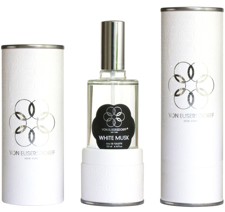
Floral designs ubiquitous from the end of the nineteenth century are rare today as most of the contemporary ‘mass market’ perfume labels bear the name of a couture designer. The design for Von Eusersdorf brings back the flower as the traditional ornament for fragrances.

And goes also back in history as it draws attention on the name of the label founder’s ancestors. A skilled family of German emigrants who use to run an apothecary for nearly three centuries. The artisanal world of oils, herbs, spices and petals being the initial cradle of the perfume industry as we currently know it.

With their roots in Europe, New York is the inspiring place for Von Eusersdorff today. The simple yet meticulous character of the packaging reflects the quality of the product within. As the focus of the small brand is a true commitment to authenticity. Based upon knowledge, handed over from one generation to the next generation.

Designed by using commonly available materials and manufacturing processes, the Von Eusersdorff packaging projects demonstrate that an understated end result still can look rich and sophisticated. Keys to the executions are a close attention to detail, an innovative use of materials & techniques and an accurate production.

The geometrical flower symbol serves as a short-cut to recognition. It combines the effective transmission of the message and the imaginative presentation of the idea into one bold visual statement. In a process were impact and speed highly depend on aesthetic values.

According to the compendium ‘Dictionary of Visual Language’ by Thompson & Davenport are flowers in general indicative of creativity, as in the colloquial expression ‘flowering of ideas’. Which adds a layered meaning to the graphic symbol and the specific business it symbolises.

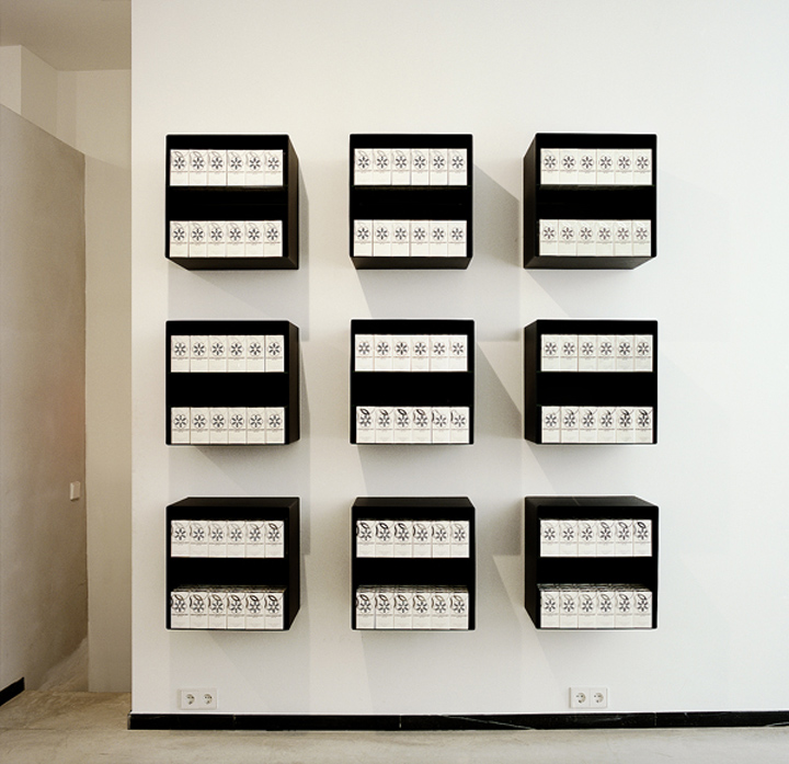
The overall graphic design approach for both space and packaging is about making 2 dimensional information function in a 3 dimensional context. Preferably through simple processes. Like the double sided logo placement on the rectangular glass bottle: that creates a subtle see-through effect when filled with the liquid treasure.

Packaging is related to an ‘advertising’ function as it is an instrument in the service of communication. Next to its more conventional functions: – to contain, to carry and to protect-. its the aesthetic value that confers character and personality to the product and turns the graphic design into a silent salesman.

Von Eusersdorff Europe Office, executive architect: Carlo Scholten, photography Kim Zwarts

http://www.stormhand.com/von-eusersdorff


Add to collection