
Crocs flagship store by The One Off, Greenhithe – United Kingdom
posted by retail design blog on 2012-06-27
Add to collection

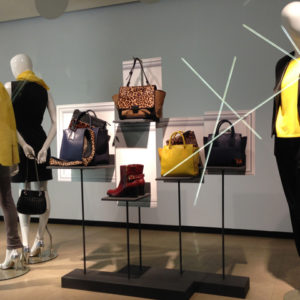
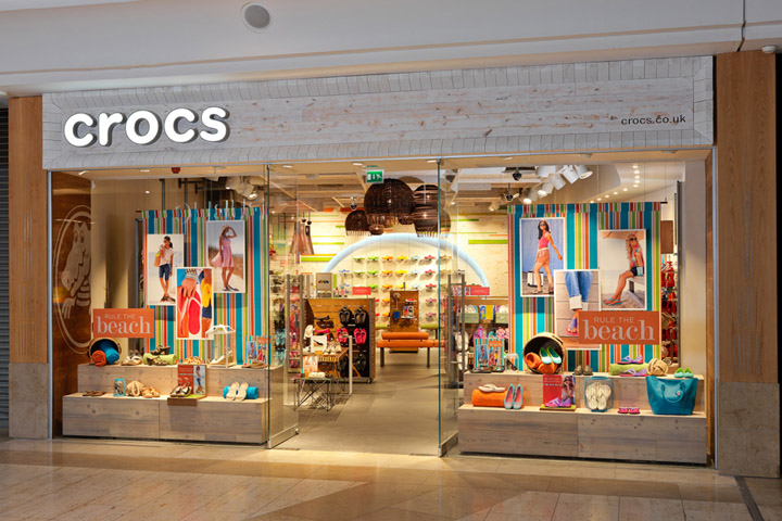
Crocs appointed The One Off to design their European HQ which was completed three weeks ago. During the creative presentation stage, the concepts were shared with the US design team who felt the brand tone of voice would work at retail. Following an insights and research tour of US and European retail stores with David Curtis, Creative Director at Crocs, the agency were asked to develop initial concepts for Crocs. The new retail presentation was to reflect Crocs as innovative, fun and comfortable. The key was building on the success of Crocs as a well loved family brand…to celebrate the brand foundations whilst creating a softer warmer environment that showcases new product ranges and open Crocs to a new international audience. A brand home that could be delivered across all markets and retail formats.

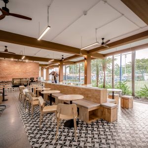
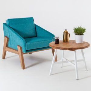
A simple honest pallet of materials was created that focused on natural texture with a hand finished quality. A refined rawness that celebrates each materials own qualities be it the patina of lacquered metal or the different grains within timber from finished to rough sawn. The use of Cedar shingle adds a warmth and connection to the traditional boat house which relates to the brand heritage… this brand was created on a boat! Glass was also used to add refinement and a fashion element; whilst reclaimed timber for the bleacher style product displays was used.
The palette of colours were inspired from the outdoors allowing the graphics and product to add spashes of colour.

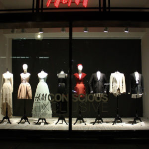
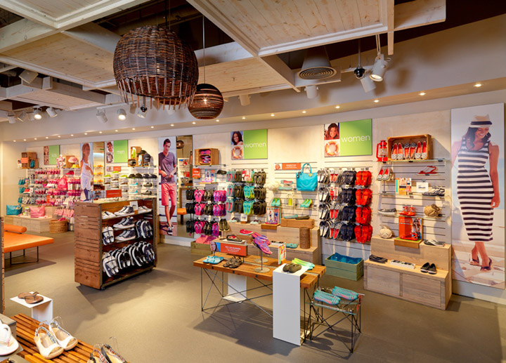
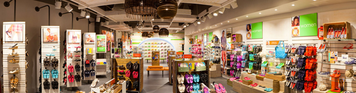
Crocs retail history was very much based on a wholesale model using self serve hanging product displays. Our goal and challenge from the start was to elevate the visual merchandising whilst still retaining some of the assortment requirements of Crocs… a diverse collection requires diverse merchandising systems and techniques to truly communicate the style behind each collection type.
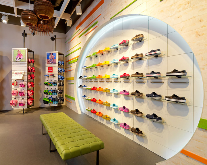
The spinners, classics wall and bleachers are all a response to this: Create compelling visual merchandising and still have stock density close by.

The spinners have been a great success as the store has the ability to flex from seasonal promotions to high density sale time without adding more sale fixturing that clutters the retail environment. The classics wall is about celebrating the iconic classic clog; elevate it to be even more of a hero than it already is and use the amazing colours for impact and make a brand destination. Never forget your heritage. Locating the display at the back of the store, allows customers to engage with new collection categories challenging perceptions of Crocs as they travel toward the classics wall before engaging with the much loved classic.

Being part of a team that really wants to challenge everyone’s perceptions and create a solution with global application was a great experience. The original classic clog is a “love ‘em or not” product…there is no middle ground. The new collection however has universal appeal. Like the Levi’s 501 in the 90’s or the 1460 DM Boot in the 00’s the key is celebrating the credibility of the brand and delivering great product… the difference is the Crocs brand is built on fun and comfort with a broader footwear collection. The Crocs design team have created the product, they just needed a home that truly reflects this young brands personality. Crocs are an amazing brand with a hugely talented team of original entrepreneurs and seasoned experts, in brand, product and retail from Nike, Starbucks and Body Shop with the vision, passion and open collaboration to excel.

Add to collection