

Client details:
Pony Craft is a part of Needle Industries, a 50 year old company located in the Nilgiris region in Tamil Nadu. The company manufactures and exports sewing needles, knitting needles, pins and accessories, snap fasteners, hooks and eyes and a complete range of related products. The company is well respected and reputed for its high quality standards. Some would even go as far to say that the company is the master in this space.Generations have sewed and knitted with Pony Craft knitting needles, so the brand has many associations for many people.

Brand brief:
The client has built its reputation over the years and it was felt that it now needed to have a company owned store exclusively for craft lovers. It was also decided that the store needed to be located close to where the company head office and factory were located, i.e. in Ooty. This gave customers the added advantage of being able to avail the facilities of the company workshop in the interest of their specific hobbies. Naturally, it was important that the store had to be very inviting and needed to give customers the feel of being in their own home workshop where they could comfortably browse, explore options and buy. The advantage of the beautiful surrounding scenery and the mountains would also add to the appeal and so the decision was made that this had to become the desired destination for craft lovers. By creating an area of light and color amidst the mountains, the brand extension created was bound to be a success.

Design strategy:
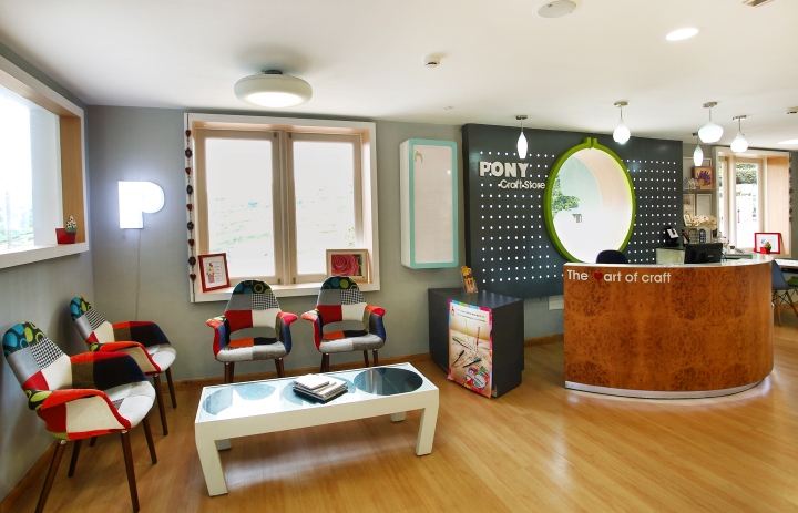
The fact that this was both a selling space and a working space meant that the store design had to accommodate the customer’s need to purchase as well as explore around trying out the different craft and hobby items that were available. The environment therefore, had to be like a spacious summer home with plenty of natural light and comfortable seating, as if the customer was in his/her own personal space. There also had to be an air of informality without being cluttered. Clean spaces inspire creativity and innovation.

Store design signature:
The store’s location in the mountains was clearly a major selling point so it was decided that this aspect should be incorporated as much as possible in the design. A combination of natural light and product display techniques that would put everything within easy distance was the way to go. The different product categories and sizes needed to be presented in a unique manner keeping in mind that there was a difference in the types of products being shown. All this was to ensure that the customer understood each product better. Even the furniture and fixtures that were being used had to have some flexibility and needed to be built around the customer experience factor. The scenario would be something like this – the customer would casually browse through the items perhaps with a hobby or project in mind. Occasionally, while looking out through the windows he/she would take in the beauty of the mountains and this would add a sense of well-being to the whole shopping and browsing experience.

Store front design:
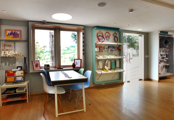
Since the store was built on a slope there were certain space constraints. The geography of the area demanded that the store façade should be simple, easy to spot and with no unnecessary fuss. It also had to blend beautifully with the surroundings. The design created had all these as well as large windows which gave the customers sweeping views of the surrounding hills and the distant mountain range.

Store interior design:
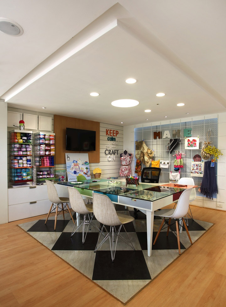
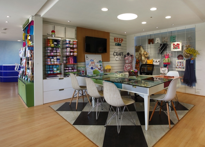
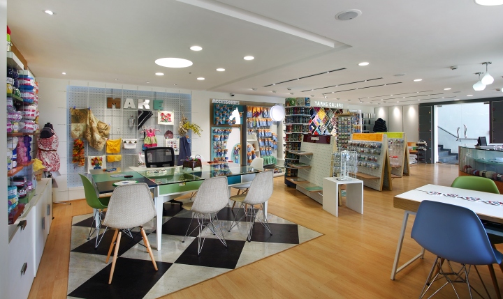
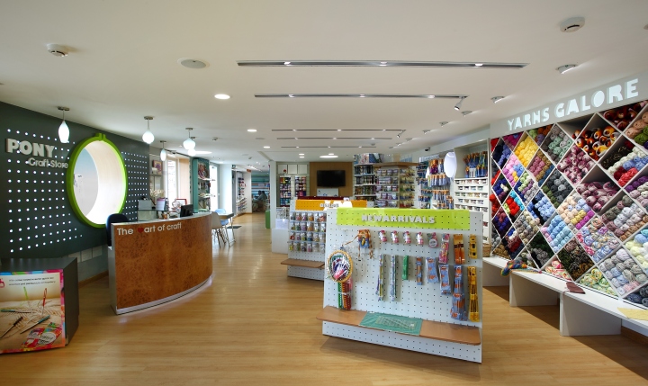
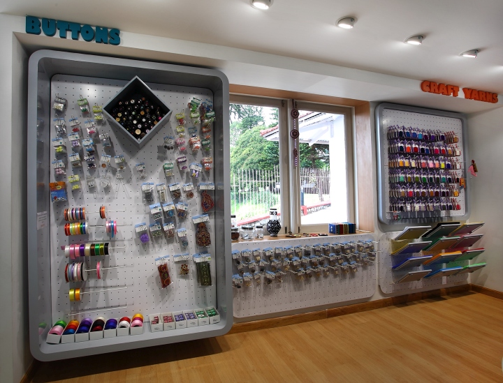
The range of products on display was large and since the categories were crafts and hobbies it was important to keep the interior vibrant and colorful. And also, depending on availability of products the décor keeps changing so that customers do not feel a lack of anything. The design is clean and simple with carefully chosen fittings and fixtures playing a significant role as well as adding to the overall ambience. White tones contrast beautifully with warm wooden flooring and vibrantly colored seating consoles. An interesting feature is the way the windows are framed like they are embroidery frames and kept open to allow the easy flow of natural light especially in area around the work tables. Everywhere there is an abundance of bright colors that emphasize the many possibilities of the Pony Craft range. No corner is left unattended, so that there is a new discovery awaiting the customer round every little nook and corner.

Store zoning and layout:
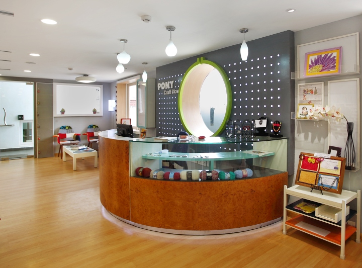
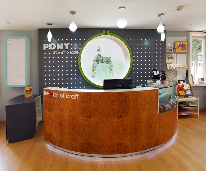
The store has been divided into different zones such as – waiting, seating, workshop, cash counter, product gallery, internet area, kids and office. The workshop and product areas are adjacent to each other so that there is free exchange of ideas amongst customers as they come upon new products or unearth a long forgotten hobby while browsing. While the kids’ area and the office section are located at the rear end of the store. In the center of it all is the cash and wrap-up section, making it easily accessible and also making it possible for one person to keep an eye on the store from this vantage point.

Lighting and ceiling:
The Pony Craft store is a marvel of natural lighting combined cleverly with regular store lighting so that the colors of the products appear at their natural best. This is especially critical when customers are looking for threads or wool to match. Lighting has to achieve the perfect balance since too much of it leaves the products looking garish. The entire store uses LED lighting and gentle little pools of it are concentrated around the work tables and special displays. The ceiling is left uncluttered especially since there was a limit to the height and the number of lights has been kept to a minimum so that there is no “overlighting”.

Shop fitting:
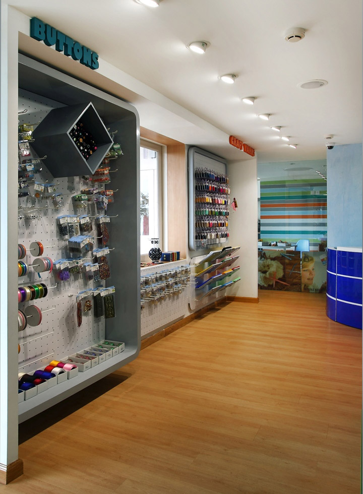
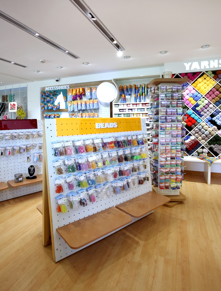
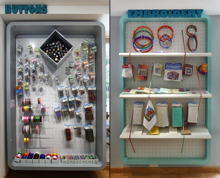
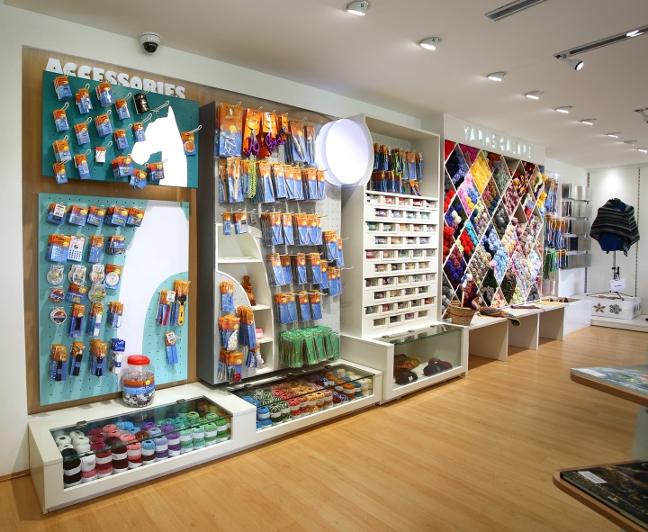
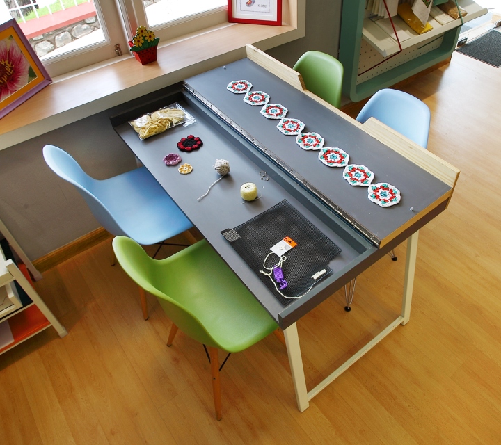
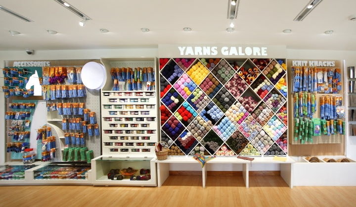
Designing the fixtures in the store was a challenge since there was no consistency in sizes, packaging systems and product usage. The main fixture is perforated to include several sub-fixtures. Among the many items that need these fixtures are bins, floor and wall holdings which are essential for accommodating the different types of products on display. The work tables are modular and foldable making it easy for customers who come to the store for workshops to put away their craft items in an organized manner. A major part of the display is taken up by yarns and knitting needles and these are displayed in a way to attract the most attention. Wool and yarn displays add vivid pools of color to the store interiors.

Visual Merchandising and display:
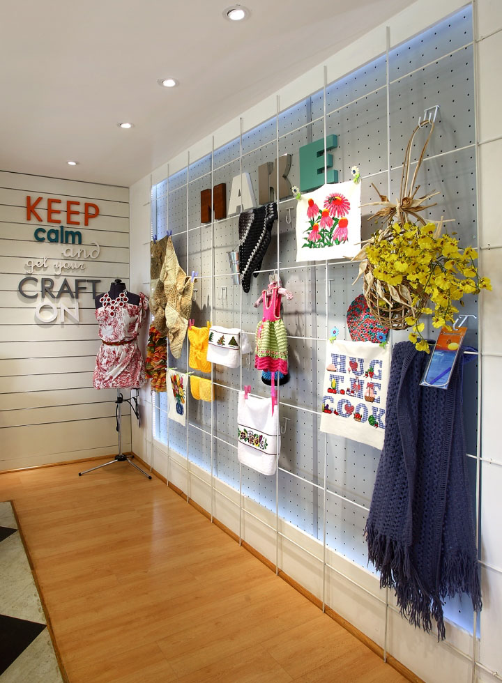
Craft products make for entertaining visual displays. There are many options available for each sub-category and the right type of displays can do tremendous justice to the product. There is room provided on the workshop wall where an entire craft project can be pinned, clipped or hung. This has the additional advantage of being a visual merchandising tool to support and display a product that is on sale as well as acting like an art gallery of craft work for a customer who is looking to browse through. Using wall space in an interesting manner is the hallmark of the Pony Craft store. It also gives customers who put their work up on a wall a sense of pride and accomplishment which in turn translate directly into customer satisfaction.

Graphics and signage:
The signage clearly outlines the product category and also captures the fun element of the products. The customer can easily get the details through the signage and can recognize a product or product category, right away. The pony imagery is ubiquitous since it is the brand name and ensures that it becomes the clasp that holds the different products together.

Innovative use of material and finishes:
Powder coated metal, puck boards, ss sheets, wood painted letters, perforated panels, textured and plain finished laminates, textured paints and tinted acrylics are some of the things used through the store to keep an aesthetic, bright and creative look. Each one of these has a different feel and inspires assorted ‘looks’, which add to the Pony Craft range.
Design: 4D
