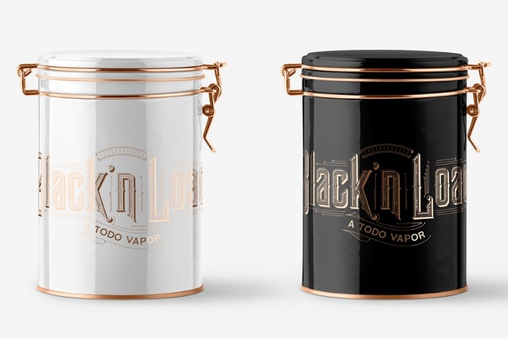
branding/branding/café & tea house/hotels & restaurants/packaging/spaces/stationery/visual Add to collection Black’n Load by Ricebean Studio & Tomás Miller, São Paulo – Brazil posted by retail design blog on 2018-08-15
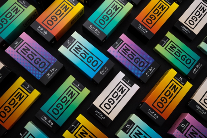
branding/branding/packaging/visual Add to collection INDIGO packaging by Fabula Branding posted by retail design blog on 2017-04-28
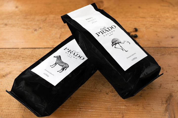
branding/branding/packaging/visual Add to collection Café Prado packaging by Miklos Kiss posted by retail design blog on 2017-02-13
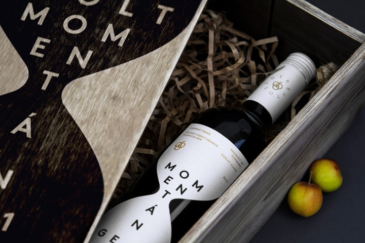
branding/branding/packaging/visual Add to collection Momentán wine label by Kiss József Gergely posted by retail design blog on 2016-10-21
branding/branding/fast food/hotels & restaurants/spaces/visual Add to collection Starbird Chicken identity by Strohl, Sunnyvale – California posted by retail design blog on 2016-09-05
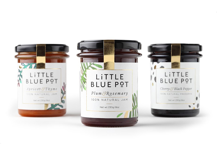
branding/branding/packaging/visual Add to collection Little Blue Pot branding by Coba&Associates posted by retail design blog on 2016-05-25
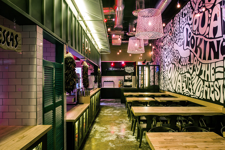
fast food/hotels & restaurants/spaces Add to collection Salsa Fiesta restaurant by Greg Gayle & Casa Conde, Miami – Florida posted by retail design blog on 2016-04-23
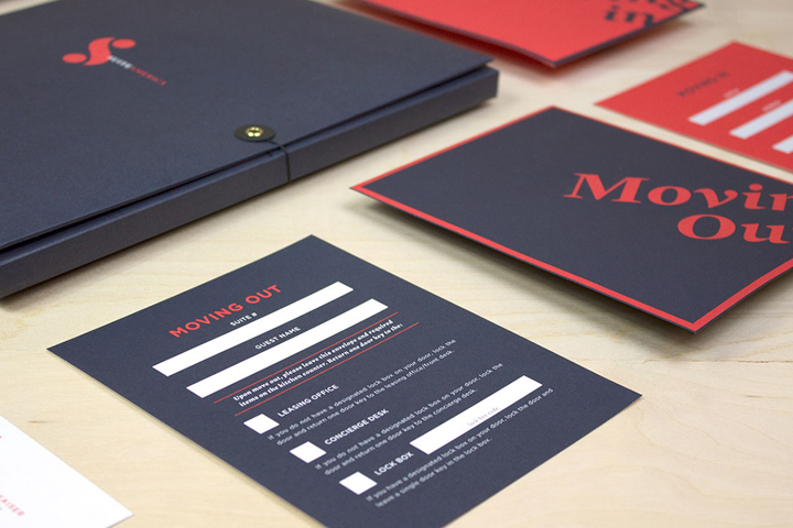
branding/branding/stationery/visual Add to collection SuiteAmerica rebranding by Omnibus Design posted by retail design blog on 2016-03-04
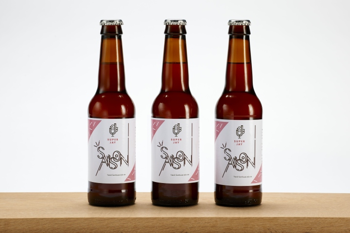
branding/packaging/visual Add to collection Super Jay Saison packaging by Pope Wainwright & Wykes posted by retail design blog on 2016-02-28