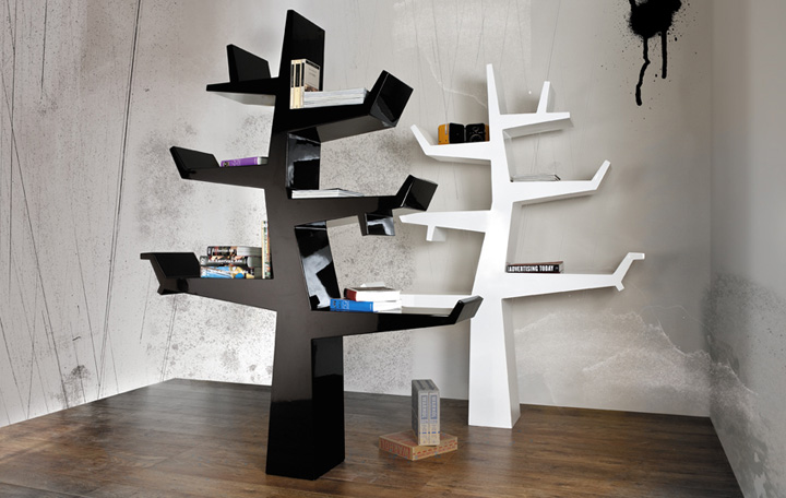

There’s something decidedly creepy about trees stripped of their greenery, left bare as skeletons, shaking their knotted arms at you, pointing with their gnarled fingers. They seem dead in that state, but in actuality they’re somnolent, awaiting next spring’s reawakening. And that’s a little creepy too—because they seem poised for animation. This uncanny aspect also makes bare trees rather attractive, particularly to people who like to read The Anatomy of Melancholy and leaf through archaic alchemical manuals. In truth, the bone trees appeal to a much wider audience. This is evident in the popularity of Ansel Adams images, Julie Taymor set designs, and Tim Burton animated films. The look has now been translated into a bookshelf entitled Wintertree, designed by Twentyfirst.

In black or white, Wintertree holds out six shelves in an asymmetrical pattern that represents bare branches. An expressionistic, if not downright cartoonish (I mean that in a good way) form, the trunk with limbs makes a perfect place for books. What books? Wintertree might hold only books that deal with woods: nonfiction titles such as The Life & Love of Trees and novels such as The Baron in the Trees. It might just as easily house a children’s library—perhaps with a special place for The Giving Tree. Not to be too literal, Wintertree is also a perfect place to display books about form: from A+D books to anatomical tomes to histories of skyscrapers. In fact, it’s an ideal spot for architecture monographs. If you like arranging books by color, try placing all your red-spined books on the white Wintertree or all your lime-spined books on the black Wintertree—or white on white and black on black. If you’re not an avid reader, use the shelves to arrange any collection: line up your troll and kewpie dolls, or scatter your aluminum lunchboxes. Twentyfirst wants to create products for a whole new century—as you might have guessed—and Wintertree is one step in what I hope will be an entire forest of design.



Add to collection
