

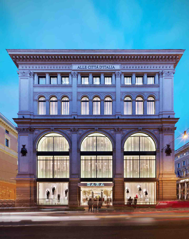
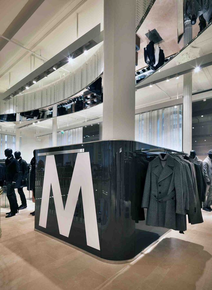
I stay in Rome for business only rarely and I must admit I never paid attention to Palazzo Bocconi, an almost cubic neo-renaissant palace, on Largo Chigi. At the first on site visit the unexpected exceptionality of the architecture lets perceive the original intentions of the architect: extraordinary interior volumes which open through inmense windows towards the city. The former tenant had closed these windows for merchandise reasons and for technical reasons, the passage of the implants.

I presume at the time of construction, 1886, this building – with its pure geometry, compact and yet light, thank to the enormous external surfaces in iron and glass – would have the same effect that the kunsthaus glass cube in Bregenz had in more recent years. Frequently, when we design retail spaces we have to intervene in historical buildings which were not designed for this purpose.
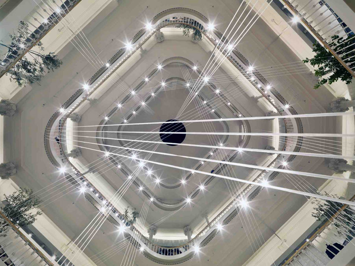
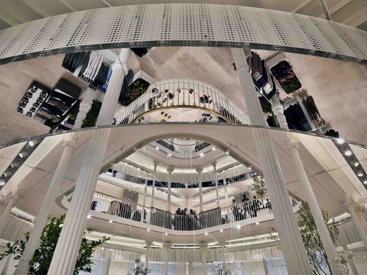
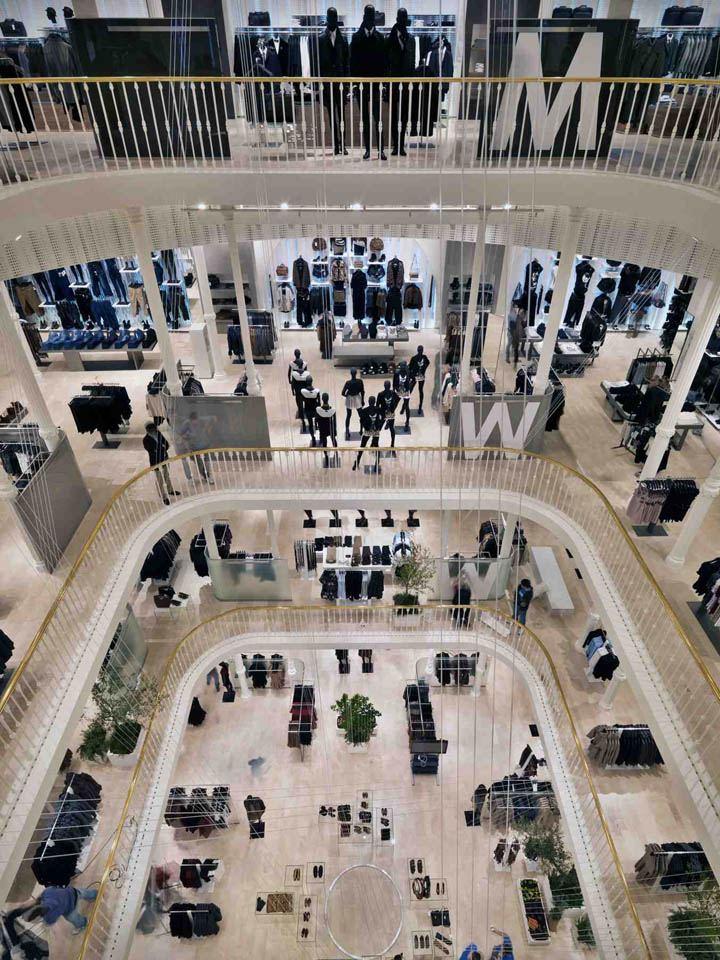
The violence we are forced to use on these places can contain the seed of beauty, of contrast, of the unexpected. For example, we happend to create a commercial space restoring the remainings of a Paleochristina church. In the case of Palazzo Bocconi, the building was originally designed with a commercial aim. The volumes are made to be seen as a unity, the sight crosses the whole space. The volumes, the architectures take you by the hand and you cannot do anything but following them.

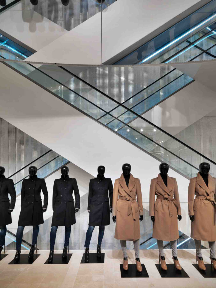
You cannot add anything, you can only remove what does not fit. To restore the light, the lightness, the transparency, the thin size of the original floors became a must. The central patio cannot hosts icons as it is an icon itself. Certainly the commercial spaces have now changed compared to one century ago: there are needs for safety and climatization, the amount of people has increased enourmously and the merchandising is much different.

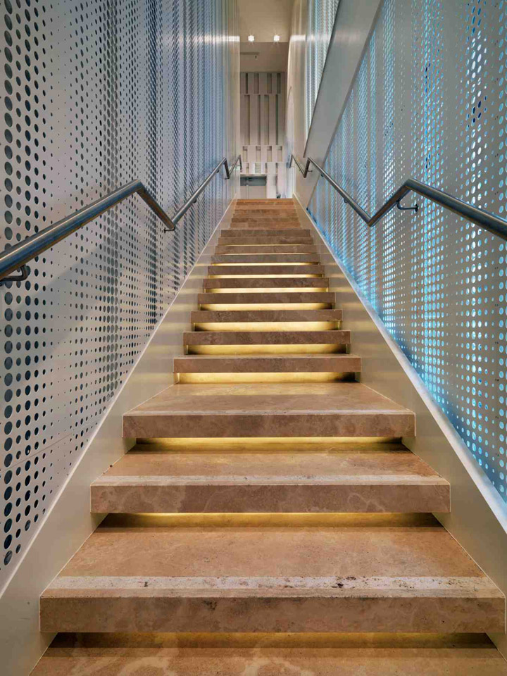
The project must create the armony among these requirements and the architecture, the soul of the building; this task is eased by the passion and the competence of the client. On the exterior we have re-opened the large windows towards the city, creating a filter, which acts as an osmotic membrane and embraces all floors inside the cube / building. Inside each window has a double metal sheet shaped as a drapped curtain. The holes of the two metal sheets are coicident: facing them you can see outside, the sun, the rain, the city life; passing by them you perceive only the light which enters with different effects according to the time of the day. Seen from inside the metal sheet is naturally fit for hanging and shelves.







Architects: Duccio Grassi Architects
Photos © Andrea Martiradonna
http://www.archdaily.com/120947/zara-rome-duccio-grassi-architects/
Add to collection
