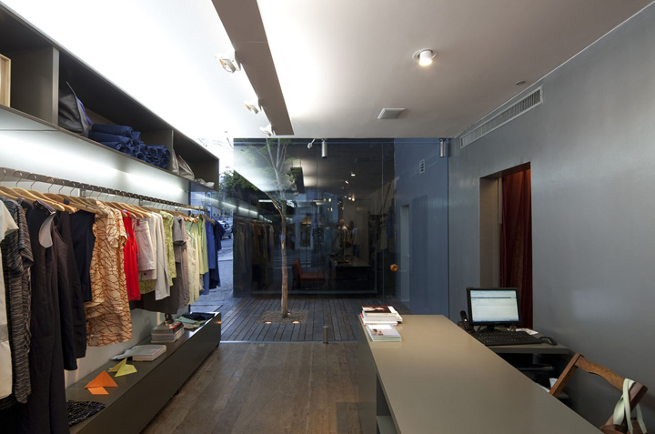

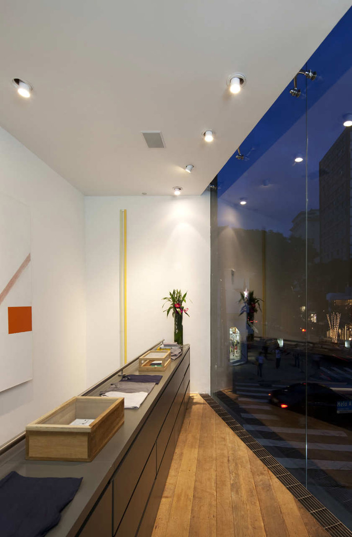
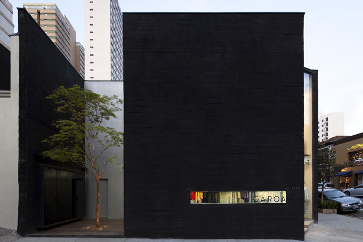
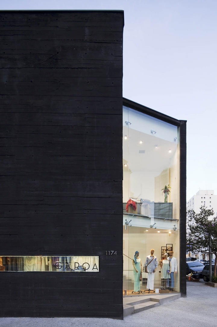
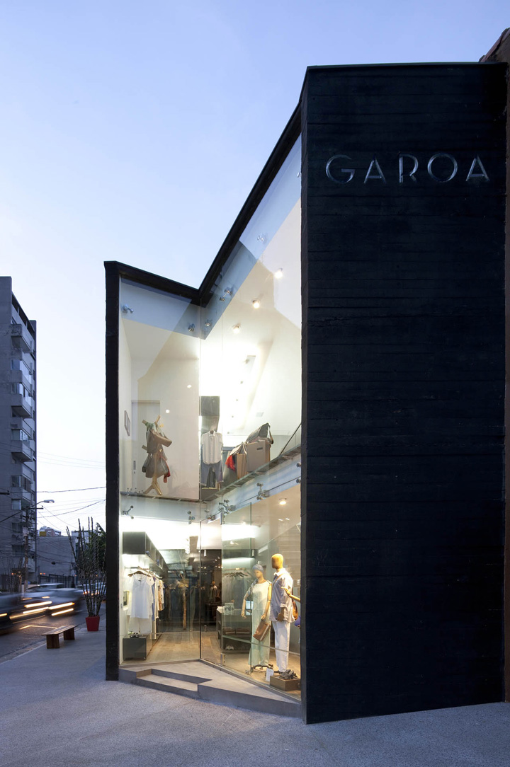
The Garoa store is located in a small plot at one of the most sophisticated commercial streets of São Paulo, the Oscar Freire Street. We see the corner as the place where the building has its best exposure for it is there that it is two times linked to the street, to the sidewalk. Right at this encounter of streets, a dent in the building was drawn as if a portion of its volume had been extracted, defining two transparent planes, which shows the store interior and expands its presence in the corner. The indentation was thought to intensify the most immediate relationship with the public space.
Even though the plot is located at the beginning of the street, the traffic has its single direction opposite to the corner in which the building is. That condition led us to think that, the sight to the corner or even to the Oscar Freire Street, will be more pleasant if taken from the oblique sights. That has the effect that the transparencies of the store do not follow lines parallel to the street, and do not reproduce a façade but rather define a volume.
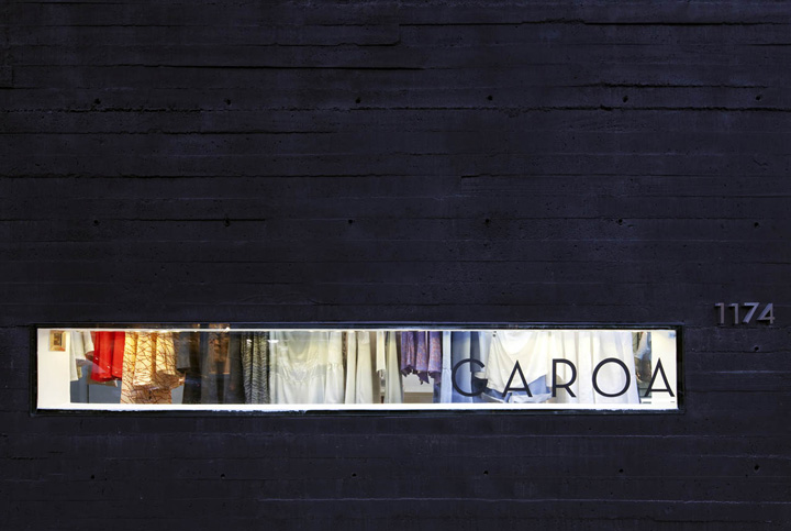
The construction made in small-scale uses exposed concrete which because of its peculiar texture gives the building a sense of unity. In addition, the black concrete adds drama to the building by giving it opacity and tactfulness. Just like a charred stone, cut in oblique angles, it reminds of a large piece of art cut in stone. The dark volume helps in emphasizing the white and bright interior, where the store merchandises can be seen. A narrow opening across the wall permits pedestrians to see what the colors of the season’s palette are.
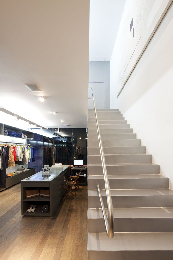
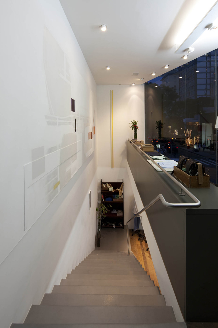
Women buy at ground level and men in the first floor. The stair, placed right beside the entrance door, is an invitation for knowing the first floor. Up there, the organization of a small area for showing the products, offers a space from where and through the same dent that has invited us to get in the store, one can see the movement in the street made by costumers of stores and small cafes.
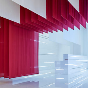
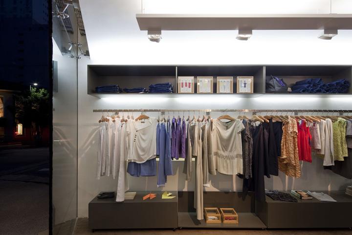
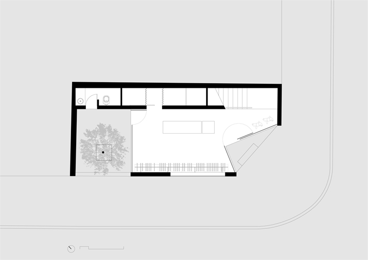
Internally the store is organized from a longitudinal volume (about 1.2 meter wide) occupying all extension of the lateral border thus resolving all supporting activities: stairway, pantry, toilet, cloth provers and stock. This concentration has permitted that the main space remained open. The latter is painted bright silver in automotive paint, reinforcing the contrast between inside and outside spaces.
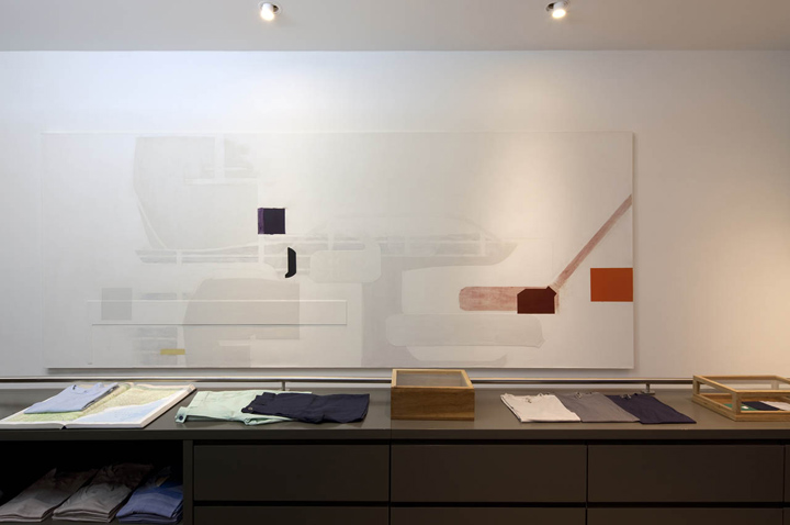
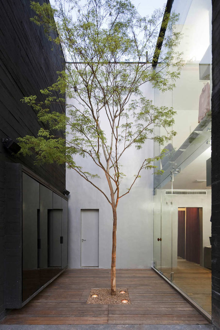
The store interior defines itself in conjunction with its transparencies. At the backside of the patio, a volume in dark crystal gives depth to the dimension of the space. The floor made of recovered wood lends age to the space. Those same planks are used on the outside space, thus creating a feeling of a floor to the soil rather than to the building. In the side that faces Rua Oscar Freire a patio border the limits of the plot. This small open space suggests that, the sidewalk floor merges with the floor of the store creating a rest area that is also a way to access the store. The “pau-ferro” tree that crowns the patio reinforces the feeling of peace that was sought in the first place. The art works inside the store, pieces by São Paulo artists, were curated by the art critic Alberto Tassinari.
Designed by Una Arquitetos
Photographs: Leonardo Finotti
http://www.archdaily.com/119949/the-garoa-store-una-arquitetos/


Add to collection
